1.8: Convert - Conversion Optimization
- Page ID
- 89457
\( \newcommand{\vecs}[1]{\overset { \scriptstyle \rightharpoonup} {\mathbf{#1}} } \)
\( \newcommand{\vecd}[1]{\overset{-\!-\!\rightharpoonup}{\vphantom{a}\smash {#1}}} \)
\( \newcommand{\dsum}{\displaystyle\sum\limits} \)
\( \newcommand{\dint}{\displaystyle\int\limits} \)
\( \newcommand{\dlim}{\displaystyle\lim\limits} \)
\( \newcommand{\id}{\mathrm{id}}\) \( \newcommand{\Span}{\mathrm{span}}\)
( \newcommand{\kernel}{\mathrm{null}\,}\) \( \newcommand{\range}{\mathrm{range}\,}\)
\( \newcommand{\RealPart}{\mathrm{Re}}\) \( \newcommand{\ImaginaryPart}{\mathrm{Im}}\)
\( \newcommand{\Argument}{\mathrm{Arg}}\) \( \newcommand{\norm}[1]{\| #1 \|}\)
\( \newcommand{\inner}[2]{\langle #1, #2 \rangle}\)
\( \newcommand{\Span}{\mathrm{span}}\)
\( \newcommand{\id}{\mathrm{id}}\)
\( \newcommand{\Span}{\mathrm{span}}\)
\( \newcommand{\kernel}{\mathrm{null}\,}\)
\( \newcommand{\range}{\mathrm{range}\,}\)
\( \newcommand{\RealPart}{\mathrm{Re}}\)
\( \newcommand{\ImaginaryPart}{\mathrm{Im}}\)
\( \newcommand{\Argument}{\mathrm{Arg}}\)
\( \newcommand{\norm}[1]{\| #1 \|}\)
\( \newcommand{\inner}[2]{\langle #1, #2 \rangle}\)
\( \newcommand{\Span}{\mathrm{span}}\) \( \newcommand{\AA}{\unicode[.8,0]{x212B}}\)
\( \newcommand{\vectorA}[1]{\vec{#1}} % arrow\)
\( \newcommand{\vectorAt}[1]{\vec{\text{#1}}} % arrow\)
\( \newcommand{\vectorB}[1]{\overset { \scriptstyle \rightharpoonup} {\mathbf{#1}} } \)
\( \newcommand{\vectorC}[1]{\textbf{#1}} \)
\( \newcommand{\vectorD}[1]{\overrightarrow{#1}} \)
\( \newcommand{\vectorDt}[1]{\overrightarrow{\text{#1}}} \)
\( \newcommand{\vectE}[1]{\overset{-\!-\!\rightharpoonup}{\vphantom{a}\smash{\mathbf {#1}}}} \)
\( \newcommand{\vecs}[1]{\overset { \scriptstyle \rightharpoonup} {\mathbf{#1}} } \)
\(\newcommand{\longvect}{\overrightarrow}\)
\( \newcommand{\vecd}[1]{\overset{-\!-\!\rightharpoonup}{\vphantom{a}\smash {#1}}} \)
\(\newcommand{\avec}{\mathbf a}\) \(\newcommand{\bvec}{\mathbf b}\) \(\newcommand{\cvec}{\mathbf c}\) \(\newcommand{\dvec}{\mathbf d}\) \(\newcommand{\dtil}{\widetilde{\mathbf d}}\) \(\newcommand{\evec}{\mathbf e}\) \(\newcommand{\fvec}{\mathbf f}\) \(\newcommand{\nvec}{\mathbf n}\) \(\newcommand{\pvec}{\mathbf p}\) \(\newcommand{\qvec}{\mathbf q}\) \(\newcommand{\svec}{\mathbf s}\) \(\newcommand{\tvec}{\mathbf t}\) \(\newcommand{\uvec}{\mathbf u}\) \(\newcommand{\vvec}{\mathbf v}\) \(\newcommand{\wvec}{\mathbf w}\) \(\newcommand{\xvec}{\mathbf x}\) \(\newcommand{\yvec}{\mathbf y}\) \(\newcommand{\zvec}{\mathbf z}\) \(\newcommand{\rvec}{\mathbf r}\) \(\newcommand{\mvec}{\mathbf m}\) \(\newcommand{\zerovec}{\mathbf 0}\) \(\newcommand{\onevec}{\mathbf 1}\) \(\newcommand{\real}{\mathbb R}\) \(\newcommand{\twovec}[2]{\left[\begin{array}{r}#1 \\ #2 \end{array}\right]}\) \(\newcommand{\ctwovec}[2]{\left[\begin{array}{c}#1 \\ #2 \end{array}\right]}\) \(\newcommand{\threevec}[3]{\left[\begin{array}{r}#1 \\ #2 \\ #3 \end{array}\right]}\) \(\newcommand{\cthreevec}[3]{\left[\begin{array}{c}#1 \\ #2 \\ #3 \end{array}\right]}\) \(\newcommand{\fourvec}[4]{\left[\begin{array}{r}#1 \\ #2 \\ #3 \\ #4 \end{array}\right]}\) \(\newcommand{\cfourvec}[4]{\left[\begin{array}{c}#1 \\ #2 \\ #3 \\ #4 \end{array}\right]}\) \(\newcommand{\fivevec}[5]{\left[\begin{array}{r}#1 \\ #2 \\ #3 \\ #4 \\ #5 \\ \end{array}\right]}\) \(\newcommand{\cfivevec}[5]{\left[\begin{array}{c}#1 \\ #2 \\ #3 \\ #4 \\ #5 \\ \end{array}\right]}\) \(\newcommand{\mattwo}[4]{\left[\begin{array}{rr}#1 \amp #2 \\ #3 \amp #4 \\ \end{array}\right]}\) \(\newcommand{\laspan}[1]{\text{Span}\{#1\}}\) \(\newcommand{\bcal}{\cal B}\) \(\newcommand{\ccal}{\cal C}\) \(\newcommand{\scal}{\cal S}\) \(\newcommand{\wcal}{\cal W}\) \(\newcommand{\ecal}{\cal E}\) \(\newcommand{\coords}[2]{\left\{#1\right\}_{#2}}\) \(\newcommand{\gray}[1]{\color{gray}{#1}}\) \(\newcommand{\lgray}[1]{\color{lightgray}{#1}}\) \(\newcommand{\rank}{\operatorname{rank}}\) \(\newcommand{\row}{\text{Row}}\) \(\newcommand{\col}{\text{Col}}\) \(\renewcommand{\row}{\text{Row}}\) \(\newcommand{\nul}{\text{Nul}}\) \(\newcommand{\var}{\text{Var}}\) \(\newcommand{\corr}{\text{corr}}\) \(\newcommand{\len}[1]{\left|#1\right|}\) \(\newcommand{\bbar}{\overline{\bvec}}\) \(\newcommand{\bhat}{\widehat{\bvec}}\) \(\newcommand{\bperp}{\bvec^\perp}\) \(\newcommand{\xhat}{\widehat{\xvec}}\) \(\newcommand{\vhat}{\widehat{\vvec}}\) \(\newcommand{\uhat}{\widehat{\uvec}}\) \(\newcommand{\what}{\widehat{\wvec}}\) \(\newcommand{\Sighat}{\widehat{\Sigma}}\) \(\newcommand{\lt}{<}\) \(\newcommand{\gt}{>}\) \(\newcommand{\amp}{&}\) \(\definecolor{fillinmathshade}{gray}{0.9}\)- Understand what conversion rate optimization is and some approaches to optimize webpages and websites.
In this chapter, we cover what conversion is and how to optimize web pages to convert better. To do so, we discuss conversion rate optimization, how to identify what to optimize when people move one web page to another, some conversion-centered principles, A/B testing, and retargeting.
Convert
The convert stage is focused on increasing conversions to maximize sales. It emphasizes both maximizing conversions across the journey of consumers and improving conversion from lead to customer. Since our main objective is to increase conversions, any indicator associated with measuring and improving conversion can serve as a KPI here, depending on what we exactly are trying to achieve. Examples of KPIs include: Sales, % conversion lead to sale, average order, cost per conversion (per channel), average conversion time, abandoned carts, and sales per source.
Conversion Rate Optimization
Conversion rate optimization is the process of improving webpages and websites to increase conversions. A conversion refers to a user achieving a goal by taking a desired action. Conversions can therefore happen on any webpage of a website that has a goal that a firm wants users to achieve.
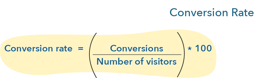
Conversion rate is the percentage of people that visit a page and achieve a desired goal or action. It is calculated as follows:
Although we might tend to think of conversion as a consumer completing a purchase, many other goals can be set up for them, such as submitting a form, clicking on a link, reaching a particular page, spending an amount of time on a website, or viewing a certain number of pages on a website. A distinction tends to be made between goals that lead consumers to achieve certain critical actions set up by a firm and goals that consumers complete in their journey to do so. Optimizely talks about common and ultimate goals. Google discusses micro and macro conversions.
Conversion rate optimization is important because it helps firms improve the number of users who might achieve specific goals. It can lead to a higher number of leads, lower acquisition costs, and increased revenue, for example. It is also usually cheaper to convert more visitors than to attract more visitors, making conversion rate optimization more cost-effective to improve a business.
A useful way to think about micro and macro goals or conversions is to ask the question: What are the little actions along their journey that consumers need to take (micro goal/conversion) in order for them to achieve what I ultimately want them to do (macro goal/conversion)?
These can vary depending on the type of website that a firm is running. For e-commerce websites, purchases are the main indicator of whether the site is performing well. Because social media websites mostly make revenue based on ads and by making sure that users are participating and returning, time spent on site and engagement-related goals might be more important. News websites might have a mix of both. Thus, goals for visitors vary depending on the type of website and the business model of a firm.
Since conversions are calculated based on whether users achieve a goal or not, the first question to ask, then, to practice conversion rate optimization is: what are the goals I want users to achieve on my website? What are the goals users should achieve on specific webpages to do so? Many such goals can be achieved, and as a result, conversion rate optimization might touch many elements of websites, such as forms, carts, and content on webpages. Other types of online properties, such as apps and emails, can also be optimized. Last, conversion paths can be optimized by identifying whether there are movements between parts of a path (e.g., moving from an ad to a landing page or from a landing page to a cart) that seem to be hindered.
Understanding What to Optimize
To take to manage optimization, firms should first examine the general path of a specific persona as they move from visitor to lead to customer. This gives an overview of the strategic picture of our overall conversion efforts. Trew Marketing provides us with an abstract funnel below:
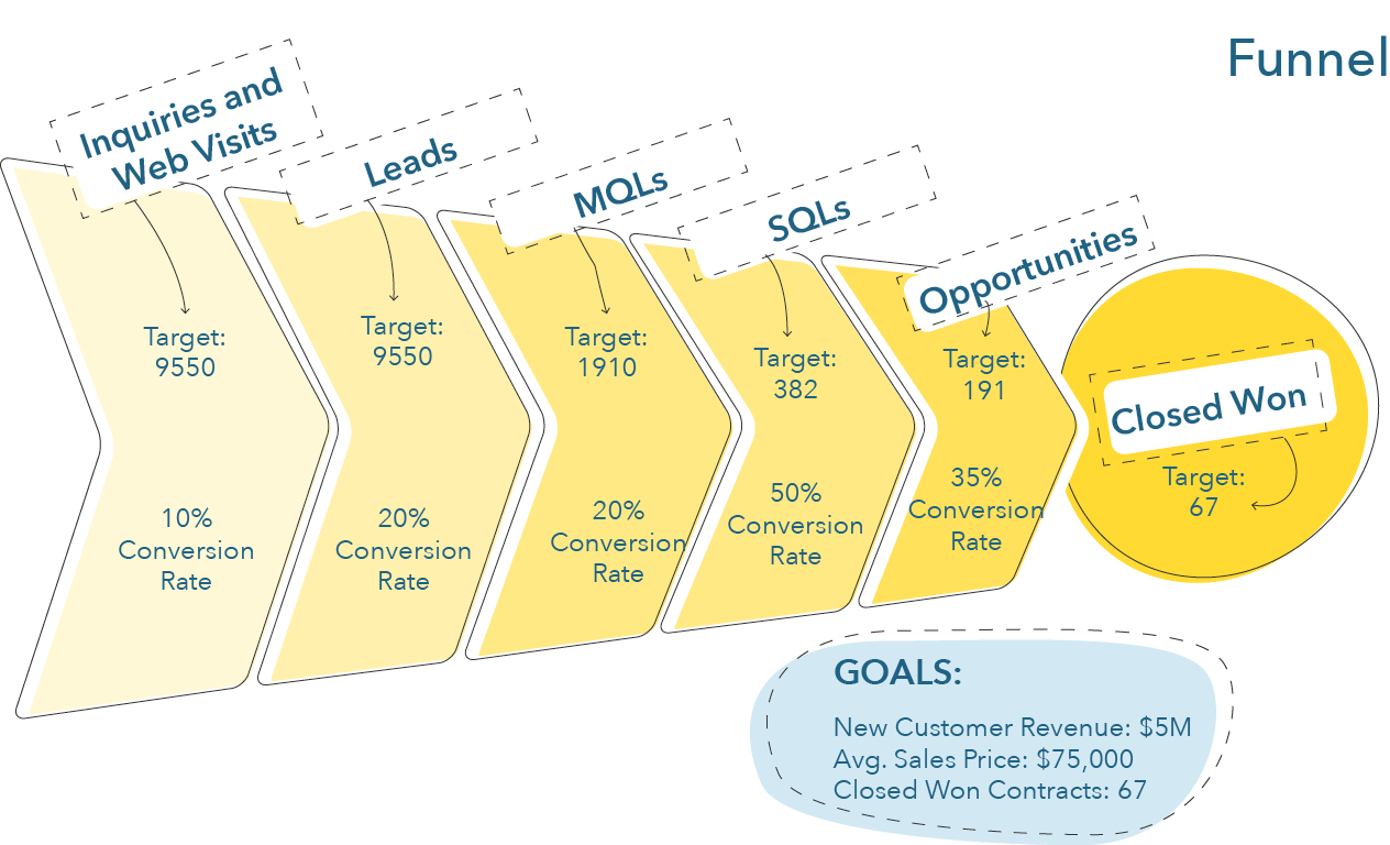
When we look at a the journey of consumers this way, we see how, out of all of the visits that we receive on our website, we convert only a percentage to leads. Then, out of all of these leads, only a percentage will be marketing qualified. We then market to these leads and engage in lead nurturing, and only a percentage will move forward in their journey and become sales qualified. Lastly, from these sales qualified leads, only a percentage will become our customers. Each of these moments, where a person moves from one stage to another, might need our attention. Is our conversion rate from visitor to lead good? What about our conversion rate from sales qualified lead to customer?
Looking at the performance of a firm throughout its efforts associated with the consumer journey and what happens between the difference stages a consumer goes through (i.e., visitor, lead, customer, engaged customer) is a good first step to identify exactly where a firm should deploy optimization efforts.
Once a firm understands what steps in the journey seem to be a bottleneck to acquiring customers, it can concentrate on optimizing the specific elements of that step (e.g., a landing page, a shopping cart, a product page). Using software such as Google Analytics, firms can set up steps for users to achieve on specific pages and measure whether users are going through these steps. For each goal, firms can link a series of steps to create conversion funnels (here is an example for cart abandonment). An example of a funnel for the goal of buying a product could be:
Home page > [Step: Click on shop now] > Product categories page > [Step: Click on a category] > Specific product category > [Step: Click on a product] > Product page > [Step: Click ‘buy now’] > Check-out page > [Step: Fill out form] > [Step: Buy product]
Analytics solutions then give output that shows the percentage of people that achieve each step. For example, Google’s conversion funnel looks like this (from Neil Patel):
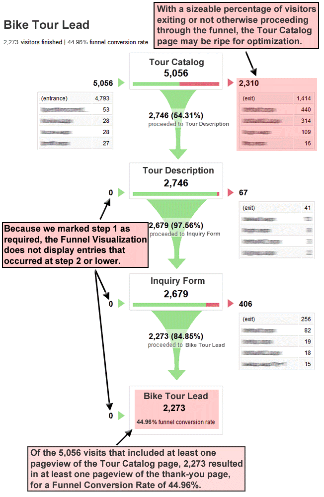
As Patel indicates in this figure, the information provided helps identify potential areas ripe for optimization. For example, only 54% of visitors to the tour catalog complete the first goal and move to the tour description, which in this funnel seems to be the place where the firm is ‘losing’ most of its potential customers. This seems like a good place to start conversion optimization efforts.
A/B Testing
One of the main tools in the arsenal of conversion optimization is A/B testing. A/B tests:
“consist of a randomized experiment with two variants, A and B. It includes the application of statistical hypothesis testing or “two-sample hypothesis testing” as used in the field of statistics. A/B testing is a way to compare two versions of a single variable, typically by testing a subject’s response to variant A against variant B, and determining which of the two variants is more effective” (Wikipedia).
In plain English language, an A/B test compares two versions of the same webpage where one element differs (e.g., a different call-to-action, or a different background image, or a different heading). Using software solutions, half the traffic to this webpage over a specific period of time is sent on version A and the other half of the traffic is sent on version B. Then, the performance of both pages on whatever goal consumers were supposed to achieve on this page is compared.
Let’s take the following landing page, for example. The signup rate is lower than expected, and the firm wants to test different elements. Their first hypothesis is that the headline is not convincing enough. They thus decide to test a different headline with a clearer call-to-action:
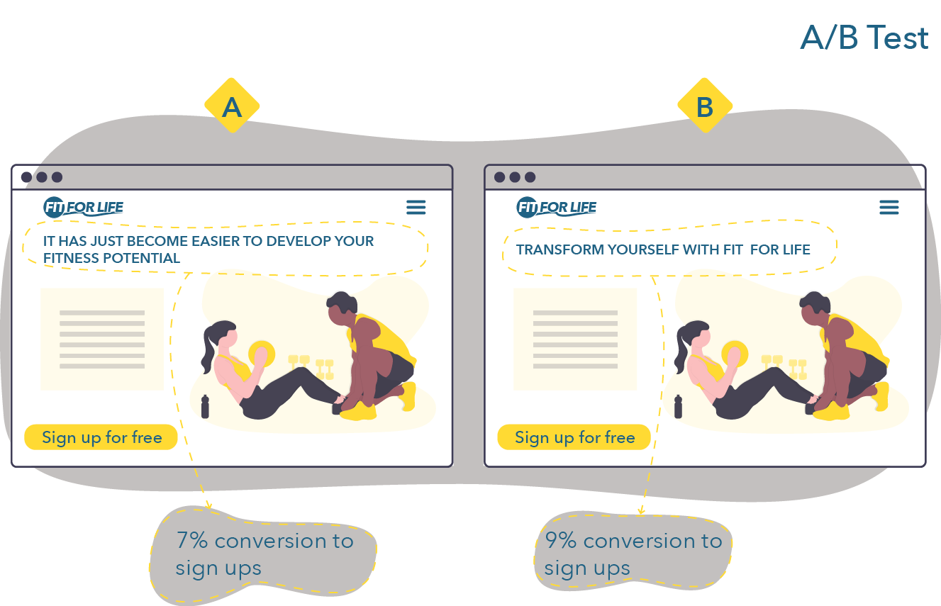
They test both pages over a period of a week. After the week ends, they compare version A and version B and finds out that version B performed better. They thus keep version B and move on to either test other elements of the landing page.
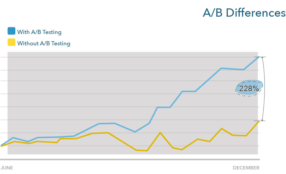
Optimizing through A/B testing typically leads to marginal gains, meaning that it is rare to see a massive difference between two versions. But, over time, these marginal gains can add up to important differences. Let’s, for example, compare a website that does not do any A/B testing on a landing page to one that does A/B testing every week and make small gains, improving their conversion rate a factor of one percent a week (e.g., moving from 8% to 8.08% in the first week). The second website, at the end of the year, will have a page that performs 1.39% better. At the end of the second year, 2.97%. At the end of the third year, 4.76%. While the first landing page still converts, let’s say, 10% of visitors, the second landing page now converted 14.76%. If the improvements are by a factor of 2% per week, this difference moves to 21.77%. Like compound interests, small differences add up to large differences over time:
Anything can be A/B tested. If you want more information on how A/B tests can be used in practice, I highly encourage you to read one of the following three cases from Optimizely:
- – How Secret Escapes A/B tested a mandatory signup for an app
- – How Sony Vaio A/B tested a banner ad and a cart
- – How ComScore tested social proofing (testimonials on product pages) (note: ComScore used multi-variate testing rather than an A/B test by testing three variations of their page)
Conversion-Centered Principles
We will next cover principles for conversion-centered design proposed by Unbounce. The main idea behind these principles is to help create highly converting webpages by concentrating on key design ideas that have less to do with creating aesthetically pleasing websites and more with creating websites that help marketers achieve their objectives.
The principles are:
- Create focus: Design pages for a single goal, minimize attention ratio
- Draw attention: Use design tips such as color, directional cues, and white space to direct visitors’ attention
- Build structure for clarity: Use visual/information hierarchy to facilitate rapid reading
- Stay consistent: Match your ads with your landing page through design and message matches
- Build trust: Using testimonials and social proofing to create trustworthy pages
- Congruence: Align all elements of a webpage towards achieving its goal
- Think continuity: Always know what the next step is
For example, let’s apply these principles to the optimization of a landing page:
- Does the page have one goal and one associated link/call-to-action?
- Am I using visuals to clearly indicate what users should do?
- If I scan the page quickly, is it clear and obvious what I should be doing?
- Are my ad and page visually and rhetorically aligned?
- Would I believe this page is trustworthy if it was a competitor’s page?
- Do all elements work together towards helping visitors achieve the page’s goal?
- Is it clear what users should be doing once they are done with completing the goal on this page?
Let’s see each principle in-depth.
Create Focus
Although we think of choice as a great thing, more options are associated with a breadth of negative consequences. According to leading psychologist Barry Schwartz, offering more choices make people less likely to pick an option and more likely to be dissatisfied with the option they picked (TED Talk). Think of the last time you tried to pick a Netflix movie, for example. How long did it take you to choose a movie? How long would it have taken you if you only had two options? On web pages, more choices also mean more options offered to visitors, and more chances that they will not do what they should be doing on a certain page.
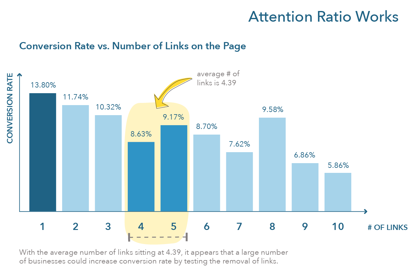
For this reason, the first principle asks to create focus on your web pages. On landing pages, we saw that the lower the attention ratio (the ratio between goals and links on a page), the higher the conversion rate. In 2013, Unbounce analyzed more than 20 000 lead generation landing pages and found the following relationship for attention ratio (see the figure below). Clearly, the more links on a lead generation landing page, the less likely a firm is to create a lead. Thus, to create focus on landing pages, firms should focus on a 1 to 1 attention ratio. In order to do this, landing pages should aim at making visitors accomplish one and one goal only.
How does focus translate on other pages? Often, this is achieved by drawing people’s attention to the goal they are the more likely wanting to accomplish by positioning this goal above the fold on a firm’s page. Concretely, this often translates on having only one call-to-action above the fold, where the call-to-action is associated with the goal that consumers should be achieving.
Let’s see a few examples of top websites in three domains: Optimizely (b2b), Mint and Discord (b2c-app), and retailers.
Optimizely offers visitors a personalized option depending on their role. Engineers are asked to create a free account, product managers are invited to watch a demo, marketers can try a visual editor, data scientists are offered a white paper, and team leaders are guided to read a guide to experimentation. In short, what Optimizely has done is (1) identify the main goal that each persona is likely to want to accomplish when going on the firm’s website and (2) put this goal front-and-center.
Discord and Mint employ the same tactic: They offer visitors one option above the fold, that is, to use or sign up for their product. Below the fold, the strategy of both websites is also the same. They expand on the benefits of their products, what users should expect when they sign up, provide social proofing, and conclude this sales pitch with, again, an option to sign up or use the product. This is a typically home page design strategy for firms that sell one or a few products, such as Paperlike, which we discussed in our exercise for the last chapter.
Altitude-Sports, an online retailer, employs a strategy typical for this type of website: They offer the visitor to move to shop to a section of the website (see also FARFETCH). There are different approaches to doing this. Mr. Porter invites consumers to different product categories that align with the season, such as rain jackets for Fall, as well as a link to new items. END Clothing pursues a strategy typical of the niche menswear market and invites consumers to register to drops. An alternative for retailers that have content-heavy websites is to drive visitors to content articles (SSENSE follows this strategy), probably in a bid to become a privileged source of information for high fashion and turn readers into customers.
Importantly, for retailers and other types of websites, the number of links that visitors can click above the fold is limited. In all these examples, visitors are offered a maximum of three options above the fold (not including the menu).
Draw Attention
Once a firm has identified what goal visitors are supposed to achieve, it can use visual elements to draw the attention of visitors to elements of the website that should lead them to achieve this goal. A few visual principles can help us here (images from Unbounce):
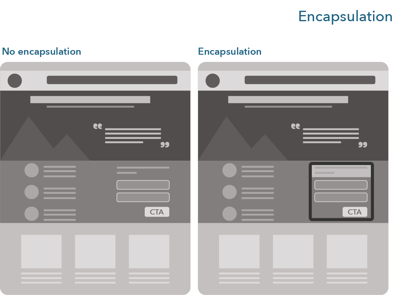
- Encapsulation: Practice encapsulation by bounding an element you want to draw attention to in a box or a figure. A typical example of encapsulation is the introduction sequence of old James Bond movies, where the gun barrel draws our focus to James Bond. On a webpage, this can be done, for example, by putting an element that visitors should focus on in a box. See the following two figures for examples:

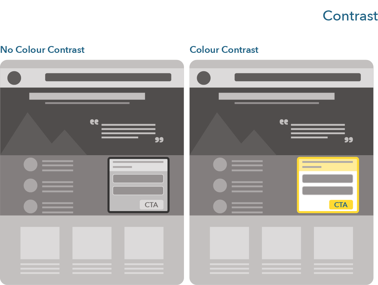
- Contrast and color: They similarly draw the attention of the visitors to the contrasting and colorful design elements, like a button, a specific sentence, a title, or a form. Many sites now help with color theory and finding the best contrasting colors, such as Coolors.
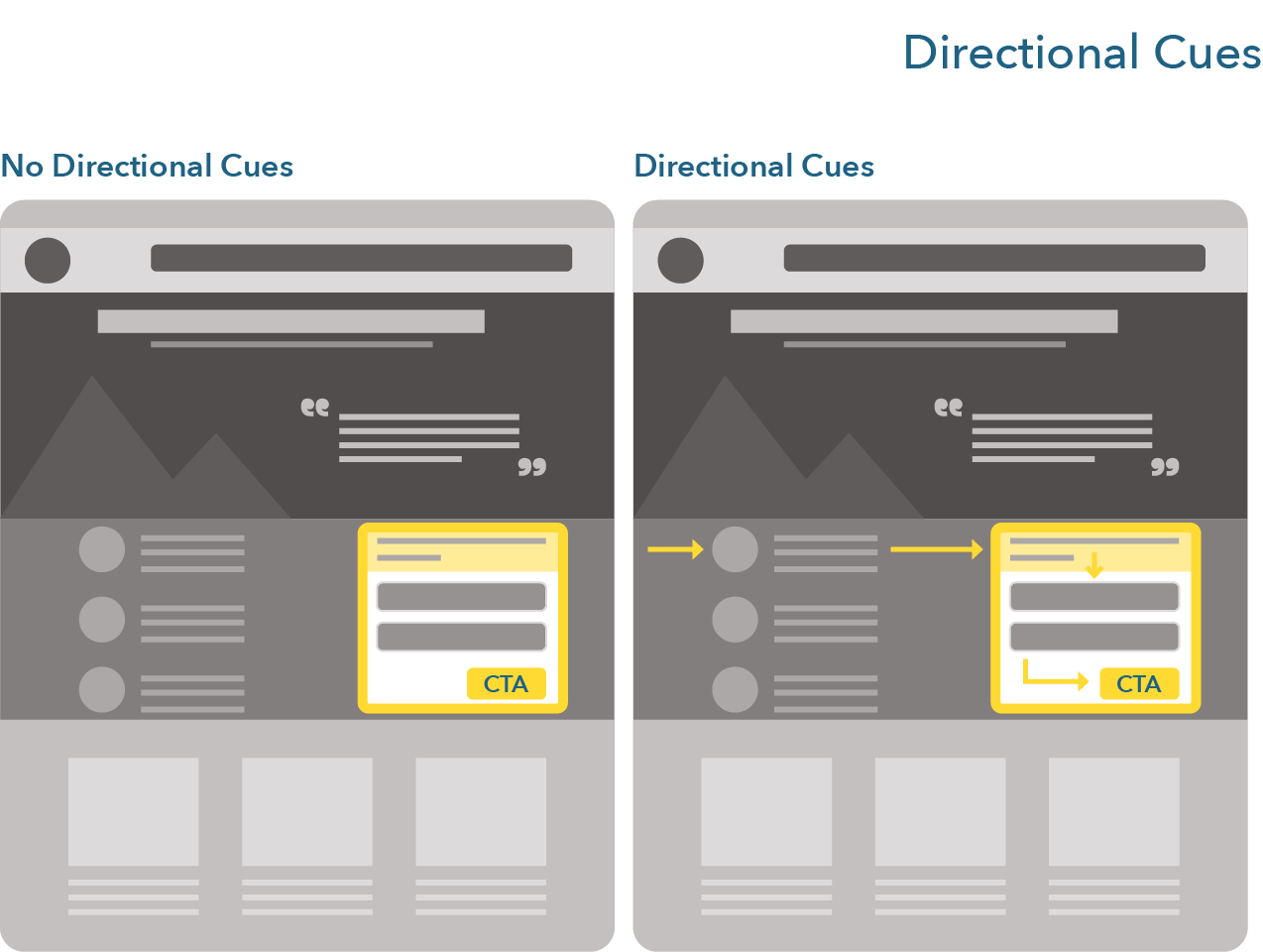
- Directional cues serve two purposes. First, they help direct visitors’ attention to the elements that are pointed to. Second, they help create a reading pattern for your users to follow (reading patterns should also be supported by the rest of your website structure, i.e., how your images and text are positioned, which is beyond the scope of this course).
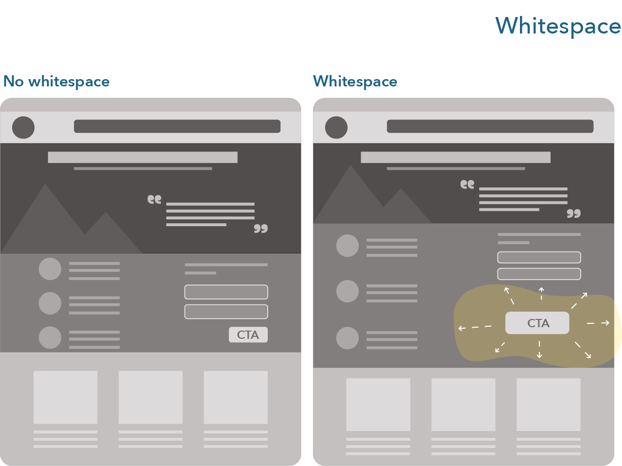
- Lastly, white space is also a design tool that is useful to draw the attention of visitors to specific webpage elements, as exemplified below:
Build Structure for Clarity
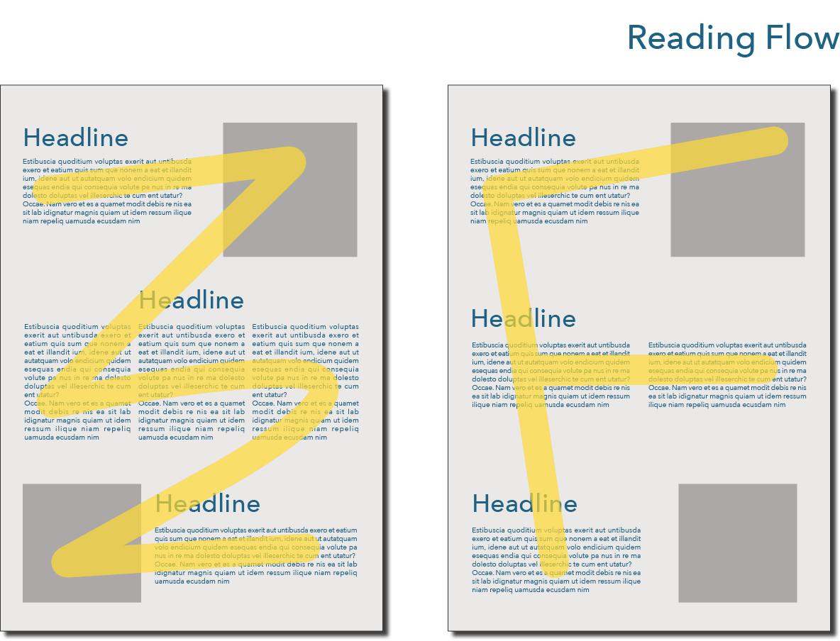
Building structure for clarity is all about matching sure the message of a page gets across clearly and quickly. To do so, it is useful to follow basic principles of information and visual hierarchy, where the more important the information, the better positioned, bigger, brighter, more colorful it is on the page (see figure below).
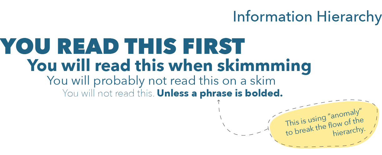
Follow the principle of Sullivan (the “father of skyscrapers”): Form follows function. Gone are the days when we designed webpages for purely aesthetic reasons. Webpages now have clear goals for visitors to achieve. Our objective as digital marketers is to make sure consumers achieve these goals. Design should support the achievement of goals rather than serve solely aesthetic purposes (i.e., designing a pretty website is not something we should solely strive for).
A useful, quick test to see if a page achieves a clear structure is the 5-seconds test. From 5secondstest.com:
“Five second tests are a method of user research that helps you measure what information users take away and what impression they get within the first five seconds of viewing a design. They’re commonly used to test whether web pages are effectively communicating their intended message.”
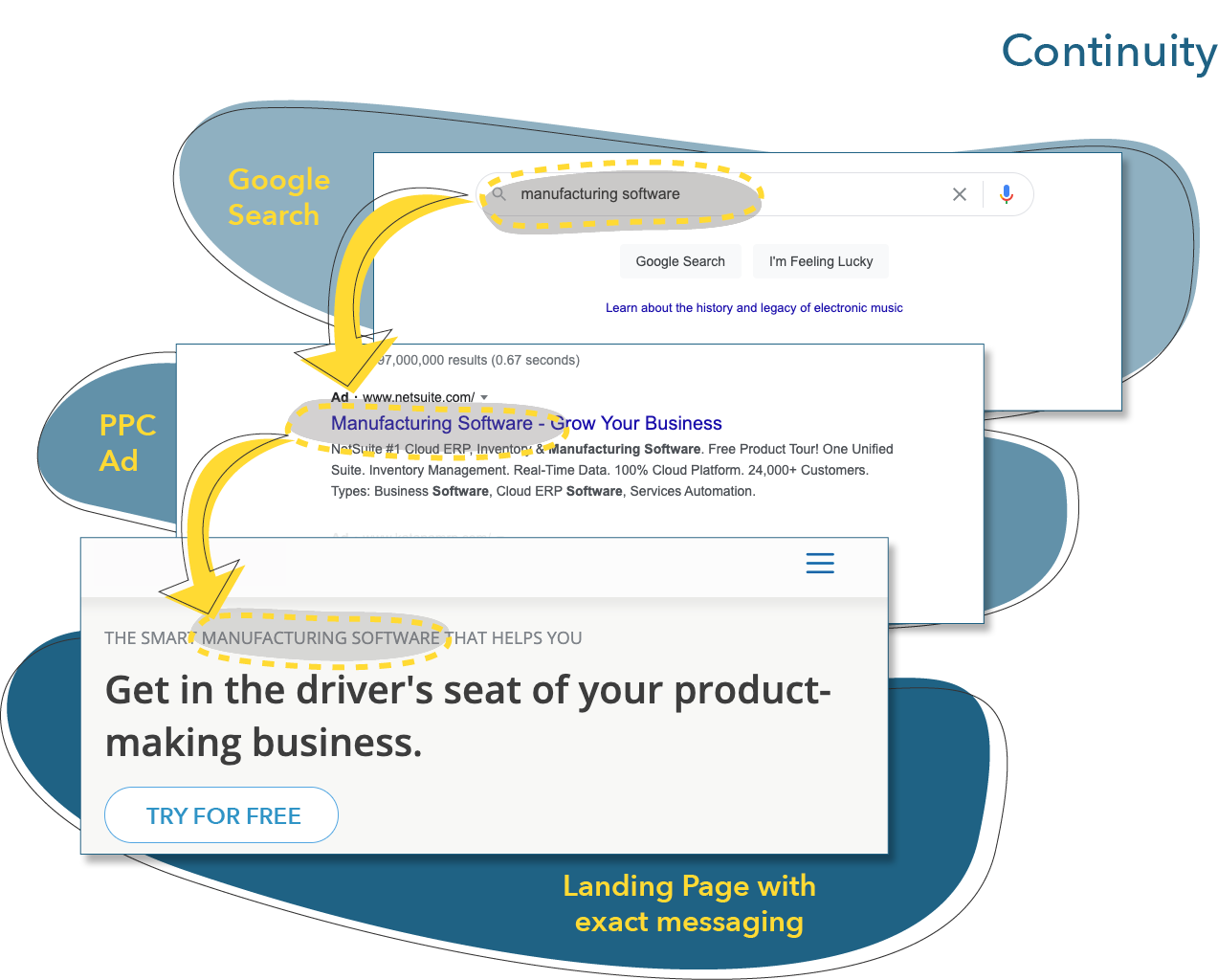
Stay Consistent
By consistency, we are talking about how all the elements of a campaign work together. Ideally, these elements should match. A few questions to answers that can help to do so:
- What was the search that the consumer did that lead them to see my ad or search result?
- Is my ad or search result well-aligned to answer that search?
- Do I create expectations with my page title and description, or headline and description that I thoroughly answer on the page?
- Is this information repeated on the page that they arrive on?
These ideas are expressed in the figure below:
Message and Design Matching
Ensuring consistency can be supported by practicing message and design matching.
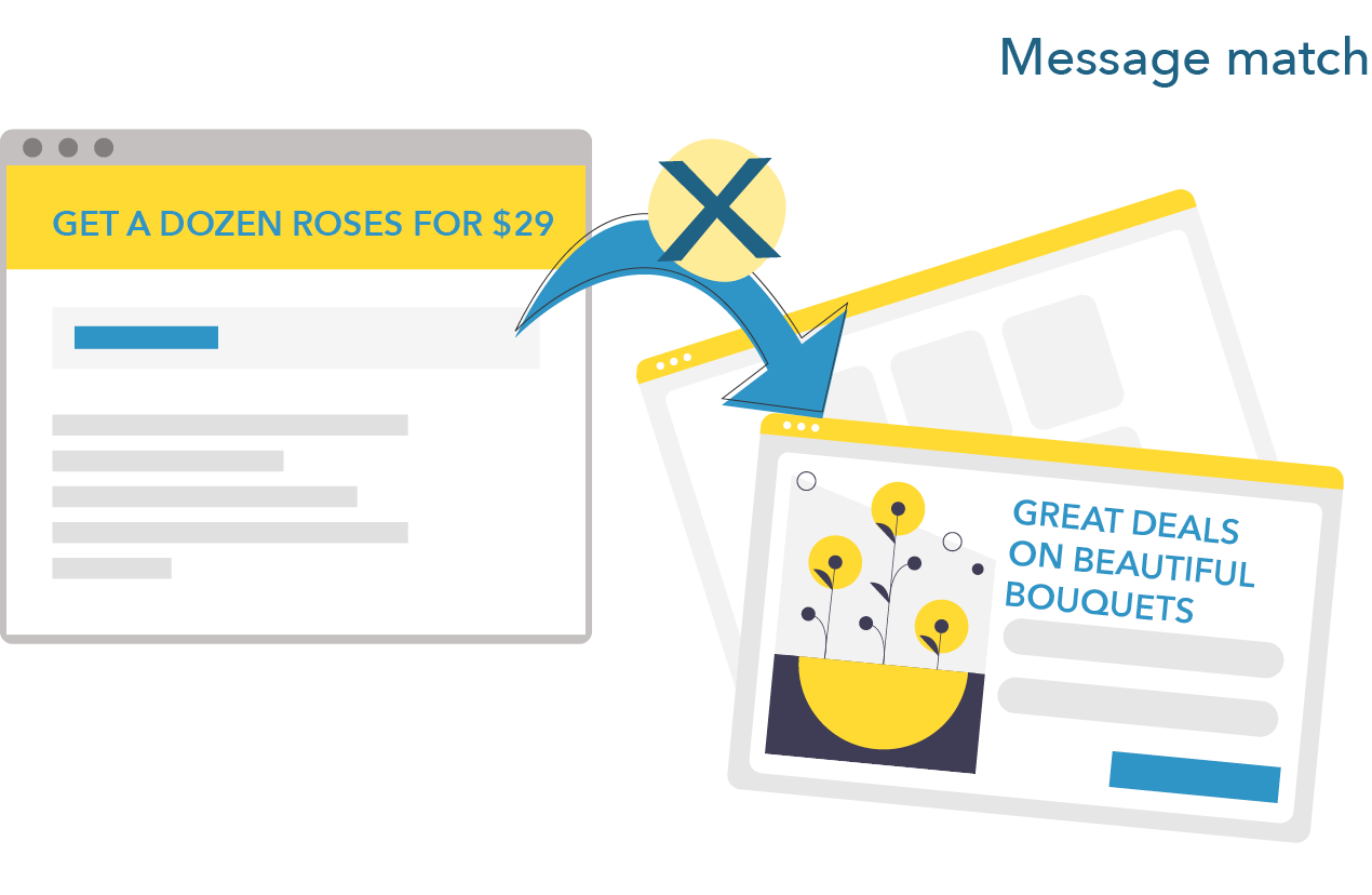
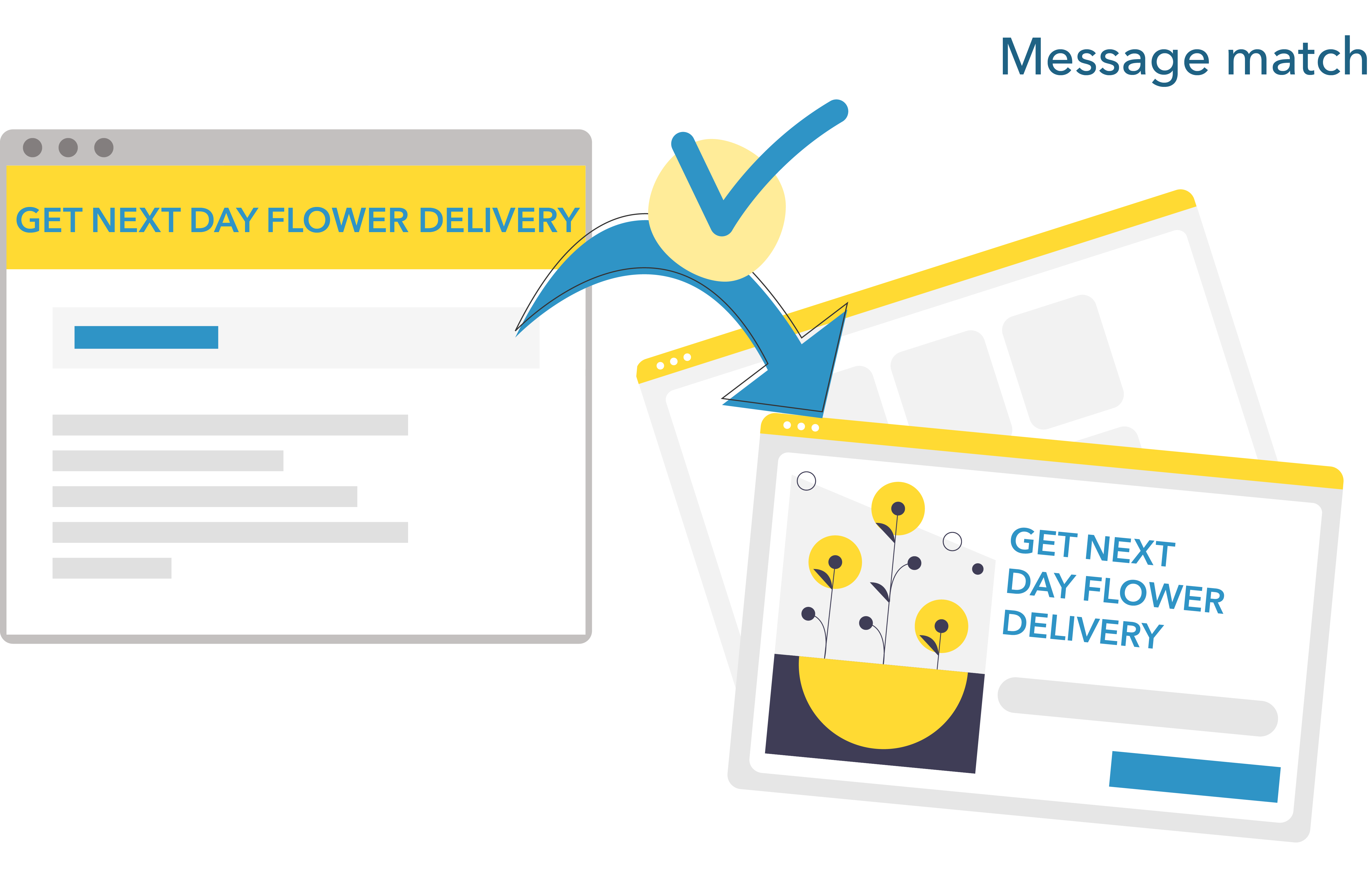
Message matching entails repeating the copy or phrasing of your ad or search page result in the web page where users land. This ensures that the user knows that the page they ended up on will answer their query. We are kind of lazy and stupid when it comes to navigating and looking for information online. The easier we can the lives of consumers, the more likely they are to convert.
Take the following example, where the first image doesn’t practice message match and the second does.
Does not practice message match because the search ad headline differs from the landing page headline
In contrast, the ad and landing page here are clearly aligned:
A similar idea has to do with matching the design of an ad and the page on which users land, or design matching. Here, we want to repeat the visual elements of the ad on the page. This can be done, for example, by repeating the visuals, colors, and structure of the ad.
Take the following example, where the first image doesn’t practice design match and the second does.
The following page does not repeat the elements of the ad (and it also does not repeat the copy!)

In comparison, here the ad and landing page are clearly aligned:

Build Trust
At an age where fake news is rampant, almost half of Amazon reviews are unreliable (AdAge), and when anybody, anywhere can create an online shop, instilling trust is a key component to make sales. This is especially true for smaller brands that consumers might not have heard of. Some website elements can help us build trust, such as:
- Testimonials and reviews
- Client logos
- Numbers, such as number of clients, downloads, or sales
- Awards and accolades
- Media mentions
Most of these elements are considered social proofs. Originally, social proof relates to the idea that we copy others, especially in situations of uncertainty (fun fact, organizations do the same thing, a concept called mimetic isomorphism). Online, this translates into proving to visitors that something is noteworthy or trustworthy because it has been adopted by others.
A couple of tricks provided by Unbounce when creating testimonials:
- Use a headshot to indicate that the testimonials come from a real person
- Use that person’s full name because using names like ‘Andre H.’ might raise doubts as to whether Andre is real
- Highlight some key feature of your product or software in the testimonial
- Use multiple testimonials
And, importantly, use some of the principles we just covered to have social proofing stand out so that it is easier for visitors to quickly grasp that other people already believe in the brand.
Congruence
Congruence is particularly relevant when designing landing pages, but its driving principles can be used when designing pages throughout a website. It refers to
The alignment of every landing page element with your single campaign goal. Congruence is a high-level conversion-centered design principle. If a piece of copy or image on your page isn’t aligned with your campaign, it’s going to cause friction and hurt your conversion rate. (Unbounce)
When designing landing pages, Unbounce proposes to score a page based on the congruence of its individual elements with the goal that consumers should achieved. We saw that landing pages typically possess some core elements, i.e., a unique selling proposition, a hero shot, a benefit statement, social proofing, and a link which is typically a call-to-action. These core elements are usually implemented into page elements, such as headline, subheadline, picture, introduction paragraph, bullet points, and link. An easy way to evaluate the congruence of a webpage to its goal is to build a scoring sheet for each of these elements. Take the following landing page as an example:

Now let’s see how each element of the landing page is performing. The first question to ask is: What is the goal that consumers need to achieve on that page? In this case, it is to download the white paper. Hence, all elements of this page should be talking about the white paper. The headline and sub-headline should offer some unique selling proposition associated with the white paper. The hero shot should be white paper related. The benefits, in this case explained in a short paragraph and bullet points, should explain what the consumer will get by downloading the white paper. The call-to-action should be white paper-related. And so on. How are each of these elements performing?
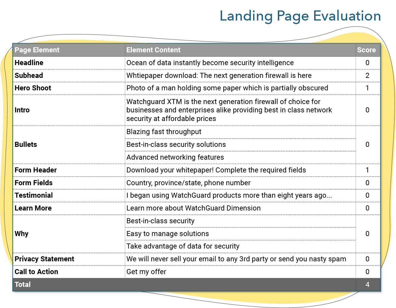
Generally, pretty badly: The headline is not aligned with the white paper, the intro and benefits are not white paper-related, the testimonial relates to the product rather than the white paper, and so on.
To optimize this page, the firm should transform each individual element to better represent the goal of this page.
Think Continuity
Ensuring that a persona achieves its macro conversion (e.g., making a sale) entails having well-defined, pre-planned paths through which it will go. This idea can be broken down into two main components.
First, every conversion is an opportunity for another conversion. This is the principle of continuance, as defined by Unbounce:
“A conversion centered design technique that uses the momentum of one conversion to drive a secondary conversion request, like a social share or a newsletter signup. Confirmation pages and thank you emails are prime channels for continuance.”
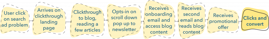
Second, this emphasizes the importance of clearly defined conversion paths. In order to know what to optimize in a sequence of steps, such as we have covered at the start of this chapter, it is necessary to know in advance what is the series of steps the consumers should take to complete an overarching goal or macro conversion such as making a purchase.
To do so, it is important to ask: What comes next? If I have consumers signup for a newsletter, it should be because I exactly know what I will be doing next and what the consumer who signed up will be asked to do. Optimizing conversion is about creating these clearly defined paths so that we can analyze each step, and the relationship between these steps, to boost our conversion rate over time both for specific steps and for the path as a whole.
Remarketing and Retargeting
Remarketing (sometimes called list-based retargeting) and retargeting (also called pixel or behavioral retargeting) are forms of targeting that serve ads to specific consumers, albeit differently. Online, you might find varying terms for these two activities. For example, Google places both under their remarketing tools.
Both strategies help during lead nurturing to maximize opportunities for conversion by serving ads to the right lead at the right stage of their journey. Remarketing and retargeting typically target qualified leads (MQL or SQL).
Although we discuss these two practices at the conversion stage, they can be used to convert for any goal (e.g., having consumer signup for a webinar or visit a blog post, as well as making a purchase). In short, these approaches can be used to generate leads, qualify leads, or convert to purchase.
The main difference between the two approaches is how targeting is put into action. Remarketing uses emails collected during lead generation activities to target leads, while retargeting target consumers based on previous behaviors. In both cases, ads are displayed to consumers.
To practice remarketing, a firm first needs to create an email list. Then, using targeting options on advertising platforms, such as Facebook Custom Audience or Google Customer Match, a firm can create an ad campaign that will only be seen by consumers with these email addresses.
Remarketing can be useful for many strategic purposes, although it is often used during retention strategies (i.e., when customers have already been acquired). This is, though, not the only use of remarketing. Remarketing can be used as part of a greater lead nurturing campaign to engage leads at any stage of their journey. For example, as long as a firm is properly keeping track of the stage at which the lead is located, it can use the emails associated with a large number of leads at a specific stage to personalize an ad campaign.
A plus of remarketing is that it is highly customizable to specific customers since you are targeting based on their email addresses. Two downsides, though, are that mismatch of email addresses happen (e.g., a lead might have given you an email address they do not use for their Facebook or Google accounts) and that it is not automatic (when compared to retargeting).
Instead of targeting ads based on an email list, retargeting uses previous behaviors, such as clicking a link, putting a product in a cart, or liking or commenting on a post. This is why, sometimes, after putting an item in a cart and abandoning your purchase, you might see the same article in the ads shown to you in numerous website, over and over again:
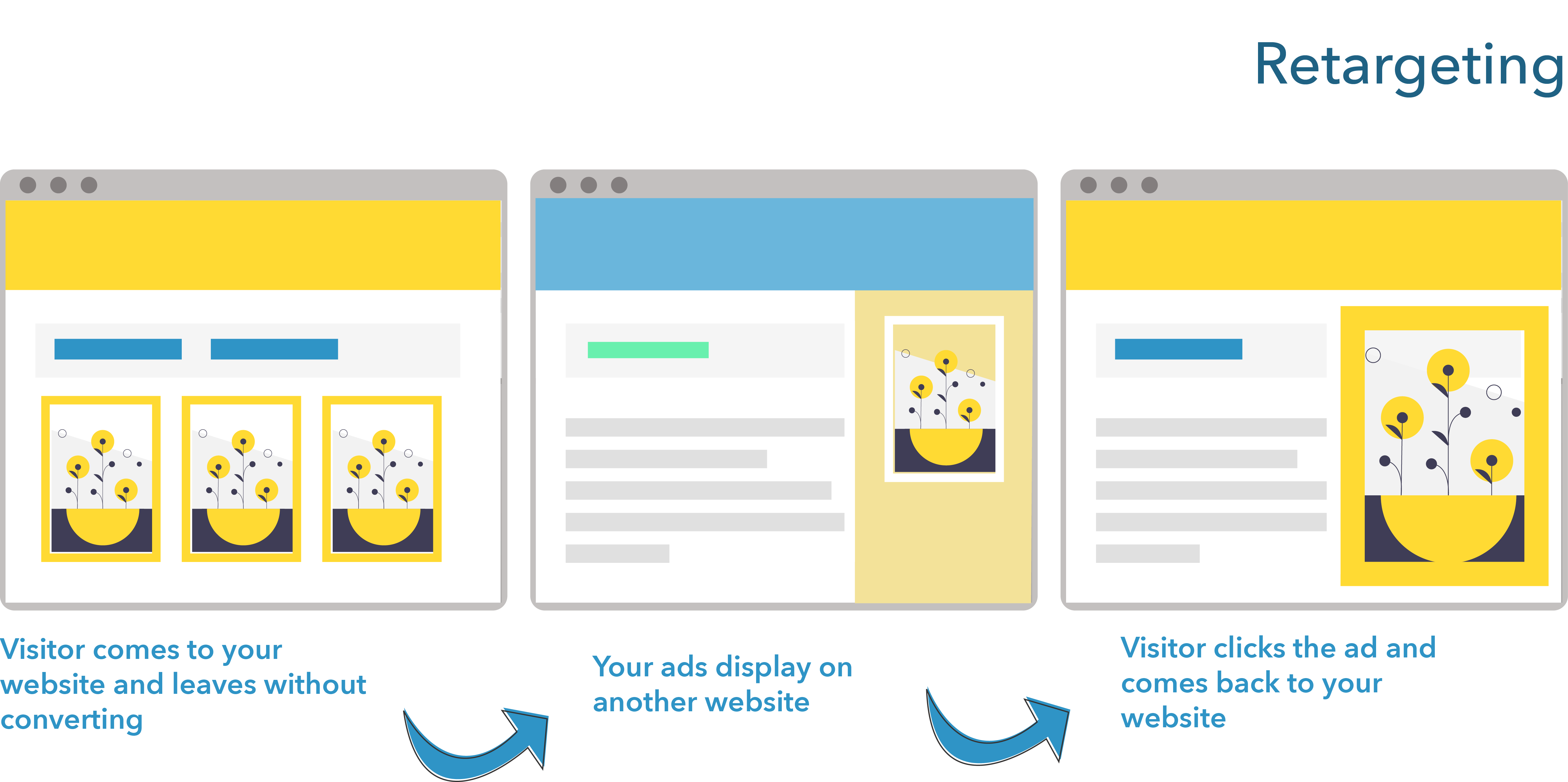
Because retargeting is automatic, and because it works on any pre-defined goal that has been accomplished by a visitor or a lead (e.g., viewing a specific page, clicking a link, spending time on a site, commenting on a Facebook post), it is a great tool to master to perfect lead nurturing campaigns. Although retargeting is often used to push consumers to complete purchases, its uses are much wide-ranging. Retargeting is a great tool to engage leads to perform the next action in a pre-planned path. For example, a firm could create a blog post or a piece of gated content to generate leads and retarget anybody who gave their email address on either in order for them to accomplish the next goal the path set up for that specific persona.
Retargeting can also be used for lead generation, where a company could target people interested in a specific product category. For example, car companies do retargeting campaigns by advertising product reviews on social media, of their cars and that of their competitors, and by retargeting anybody who clicks on the ads to read the reviews. Such campaigns help generate leads by identifying consumers who seem to be looking to make a purchase in a specific product category, and then targeting them to engage in lead generation activities.
Because it is highly customizable and automatic, the options when using retargeting are almost limitless. A firm simply needs to identify behavior that they deem interesting for, for example, scoring leads or identifying their stage in the journey, and use retargeting to serve ads to the specific consumers who will have performed that behavior. Retargeting campaigns work best when firms have a clear idea of the path their persona should take to make a purchase because they can then be used to maximize the chances that a persona at a specific step in that path will continue on and perform the next step.
Lastly, it is important, though, to ensure to identify the right actions! To finish this chapter on some laughs (or at least a smile):
Conversion optimization
- Based on this week’s chapter, optimize the landing page located at: bit.ly/34muGIR
- Explain your reasoning
Retargeting and remarketing
Assuming the following path, where could use you retargeting ads?