5.24: Images Overview
- Page ID
- 46144
\( \newcommand{\vecs}[1]{\overset { \scriptstyle \rightharpoonup} {\mathbf{#1}} } \)
\( \newcommand{\vecd}[1]{\overset{-\!-\!\rightharpoonup}{\vphantom{a}\smash {#1}}} \)
\( \newcommand{\id}{\mathrm{id}}\) \( \newcommand{\Span}{\mathrm{span}}\)
( \newcommand{\kernel}{\mathrm{null}\,}\) \( \newcommand{\range}{\mathrm{range}\,}\)
\( \newcommand{\RealPart}{\mathrm{Re}}\) \( \newcommand{\ImaginaryPart}{\mathrm{Im}}\)
\( \newcommand{\Argument}{\mathrm{Arg}}\) \( \newcommand{\norm}[1]{\| #1 \|}\)
\( \newcommand{\inner}[2]{\langle #1, #2 \rangle}\)
\( \newcommand{\Span}{\mathrm{span}}\)
\( \newcommand{\id}{\mathrm{id}}\)
\( \newcommand{\Span}{\mathrm{span}}\)
\( \newcommand{\kernel}{\mathrm{null}\,}\)
\( \newcommand{\range}{\mathrm{range}\,}\)
\( \newcommand{\RealPart}{\mathrm{Re}}\)
\( \newcommand{\ImaginaryPart}{\mathrm{Im}}\)
\( \newcommand{\Argument}{\mathrm{Arg}}\)
\( \newcommand{\norm}[1]{\| #1 \|}\)
\( \newcommand{\inner}[2]{\langle #1, #2 \rangle}\)
\( \newcommand{\Span}{\mathrm{span}}\) \( \newcommand{\AA}{\unicode[.8,0]{x212B}}\)
\( \newcommand{\vectorA}[1]{\vec{#1}} % arrow\)
\( \newcommand{\vectorAt}[1]{\vec{\text{#1}}} % arrow\)
\( \newcommand{\vectorB}[1]{\overset { \scriptstyle \rightharpoonup} {\mathbf{#1}} } \)
\( \newcommand{\vectorC}[1]{\textbf{#1}} \)
\( \newcommand{\vectorD}[1]{\overrightarrow{#1}} \)
\( \newcommand{\vectorDt}[1]{\overrightarrow{\text{#1}}} \)
\( \newcommand{\vectE}[1]{\overset{-\!-\!\rightharpoonup}{\vphantom{a}\smash{\mathbf {#1}}}} \)
\( \newcommand{\vecs}[1]{\overset { \scriptstyle \rightharpoonup} {\mathbf{#1}} } \)
\( \newcommand{\vecd}[1]{\overset{-\!-\!\rightharpoonup}{\vphantom{a}\smash {#1}}} \)
\(\newcommand{\avec}{\mathbf a}\) \(\newcommand{\bvec}{\mathbf b}\) \(\newcommand{\cvec}{\mathbf c}\) \(\newcommand{\dvec}{\mathbf d}\) \(\newcommand{\dtil}{\widetilde{\mathbf d}}\) \(\newcommand{\evec}{\mathbf e}\) \(\newcommand{\fvec}{\mathbf f}\) \(\newcommand{\nvec}{\mathbf n}\) \(\newcommand{\pvec}{\mathbf p}\) \(\newcommand{\qvec}{\mathbf q}\) \(\newcommand{\svec}{\mathbf s}\) \(\newcommand{\tvec}{\mathbf t}\) \(\newcommand{\uvec}{\mathbf u}\) \(\newcommand{\vvec}{\mathbf v}\) \(\newcommand{\wvec}{\mathbf w}\) \(\newcommand{\xvec}{\mathbf x}\) \(\newcommand{\yvec}{\mathbf y}\) \(\newcommand{\zvec}{\mathbf z}\) \(\newcommand{\rvec}{\mathbf r}\) \(\newcommand{\mvec}{\mathbf m}\) \(\newcommand{\zerovec}{\mathbf 0}\) \(\newcommand{\onevec}{\mathbf 1}\) \(\newcommand{\real}{\mathbb R}\) \(\newcommand{\twovec}[2]{\left[\begin{array}{r}#1 \\ #2 \end{array}\right]}\) \(\newcommand{\ctwovec}[2]{\left[\begin{array}{c}#1 \\ #2 \end{array}\right]}\) \(\newcommand{\threevec}[3]{\left[\begin{array}{r}#1 \\ #2 \\ #3 \end{array}\right]}\) \(\newcommand{\cthreevec}[3]{\left[\begin{array}{c}#1 \\ #2 \\ #3 \end{array}\right]}\) \(\newcommand{\fourvec}[4]{\left[\begin{array}{r}#1 \\ #2 \\ #3 \\ #4 \end{array}\right]}\) \(\newcommand{\cfourvec}[4]{\left[\begin{array}{c}#1 \\ #2 \\ #3 \\ #4 \end{array}\right]}\) \(\newcommand{\fivevec}[5]{\left[\begin{array}{r}#1 \\ #2 \\ #3 \\ #4 \\ #5 \\ \end{array}\right]}\) \(\newcommand{\cfivevec}[5]{\left[\begin{array}{c}#1 \\ #2 \\ #3 \\ #4 \\ #5 \\ \end{array}\right]}\) \(\newcommand{\mattwo}[4]{\left[\begin{array}{rr}#1 \amp #2 \\ #3 \amp #4 \\ \end{array}\right]}\) \(\newcommand{\laspan}[1]{\text{Span}\{#1\}}\) \(\newcommand{\bcal}{\cal B}\) \(\newcommand{\ccal}{\cal C}\) \(\newcommand{\scal}{\cal S}\) \(\newcommand{\wcal}{\cal W}\) \(\newcommand{\ecal}{\cal E}\) \(\newcommand{\coords}[2]{\left\{#1\right\}_{#2}}\) \(\newcommand{\gray}[1]{\color{gray}{#1}}\) \(\newcommand{\lgray}[1]{\color{lightgray}{#1}}\) \(\newcommand{\rank}{\operatorname{rank}}\) \(\newcommand{\row}{\text{Row}}\) \(\newcommand{\col}{\text{Col}}\) \(\renewcommand{\row}{\text{Row}}\) \(\newcommand{\nul}{\text{Nul}}\) \(\newcommand{\var}{\text{Var}}\) \(\newcommand{\corr}{\text{corr}}\) \(\newcommand{\len}[1]{\left|#1\right|}\) \(\newcommand{\bbar}{\overline{\bvec}}\) \(\newcommand{\bhat}{\widehat{\bvec}}\) \(\newcommand{\bperp}{\bvec^\perp}\) \(\newcommand{\xhat}{\widehat{\xvec}}\) \(\newcommand{\vhat}{\widehat{\vvec}}\) \(\newcommand{\uhat}{\widehat{\uvec}}\) \(\newcommand{\what}{\widehat{\wvec}}\) \(\newcommand{\Sighat}{\widehat{\Sigma}}\) \(\newcommand{\lt}{<}\) \(\newcommand{\gt}{>}\) \(\newcommand{\amp}{&}\) \(\definecolor{fillinmathshade}{gray}{0.9}\)Learning Outcome
- Identify types of images used for business messages
When creating a message take a moment to you ask yourself, “Would including an image strengthen or support the message more than text alone?” Studies show that content that includes images get up to 94% more views than content without images. Users are 40 times more likely to share visual content on social media, and consumers are 80% more likely to read a piece of content if it contains colorful visuals.[1]
In short, visual images can greatly increase the comprehensibility and understandably of a message.
But how do you choose the right picture to match your content? We should apply the visual media standards we discussed earlier:
- The image should be clear and simple
- The image should have the same look and feel as the other images in the document
- The image should persuade the reader (or at least capture some feeling)
- The image should fit with your company’s brand.
PRactice Question
Let’s take a look at each of these by checking out the websites of some companies you’re familiar with.
Clear and Simple Images
A company that has a clear and strong visual identity is Apple. Apple is a technology company committed to bringing the best computing experiences to its customers. The clear, clean look of Apple’s website conveys a message to the customer: Our technology is sleek, bold, easy to use.

The iPhone X promotional website screen (Figure 1) features an eye-catching smear of colors, something that draws the viewer’s attention but doesn’t compete with the product itself. Imagine if the iPhone X screen featured a photo of a child, or a cute pet. Would you be looking at the product then, or the content on the phone? Clean and simple images help you convey a singular idea.
Conversely, Figure 2 shows a website that sells new and gently used electronics. Considering this company is trying to sell multiple types of products on one platform, what type of impact factor does it have? How would you compare the impact of this website to Figure 1?

Uniform Images
Chrysler is an automobile maker founded on the principle of “design with purpose,” and their mission is to build cars people will enjoy driving and want to buy again. Figure 3 shows a screenshot of the homepage of Chrysler’s website; here the company is using the layout and composition of the images to showcase a wide selection of items to explore here—all while doing it in a way that’s interesting to the eye. In the top row we have three of their top-selling vehicles, shown in a uniform format: all shot in the light of the afternoon from about the same distance, all of them positioned at an angle with the front of the car pointing to the right, all of them suggesting the car is in motion.
The next row features two of their vehicles in the center of human interaction – one with a dog and one with other humans, and a black box beneath each to frame written content. Note that the third box is uniform in that it’s a black box for text, but it instead features they Kelly’s Blue Book logo. A break in the pattern! Did you notice that box first?

Figure 3 is actually the bottom of Chrysler’s webpage, and the black also adds that “weight” to the design, drawing the viewers’ eyes down to the bottom of the page, adding some insurance that they’ll read the whole page. If the images in Figure 3 weren’t essentially “alike” it’s likely the viewer would avoid looking that far. If you’re using multiple images in your communication, take the time to make sure they’re visually similar.
Now let’s take a look at a website that doesn’t use similar images or uniform layout on its front page (Figure 4). How does the visual representation of products impact your desire to purchase a product from the company? In Figure 4, no two images are alike, and the audience doesn’t really know where to look—not a very successful use of images.

Persuasive Images
As a nonprofit organization, UNICEF relies on donations to work towards their mission of ending preventable child deaths. This puts them in a unique position where their main business messages must be persuasive enough to inspire people to donate money to supporting their quest. In UNICEF’s main homepage (Figure 5) the viewer is presented with a compelling image. Here you have have four young children depicted as happy little kids, just as they should be. The message this image is trying to project is that donor’s money put to good use and that by supporting this organization UNICEF creates results.

Other design elements to note are the colors on their site (Figure 5). The entire photo, with the exception of the children, the image has been digitally altered so that the building has been re-tinted blue. The altered image now aligns with the colors associated with the UNICEF brand. The brand color is then contrasted by the children’s bright yellow raincoats. Not only do the yellow raincoats stand out and catch your eye, but the color yellow is most associated with happiness. The effects of color on an image can have a large impact on how a brand, or image connected to a message, is perceived by viewers.
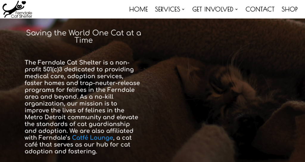
Now look at the homepage from another nonprofit organization—Ferndale Cat Shelter website (Figure 6). Take a close look at the main image from their homepage and think about what underlying message the image is trying to convey and which emotions is it trying to evoke.

In Figure 6, you see the image of a cat looking sleepy and content against a brown blanket. Due to the darker or shadowed nature of the photo it makes the viewer struggle to connect a message to the image and can make it difficult to feel a particular emotion towards the felines at the shelter. While you might have difficulty seeing the cat, the overall monochromatic use of brown and tan presents a stable, comfortable, or safe space for rescued cats. With a different image or use different colors or tones to make the subject of the photo stand out this non-profit could have made a stronger visual image to project their message and persuade the audience to offer their monetary support.
On Brand Images
“What can brown do for you?” That’s the retired slogan United Parcel Service (UPS) used to show its customers that their company can solve client’s shipping problems. The current slogan, “We (heart) logistics,” similar to the “What brown can do for you?” slogan still needs something more doesn’t it? In fact, it requires visual media to support their message.
On the homepage of UPS United Sates’ website (Figure 7), the top of the page is headed with their logo and that trademark UPS brown. The image they’ve chosen is a clean and simple photo of two people in a “small business” situation. One is reviewing the contents of a box, perhaps getting some items ready to ship. The other is at the computer, perhaps checking shipping rates right here on the UPS website. The composition of the photo is a complimentary brown, with stand-out colors in the subjects’ clothing that match UPS’s secondary color palette. The background of the photo suggests a small business, but it’s out of focus so your attention is drawn to the two individuals and their activities.

This could be considered a successful representation of the UPS brand. The image suggests that UPS is supporting the work of a small business. The image is composed of all the right colors so it’s not distracting and supports the overall brand idea. This image is saying, “This is what brown can do for you.”
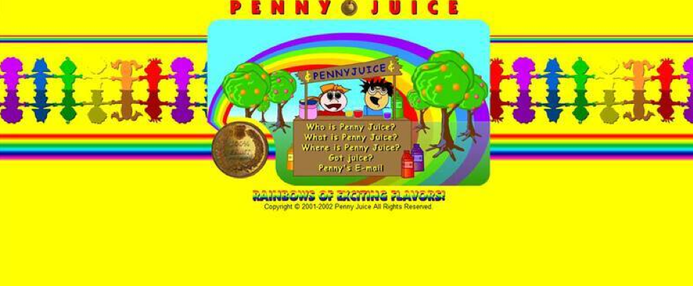
On the other hand, take a look at a website for a children’s juice manufacturer Penny Juice (Figure 8). Upon first impression this homepage does not convey any clear message about its brand promise or what the company stands for:

In fact, the cartoon figures and garish use of colors might lead the audience to have a difficult time identifying the product. As a viewer you might have ideas or suggestions for how to convey the message of “We sell juice for kids!” in a more effective manner. Possibly a cartoon of a smiling child drinking a sippy cup full of juice or images of fruit would be a better hint. This current visual does not efficiently communicate brand.
When you measure your images against the visual media standards we put in place in section one of this module, you increase the chance that your message will be effective.
- Desmarais, Ellen. "Make Your Content Engagement Skyrocket." Contently. 21 Mar 2018. Web. 28 Jun 2018. ↵
- Images Overview. Authored by: Freedom Learning Group. Provided by: Lumen Learning. License: CC BY: Attribution
- Screenshot Apple iPhone X. Provided by: Lumen Learning. License: CC BY: Attribution
- Screenshot Swappa home page. Provided by: Lumen Learning. License: CC BY: Attribution
- Screenshot Fiat Chrysler home page. Provided by: Lumen Learning. License: CC BY: Attribution
- Screenshot Arngen.net home page. Provided by: Lumen Learning. License: CC BY: Attribution
- Screenshot UNICEF home page. Provided by: Lumen Learning. License: CC BY: Attribution
- Screenshot Ferndale Cat Shelter home page. Provided by: Lumen Learning. License: CC BY: Attribution
- Screenshot United Parcel Service home page. Provided by: Lumen Learning. License: CC BY: Attribution
- Screenshot Penny Juice website. Provided by: Lumen Learning. License: CC BY: Attribution


