5.14: Increasing Impact with Media
- Page ID
- 46160
\( \newcommand{\vecs}[1]{\overset { \scriptstyle \rightharpoonup} {\mathbf{#1}} } \)
\( \newcommand{\vecd}[1]{\overset{-\!-\!\rightharpoonup}{\vphantom{a}\smash {#1}}} \)
\( \newcommand{\id}{\mathrm{id}}\) \( \newcommand{\Span}{\mathrm{span}}\)
( \newcommand{\kernel}{\mathrm{null}\,}\) \( \newcommand{\range}{\mathrm{range}\,}\)
\( \newcommand{\RealPart}{\mathrm{Re}}\) \( \newcommand{\ImaginaryPart}{\mathrm{Im}}\)
\( \newcommand{\Argument}{\mathrm{Arg}}\) \( \newcommand{\norm}[1]{\| #1 \|}\)
\( \newcommand{\inner}[2]{\langle #1, #2 \rangle}\)
\( \newcommand{\Span}{\mathrm{span}}\)
\( \newcommand{\id}{\mathrm{id}}\)
\( \newcommand{\Span}{\mathrm{span}}\)
\( \newcommand{\kernel}{\mathrm{null}\,}\)
\( \newcommand{\range}{\mathrm{range}\,}\)
\( \newcommand{\RealPart}{\mathrm{Re}}\)
\( \newcommand{\ImaginaryPart}{\mathrm{Im}}\)
\( \newcommand{\Argument}{\mathrm{Arg}}\)
\( \newcommand{\norm}[1]{\| #1 \|}\)
\( \newcommand{\inner}[2]{\langle #1, #2 \rangle}\)
\( \newcommand{\Span}{\mathrm{span}}\) \( \newcommand{\AA}{\unicode[.8,0]{x212B}}\)
\( \newcommand{\vectorA}[1]{\vec{#1}} % arrow\)
\( \newcommand{\vectorAt}[1]{\vec{\text{#1}}} % arrow\)
\( \newcommand{\vectorB}[1]{\overset { \scriptstyle \rightharpoonup} {\mathbf{#1}} } \)
\( \newcommand{\vectorC}[1]{\textbf{#1}} \)
\( \newcommand{\vectorD}[1]{\overrightarrow{#1}} \)
\( \newcommand{\vectorDt}[1]{\overrightarrow{\text{#1}}} \)
\( \newcommand{\vectE}[1]{\overset{-\!-\!\rightharpoonup}{\vphantom{a}\smash{\mathbf {#1}}}} \)
\( \newcommand{\vecs}[1]{\overset { \scriptstyle \rightharpoonup} {\mathbf{#1}} } \)
\( \newcommand{\vecd}[1]{\overset{-\!-\!\rightharpoonup}{\vphantom{a}\smash {#1}}} \)
\(\newcommand{\avec}{\mathbf a}\) \(\newcommand{\bvec}{\mathbf b}\) \(\newcommand{\cvec}{\mathbf c}\) \(\newcommand{\dvec}{\mathbf d}\) \(\newcommand{\dtil}{\widetilde{\mathbf d}}\) \(\newcommand{\evec}{\mathbf e}\) \(\newcommand{\fvec}{\mathbf f}\) \(\newcommand{\nvec}{\mathbf n}\) \(\newcommand{\pvec}{\mathbf p}\) \(\newcommand{\qvec}{\mathbf q}\) \(\newcommand{\svec}{\mathbf s}\) \(\newcommand{\tvec}{\mathbf t}\) \(\newcommand{\uvec}{\mathbf u}\) \(\newcommand{\vvec}{\mathbf v}\) \(\newcommand{\wvec}{\mathbf w}\) \(\newcommand{\xvec}{\mathbf x}\) \(\newcommand{\yvec}{\mathbf y}\) \(\newcommand{\zvec}{\mathbf z}\) \(\newcommand{\rvec}{\mathbf r}\) \(\newcommand{\mvec}{\mathbf m}\) \(\newcommand{\zerovec}{\mathbf 0}\) \(\newcommand{\onevec}{\mathbf 1}\) \(\newcommand{\real}{\mathbb R}\) \(\newcommand{\twovec}[2]{\left[\begin{array}{r}#1 \\ #2 \end{array}\right]}\) \(\newcommand{\ctwovec}[2]{\left[\begin{array}{c}#1 \\ #2 \end{array}\right]}\) \(\newcommand{\threevec}[3]{\left[\begin{array}{r}#1 \\ #2 \\ #3 \end{array}\right]}\) \(\newcommand{\cthreevec}[3]{\left[\begin{array}{c}#1 \\ #2 \\ #3 \end{array}\right]}\) \(\newcommand{\fourvec}[4]{\left[\begin{array}{r}#1 \\ #2 \\ #3 \\ #4 \end{array}\right]}\) \(\newcommand{\cfourvec}[4]{\left[\begin{array}{c}#1 \\ #2 \\ #3 \\ #4 \end{array}\right]}\) \(\newcommand{\fivevec}[5]{\left[\begin{array}{r}#1 \\ #2 \\ #3 \\ #4 \\ #5 \\ \end{array}\right]}\) \(\newcommand{\cfivevec}[5]{\left[\begin{array}{c}#1 \\ #2 \\ #3 \\ #4 \\ #5 \\ \end{array}\right]}\) \(\newcommand{\mattwo}[4]{\left[\begin{array}{rr}#1 \amp #2 \\ #3 \amp #4 \\ \end{array}\right]}\) \(\newcommand{\laspan}[1]{\text{Span}\{#1\}}\) \(\newcommand{\bcal}{\cal B}\) \(\newcommand{\ccal}{\cal C}\) \(\newcommand{\scal}{\cal S}\) \(\newcommand{\wcal}{\cal W}\) \(\newcommand{\ecal}{\cal E}\) \(\newcommand{\coords}[2]{\left\{#1\right\}_{#2}}\) \(\newcommand{\gray}[1]{\color{gray}{#1}}\) \(\newcommand{\lgray}[1]{\color{lightgray}{#1}}\) \(\newcommand{\rank}{\operatorname{rank}}\) \(\newcommand{\row}{\text{Row}}\) \(\newcommand{\col}{\text{Col}}\) \(\renewcommand{\row}{\text{Row}}\) \(\newcommand{\nul}{\text{Nul}}\) \(\newcommand{\var}{\text{Var}}\) \(\newcommand{\corr}{\text{corr}}\) \(\newcommand{\len}[1]{\left|#1\right|}\) \(\newcommand{\bbar}{\overline{\bvec}}\) \(\newcommand{\bhat}{\widehat{\bvec}}\) \(\newcommand{\bperp}{\bvec^\perp}\) \(\newcommand{\xhat}{\widehat{\xvec}}\) \(\newcommand{\vhat}{\widehat{\vvec}}\) \(\newcommand{\uhat}{\widehat{\uvec}}\) \(\newcommand{\what}{\widehat{\wvec}}\) \(\newcommand{\Sighat}{\widehat{\Sigma}}\) \(\newcommand{\lt}{<}\) \(\newcommand{\gt}{>}\) \(\newcommand{\amp}{&}\) \(\definecolor{fillinmathshade}{gray}{0.9}\)Learning Outcome
- Identify effective use of visual media in presentations, documents, spreadsheets, and messages
Speakers don’t need visual media to make a point. Just watch any stand-up comedian, and you’ll see that an engaging message can be delivered with nothing but a good story and a funny punchline.
Still, Microsoft PowerPoint and Apple Keynote offer speakers the opportunity to reinforce their messages visually, and, done right, this can have a powerful impact. Still, often, PowerPoint presentations are not done as well as they could be. We’ll learn more about making effective slide decks in Module 8: Developing and Delivering Business Presentations.
The PowerPoint Myth
If you Google “PowerPoint bad,” you get over ninety million results. It’s been fashionable for a while to bash presentation software—especially PowerPoint—as stultifying or boring. But as anyone who’s seen the classroom scene in Ferris Bueller’s Day Off knows, bad presentations didn’t start with PowerPoint.
If you try to pound a nail in with the claw side of a hammer—or worse yet, with the handle of a screwdriver—do you blame the tool? No, of course not. Blaming PowerPoint for dull presentations and even duller presenters doesn’t get at the core issue. Even when the software could practically construct the presentation for you, you still need to focus on the best ways to present your message to your audience in the most effective way possible, including relevant visuals as needed.
There are a few key things to remember when creating visuals that you’re going to use to present to an audience. If you work on formulating satisfying answers and goals, your presentation should be effective and persuasive.
Everything we’ve discussed up to now about audience analysis and honing your message applies to the process of creating visuals for your spoken presentations. In addition, you will want to keep two other key points in mind:
- Unlike the exchange between audience and recipient that happens with an email or report, presentations happen in real time, so you want to be respectful of your audience’s time and not waste it.
- The best thing that can be said about a business presentation is that it was effective and helped everyone in the room do their work. If after the presentation, people are talking about how gorgeous your slides are or how funny you were, rather than about the topic of your presentation, you might not have been focused on the important aspects of your task.
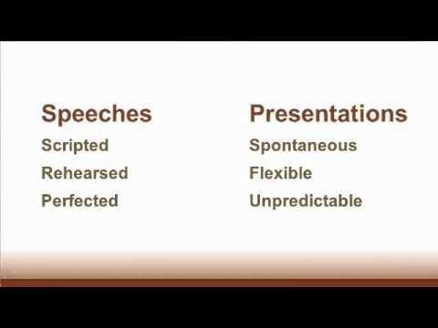
One more critical question to ask yourself is this: are you delivering a speech or giving a business presentation?
If you are giving a speech—where you expect no back-and-forth conversation with your audience—then you probably don’t need visuals at all. Obviously, if you’re giving a speech about the details of an ancient Roman sculpture, it helps to show a picture, but speeches are scripted and rehearsed, so you don’t absolutely need words or images on your screen for you or for your audience. We’ll talk more about speeches in Module 7: Public Speaking.
If you are giving a business presentation, you might need visuals to help both you and your audience stay on track. There are a few rules for this that we can sketch out here, so you’ll be prepared for Module 8.
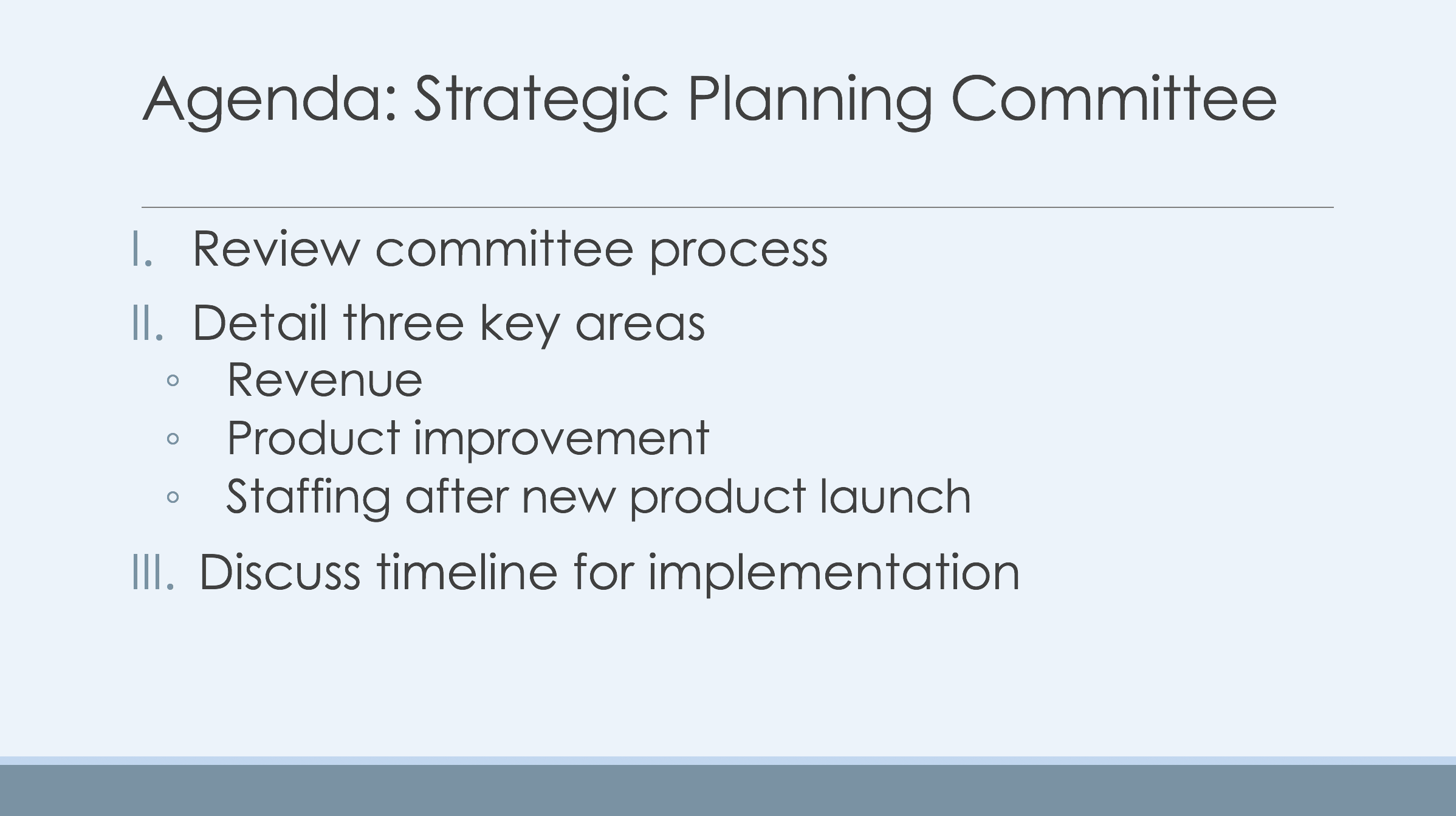
- A brief agenda slide lets the audience know you have a plan in mind. Give them a sense of the big chunks of information you’re going to cover so they trust you with their time and believe you know what you’re talking about. Deliver the agenda quickly and resist the temptation to elaborate on it. That’s what the rest of your presentation is for. Delivering a slide like the one below should take no more than thirty seconds.

- Using images to convey your message can be really effective, especially if the images apply to your content, such as charts, graphs, and pictures of products or displays. Keep in mind that . . .
- Simple is good. If you need to present only a few data points from a graph that has several, delete or gray out the ones you don’t need in order to help your audience focus on what’s important.
- Pictures should be well-edited and as sharp as possible. If you need to show a detail from a larger picture, edit down to the detail you need and show that. Your audience will mentally check-out if they can’t see or follow what you’re talking about.
- A descriptive slide title helps remind your audience of what they’re looking at. If an audience member zones out while you introduce the slide, without a slide title, they’ll be lost when they come back into focus.
- Pictures are great for eliciting emotion if that’s what you want to do. A discussion of how good customer service changed the life of one of your customers is expected to get an emotional response, so use pictures of the customer, of their letter to management, or other images that will get at the emotion you want to generate. However, when you’re simply presenting a quarterly earnings report, emotion-generating pictures will be perceived as confusing or manipulative. This doesn’t mean you can’t have strong feelings about a strong quarter. It just means that the feeling will come through in how you deliver your message rather than through pictures.
- Your slides are for you as well as for your audience. This means that they should help you stay on track and remind you of what you want to say. Therefore,
- Ignore those who say you shouldn’t read your slides. The words you put on a slide should be so brief that your audience doesn’t even notice you’re reading them. Rather, what’s on the slide will remind you of what you want to talk about in detail. As soon as you turn away from the slide and re-engage with your audience to elaborate on your point, they will be there with you—focused and learning. Watch the video following this list for a good explanation of how to read what’s on your slides without losing your audience.
- Putting on your slides the few words you need to stay on track eliminates the need for notes. More than anything, notes get in the way of engaging with your audience and staying on track. Presenters who use notes tend to either get mesmerized by them (especially if they’re on a small screen like a laptop or tablet) or they try to toggle between their notes and their audience, which is at best an awkward kind of yo-yoing act that steals focus from the point you’re trying to make.
- Remember, there is no award given for the longest presentation given with the fewest slides. It is loads better to make more slides with less on each of them. It helps you stay on track, and it gives your audience something new to focus on more frequently.
Remember the visual media standards when choosing your supporting images, charts, and video. Images should be very simple and clear, they should still be uniform, and they should support your company’s brand and be relevant to the points the speaker is trying to make. Most importantly, they should be effective and persuasive. There’s no better way to educate and persuade your audience than to be right in front of them.
If you are going to include images in a file to be sent electronically—a Word doc, a PowerPoint, or even an email—there are a few things to keep in mind. First of all, image files can be so large that they slow down the speed at which your document downloads and/or opens. This can be really annoying for your recipient, especially if they’re working on a phone or tablet and using up their data allowance. Sometimes, these files won’t even arrive because the system can’t handle them. There is a lot of information online about how to reduce image file sizes. Also keep in mind that if your recipient is reading your report or message on a small screen like a tablet or phone, the actual photo dimensions matter. In Module 8: Developing and Delivering Business Presentations, you can find information on how to resize images. Finally, since images can cause some technical trouble, include them in your documents only if they are necessary to support the points you are making. If they’re merely decorative, delete.
Practice Question
- Meaningful Visual Aids. Authored by: Freedom Learning Group. Provided by: Lumen Learning. License: CC BY: Attribution


