15: Brochures, Flyers, and Posters
- Page ID
- 109708
\( \newcommand{\vecs}[1]{\overset { \scriptstyle \rightharpoonup} {\mathbf{#1}} } \)
\( \newcommand{\vecd}[1]{\overset{-\!-\!\rightharpoonup}{\vphantom{a}\smash {#1}}} \)
\( \newcommand{\dsum}{\displaystyle\sum\limits} \)
\( \newcommand{\dint}{\displaystyle\int\limits} \)
\( \newcommand{\dlim}{\displaystyle\lim\limits} \)
\( \newcommand{\id}{\mathrm{id}}\) \( \newcommand{\Span}{\mathrm{span}}\)
( \newcommand{\kernel}{\mathrm{null}\,}\) \( \newcommand{\range}{\mathrm{range}\,}\)
\( \newcommand{\RealPart}{\mathrm{Re}}\) \( \newcommand{\ImaginaryPart}{\mathrm{Im}}\)
\( \newcommand{\Argument}{\mathrm{Arg}}\) \( \newcommand{\norm}[1]{\| #1 \|}\)
\( \newcommand{\inner}[2]{\langle #1, #2 \rangle}\)
\( \newcommand{\Span}{\mathrm{span}}\)
\( \newcommand{\id}{\mathrm{id}}\)
\( \newcommand{\Span}{\mathrm{span}}\)
\( \newcommand{\kernel}{\mathrm{null}\,}\)
\( \newcommand{\range}{\mathrm{range}\,}\)
\( \newcommand{\RealPart}{\mathrm{Re}}\)
\( \newcommand{\ImaginaryPart}{\mathrm{Im}}\)
\( \newcommand{\Argument}{\mathrm{Arg}}\)
\( \newcommand{\norm}[1]{\| #1 \|}\)
\( \newcommand{\inner}[2]{\langle #1, #2 \rangle}\)
\( \newcommand{\Span}{\mathrm{span}}\) \( \newcommand{\AA}{\unicode[.8,0]{x212B}}\)
\( \newcommand{\vectorA}[1]{\vec{#1}} % arrow\)
\( \newcommand{\vectorAt}[1]{\vec{\text{#1}}} % arrow\)
\( \newcommand{\vectorB}[1]{\overset { \scriptstyle \rightharpoonup} {\mathbf{#1}} } \)
\( \newcommand{\vectorC}[1]{\textbf{#1}} \)
\( \newcommand{\vectorD}[1]{\overrightarrow{#1}} \)
\( \newcommand{\vectorDt}[1]{\overrightarrow{\text{#1}}} \)
\( \newcommand{\vectE}[1]{\overset{-\!-\!\rightharpoonup}{\vphantom{a}\smash{\mathbf {#1}}}} \)
\( \newcommand{\vecs}[1]{\overset { \scriptstyle \rightharpoonup} {\mathbf{#1}} } \)
\(\newcommand{\longvect}{\overrightarrow}\)
\( \newcommand{\vecd}[1]{\overset{-\!-\!\rightharpoonup}{\vphantom{a}\smash {#1}}} \)
\(\newcommand{\avec}{\mathbf a}\) \(\newcommand{\bvec}{\mathbf b}\) \(\newcommand{\cvec}{\mathbf c}\) \(\newcommand{\dvec}{\mathbf d}\) \(\newcommand{\dtil}{\widetilde{\mathbf d}}\) \(\newcommand{\evec}{\mathbf e}\) \(\newcommand{\fvec}{\mathbf f}\) \(\newcommand{\nvec}{\mathbf n}\) \(\newcommand{\pvec}{\mathbf p}\) \(\newcommand{\qvec}{\mathbf q}\) \(\newcommand{\svec}{\mathbf s}\) \(\newcommand{\tvec}{\mathbf t}\) \(\newcommand{\uvec}{\mathbf u}\) \(\newcommand{\vvec}{\mathbf v}\) \(\newcommand{\wvec}{\mathbf w}\) \(\newcommand{\xvec}{\mathbf x}\) \(\newcommand{\yvec}{\mathbf y}\) \(\newcommand{\zvec}{\mathbf z}\) \(\newcommand{\rvec}{\mathbf r}\) \(\newcommand{\mvec}{\mathbf m}\) \(\newcommand{\zerovec}{\mathbf 0}\) \(\newcommand{\onevec}{\mathbf 1}\) \(\newcommand{\real}{\mathbb R}\) \(\newcommand{\twovec}[2]{\left[\begin{array}{r}#1 \\ #2 \end{array}\right]}\) \(\newcommand{\ctwovec}[2]{\left[\begin{array}{c}#1 \\ #2 \end{array}\right]}\) \(\newcommand{\threevec}[3]{\left[\begin{array}{r}#1 \\ #2 \\ #3 \end{array}\right]}\) \(\newcommand{\cthreevec}[3]{\left[\begin{array}{c}#1 \\ #2 \\ #3 \end{array}\right]}\) \(\newcommand{\fourvec}[4]{\left[\begin{array}{r}#1 \\ #2 \\ #3 \\ #4 \end{array}\right]}\) \(\newcommand{\cfourvec}[4]{\left[\begin{array}{c}#1 \\ #2 \\ #3 \\ #4 \end{array}\right]}\) \(\newcommand{\fivevec}[5]{\left[\begin{array}{r}#1 \\ #2 \\ #3 \\ #4 \\ #5 \\ \end{array}\right]}\) \(\newcommand{\cfivevec}[5]{\left[\begin{array}{c}#1 \\ #2 \\ #3 \\ #4 \\ #5 \\ \end{array}\right]}\) \(\newcommand{\mattwo}[4]{\left[\begin{array}{rr}#1 \amp #2 \\ #3 \amp #4 \\ \end{array}\right]}\) \(\newcommand{\laspan}[1]{\text{Span}\{#1\}}\) \(\newcommand{\bcal}{\cal B}\) \(\newcommand{\ccal}{\cal C}\) \(\newcommand{\scal}{\cal S}\) \(\newcommand{\wcal}{\cal W}\) \(\newcommand{\ecal}{\cal E}\) \(\newcommand{\coords}[2]{\left\{#1\right\}_{#2}}\) \(\newcommand{\gray}[1]{\color{gray}{#1}}\) \(\newcommand{\lgray}[1]{\color{lightgray}{#1}}\) \(\newcommand{\rank}{\operatorname{rank}}\) \(\newcommand{\row}{\text{Row}}\) \(\newcommand{\col}{\text{Col}}\) \(\renewcommand{\row}{\text{Row}}\) \(\newcommand{\nul}{\text{Nul}}\) \(\newcommand{\var}{\text{Var}}\) \(\newcommand{\corr}{\text{corr}}\) \(\newcommand{\len}[1]{\left|#1\right|}\) \(\newcommand{\bbar}{\overline{\bvec}}\) \(\newcommand{\bhat}{\widehat{\bvec}}\) \(\newcommand{\bperp}{\bvec^\perp}\) \(\newcommand{\xhat}{\widehat{\xvec}}\) \(\newcommand{\vhat}{\widehat{\vvec}}\) \(\newcommand{\uhat}{\widehat{\uvec}}\) \(\newcommand{\what}{\widehat{\wvec}}\) \(\newcommand{\Sighat}{\widehat{\Sigma}}\) \(\newcommand{\lt}{<}\) \(\newcommand{\gt}{>}\) \(\newcommand{\amp}{&}\) \(\definecolor{fillinmathshade}{gray}{0.9}\)Chapter Objectives
The purpose of this chapter is to:
- Understand appropriate uses for different types of marketing materials
- Understand formatting differences between brochures, flyers, and posters
- Apply basic design principles when creating brochures, flyers, and posters
Marketing materials like brochures, flyers, and posters allow companies to communicate with a wide audience in a way that is more visually engaging than an email or a letter. In order to reach their target audience, these documents need to be eye-catching, as they are often displayed in public places where they will have to compete for attention. Though it sometimes seems as though these pieces of paper are everywhere, brochures, flyers, and posters can be marketing tools that are both affordable and effective when designed well.
Types of Marketing Materials
Brochures
A brochure, sometimes referred to as a pamphlet, is an informational tool mainly used for advertising. A brochure is a single piece of paper that can be folded in a variety of ways, with summary information regarding an organization, company, product, or service printed on either side of it. The most common type of brochure is a tri-fold brochure, which utilizes a sheet of 8.5” x 11” paper, printed front and back in landscape orientation, to create 6 vertical panels that can be filled with text and images.
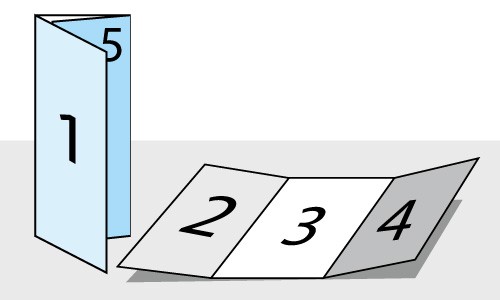
While there are many ways to fold a single piece of paper to create a pamphlet, most tri-fold brochures are created as shown in the figure below:

Figure 1: A tri-fold brochure layout with numbered panels. Source: PrintPlace.
When designing your brochure, it is important to plan what content will be placed in which column. The most common approach follows the structure below:
- Panel 1: This will be the front cover of the folded brochure. The panel should include an image and clearly identify the business. If the company has a logo, this may appear on the cover as well, along with a slogan or other brief phrasing that announces the subject of the brochure.
- Panel 2: This panel is inside front cover. Text in this column should introduce the reader to the company and the product or service being advertised.
- Panels 3 & 4: These two sections complete the interior of the brochure, and provide further details about the company, product, or service.
- Panel 5: This outside flap can be used in a variety of ways depending on what the brochure is promoting. Since this is the easiest flap to detach from the rest of the brochure, tools like coupons or interest forms can be placed here. Customer testimonials or inspirational quotes can be found in this location as well, depending on the purpose of the brochure.
- Panel 6: This is the back cover of the brochure. This space is generally used for contact info, sometimes including a picture of the location (if advertising a store) or occasionally a map to make finding the location easier. The back cover can also be formatted like the outside of an envelope if the brochure is going to be placed in the mail.
When writing text for a brochure, remember to include only that which is absolutely necessary since the narrow columns can get crowded very quickly. Balancing text with images and using tools like headers and bullet points will also make the content easier to read.
Many software packages now come equipped with tri-fold brochure templates to make the design process easier, and there are numerous websites with more advanced design ideas from which to draw inspiration. Some helpful web resources include:
Flyers
Flyers are single-page advertisements that can be easily printed and distributed throughout the community. They are frequently used to announce store openings, going out of business sales, or fundraisers within a smaller geographic area. Whether they are being handed out on a street corner, displayed on a counter at a local store, pinned to a bulletin board or tucked under windshield wipers in a parking lot, the goal is to reach a large number of people in a fast and affordable way. While flyers may have images, they tend to be simple; usually, a single photograph or a bit of clip art will do, as in the example below:
Figure 2: Sample flyer made using word processing software. (CC BY 2021; Heather Katzoff)
Posters
Like a flyer, a poster is a single piece of paper that is posted all over the community to draw in the attention of the public while providing information about a particular topic. However, posters are often larger and tend to be more visually striking, and include eye-catching images and designs, bright colors, and various text fonts and sizes. They might be for local businesses or events, but can also be used as part of larger national or international campaigns. Advertising posters may promote an event, a new product, or a new company or organization, while informative posters are used to educate and influence individuals about a specific topic, raising awareness to local, national, or international problems and to inform people of campaigns happening to contribute to causes.
Figure 3: Sample poster for a local event made using a Word template. (CC BY 2021; Heather Katzoff)
Whether you are creating a flyer or a poster, a number of common design principles apply:
- Focus on a single message. Flyers and posters have a limited amount of visual space to communicate with, so the message needs to be focused. Be specific: what single product or event are you trying to advertise or promote?
- Create a striking headline. Writing a headline that gets people to respond to your advertisement requires a clear sense of your audience. Think about who you are writing for and what they would want to know most. Gideon Wagas of Pugo Designs offers this example: "Instead of saying that you are offering a new back pain relief cream, you can place “Say goodbye to back pains!” in your headline." This keeps the focus on what the reader can gain, which makes them more likely to take action.
- Select legible fonts. Poster design utilizes a wider variety of fonts in order to catch the attention of readers, but the fonts selected still need to be easy to read at a distance. Highly decorative fonts should be avoided, as should colors that blend in with the background of the poster.
- Choose images carefully. Whether using a photograph or an illustration, be sure that the image is clear and has a reason to be there. Also, in a poster, quality is better than quantity. A single, clear visual will focus the reader's attention better than many smaller images.
- Include contact information. Though it will generally be in a smaller font and placed in a less-prominent position on the poster, make sure to include your company's name, address, phone numbers, and website. If your company has a social media presence, including logos or links for those pages has become an increasingly common practice.
Design Considerations
Typography
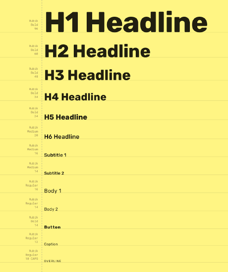
Whether creating brochures, flyers, or posters, it is important to use font styles and sizes consistently throughout the document. Creating a typescale, like the one shown below for the Owl educational app, can help ensure that your font sizes communicate the hierarchy of information clearly.

Figure 4: Example of a typescale created for the Owl app. Source: Material Design.
The Owl example utilizes a single font, Rubik, but variations in size and line thickness create differentiation between the various header and body levels. In a brochure, since the text is usually limited by the width of the columns, body text is commonly around 11 or 12 point fonts, with headlines scaling up as large as 16 or 22 point and captions as small as 8 or 10 point. Posters and flyers have more space, so headline sizes may get as large as 72 or 96 point font, depending on how much text you have. Sub-headers and body fonts should be scaled down from there, but will generally be larger than they would be on a brochure.
Multiple fonts can be used together, but care must be taken when selecting two fonts for a single document. Experimenting with different font combinations can be part of the fun of page design, but you can also use tools available online, like Fontjoy.com, to suggest pairings that are sure to work. Whether you use a single font throughout your document or opt to employ a feature font for major headings and a second for body text, make sure that the fonts you choose are easy to read at a realistic distance for your design. Remember, brochures are read just inches from a person's face while a poster generally needs to grab the viewer's attention from much further away.
Image Selection
Visual elements are always advisable when designing marketing materials. While the instinct may be to pack your documents with as much written information possible, as the saying goes, a picture really can be worth a thousand words. However, too much imagery can also have its drawbacks. Visual clutter can detract from your message just as too much text can, so select only the best images to use in your designs. Think quality, not quantity.
Any photographs you use should be in focus. If there are people in your pictures, pay attention to the position of their bodies and the direction of their gaze; you want their faces pointing to the same place you want your viewer's eyes to look. Positioning a picture with a person looking out at your margin draws the viewer's gaze out of the design and away from the information you're trying to communicate. Simply flipping a picture with a horizontal flip tool (a feature of almost all photo-editing software) can solve this problem. Using a crop tool can also remove any distracting elements at the edge of your photographs.
In brochures, having a single, strong image on the cover that grab's the readers attention is always a good idea. Within the body of the brochure, use images sparingly to break up large bodies of text rather than stacking multiple images on top of each other. For posters, a single image is more frequently employed, usually occupying the entire canvas of the design. Text can then superimposed on the image. Sometimes the opacity of the image is also reduced to make the text easier to read (as seen in the poster in Figure 3 above.)
Color
Just as the fonts and images we use for our designs need careful consideration, the colors we choose for our designs also require scrutiny. Color can be employed as a background for your design, but it can also be used for text, lines, or other graphic elements. Selecting the right colors is an art, one that requires you to know a bit about how colors work together and what they mean to people out in the world.
Different colors can communicate a range of moods and an emotions, so the colors you select should communicate a feeling that is consistent with the written content of your brochure, flyer, or poster.
According to graphic designer Cameron Chapman, some common color associations include:
- Red: Passion, Love, Anger
- Orange: Energy, Happiness, Vitality
- Yellow: Happiness, Hope, Deceit
- Green: New Beginnings, Abundance, Nature
- Blue: Calm, Responsible, Sadness
- Purple: Creativity, Royalty, Wealth
- Black: Mystery, Elegance, Evil
- Gray: Moody, Conservative, Formality
- White: Purity, Cleanliness, Virtue
- Brown: Nature, Wholesomeness, Dependability
- Tan or Beige: Conservative, Piety, Dull
- Cream or Ivory: Calm, Elegant, Purity
While these associations are very common, keep in mind that they are notuniversal, and different cultures may have different reactions to colors than you do. Also keep in mind that sometimes, especially if you are creating marketing materials for an established company, you may have to work with the color palette already in use by the company, one that coordinates with their logo and existing brand image.
If you do get to choose the colors for a design, make sure that the colors you choose work together. Selecting colors that are analogous, complementary, or triads on the color wheel can help unify your design and narrow your color choices to ones that will visually work best together. Using a tool like Adobe Color allows you to experiment with various groupings from the color wheel and create the most attractive grouping for your project. Finally, just as with text and images, less really is more. Just because you can make every element of your design a different color doesn't mean that you should.
Space
A final design consideration is one that is often overlooked: space. Also referred to as negative space, this is the absence of other design elements or the space between objects on the page. A common document design flaw is crowding the page with too much text and too many visual elements, sometimes making it difficult to understand the message being communicated. Good design has space that is intentionally left blank, giving the viewer's eye an opportunity to rest.
When employed correctly, negative space in a design should push the gaze of your viewer to the elements you want them to focus on. If you find that your eye is drawn to the negative space on your layout, then the design probably needs to be reworked. In general, for marketing materials, negative space works best when it's placed closer to the edges of your design and not trapped in the center of your layout.
Review: General Guidelines for Creating Marketing Materials
- Select what type of marketing you are going to create based on how and where it will be used: if you have a lot of details to convey, a brochure will work better than a poster or a flyer; if you need to grab attention from a distance, a poster will be a better option.
- Keep the text to a minimum. Only include essential information, providing contact information for readers if they want more details.
- Break up larger sections of text in brochures by using tools such as headers and bulleted lists.
- Fonts should be legible, and any document should use no more than two different fonts.
- Images should be in in-focus and eye-catching, but don't overcrowd your design with too many of them.
- Colors should be chosen with relevant associations in mind, and used to support the messaging in your document.
All links live as of July 2021.
References
Chapman, C. (2021). Color theory for designers, part 1: The meaning of color. Retrieved from: https://www.smashingmagazine.com/2010/01/color-theory-for-designers-part-1-the-meaning-of-color/
Material Design. (n.d.) Owl typescale. Retrieved from: https://material.io/design/material-...tml#typography
Print Place (n.d.) Layout of a tri-fold brochure. Retrieved from: https://www.printplace.com/articles/layout-of-a-trifold-brochure
Wagas, G. (2019.) How to create an effective flyer for your business. Retrieved from: https://pugodesigns.com/blog/how-to-...your-business/
This work "Brochures, Flyers, and Posters" is a derivative of Writing in Community and Justice Services, Chapter 5: "Brochures, Newsletters and Posters” by Amber Gulbranson, Nancy Jacob, and Haley Sakki. "Brochures, Flyers, and Posters" is licensed under CC BY 4.0 by Heather Katzoff.


