
10.21.2: The IS-LM Model
- Page ID
- 59650
- What are the IS and LM curves?
- What are their characteristics?
- What do we learn when we combine the IS and the LM curves on one graph?
- Why is equilibrium achieved?
- What is the IS-LM model’s biggest drawback?
The Keynesian cross diagram framework is great, as far as it goes. Note that it has nothing to say about interest rates or money, a major shortcoming for us students of money, banking, and monetary policy! It does, however, help us to build a more powerful model that examines equilibrium in the markets for goods and money, the IS (investment-savings) and the LM (liquidity preference–money) curves, respectively (hence the name of the model).
Interest rates are negatively related to I and to NX. The reasoning here is straightforward. When interest rates (i) are high, companies would rather invest in bonds than in physical plant (because fewer projects are positive net present value or +NPV) or inventory (because it has a high opportunity cost), so I (investment) is low. When rates are low, new physical plant and inventories look cheap and many more projects are +NPV (i has come down in the denominator of the present value formula), so I is high. Similarly, when i is low the domestic currency will be weak, all else equal. Exports will be facilitated and imports will decline because foreign goods will look expensive. Thus, NX will be high (exports > imports). When i is high, by contrast, the domestic currency will be in demand and hence strong. That will hurt exports and increase imports, so NX will drop and perhaps become negative (exports < imports).
Now think of Yad on a Keynesian cross diagram. As we saw above, aggregate output will rise as I and NX do. So we know that as i increases, Yad decreases, ceteris paribus. Plotting the interest rate on the vertical axis against aggregate output on the horizontal axis, as below, gives us a downward sloping curve. That’s the IS curve! For each interest rate, it tells us at what point the market for goods (I and NX, get it?) is in equilibrium—holding autonomous consumption, fiscal policy, and other determinants of aggregate demand constant. For all points to the right of the curve, there is an excess supply of goods for that interest rate, which causes firms to decrease inventories, leading to a fall in output toward the curve. For all points to the left of the IS curve, an excess demand for goods persists, which induces firms to increase inventories, leading to increased output toward the curve.
Obviously, the IS curve alone is as insufficient to determine i or Y as demand alone is to determine prices or quantities in the standard supply and demand microeconomic price model. We need another curve, one that slopes the other way, which is to say, upward. That curve is called the LM curve and it represents equilibrium points in the market for money. The demand for money is positively related to income because more income means more transactions and because more income means more assets, and money is one of those assets. So we can immediately plot an upward sloping LM curve, a curve that holds the money supply constant. To the left of the LM curve there is an excess supply of money given the interest rate and the amount of output. That’ll cause people to use their money to buy bonds, thus driving bond prices up, and hence i down to the LM curve. To the right of the LM curve, there is an excess demand for money, inducing people to sell bonds for cash, which drives bond prices down and hence i up to the LM curve.
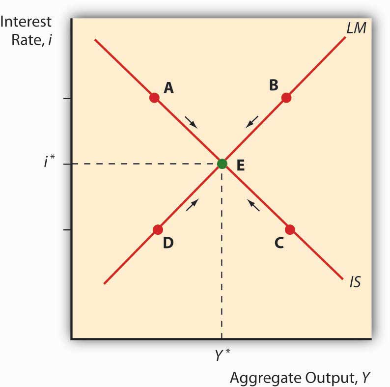
When we put the IS and LM curves on the graph at the same time, as inFigure21.4 "IS-LM diagram: equilibrium in the markets for money and goods", we immediately see that there is only one point, their intersection, where the markets for both goods and money are in equilibrium. Both the interest rate and aggregate output are determined by that intersection. We can then shift the IS and LM curves around to see how they affect interest rates and output, i* and Y*. In the next chapter, we’ll see how policymakers manipulate those curves to increase output. But we still won’t be done because, as mentioned above, the IS-LM model has one major drawback: it works only in the short term or when the price level is otherwise fixed.
Stop and Think Box
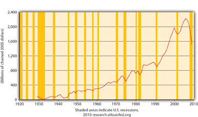
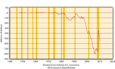
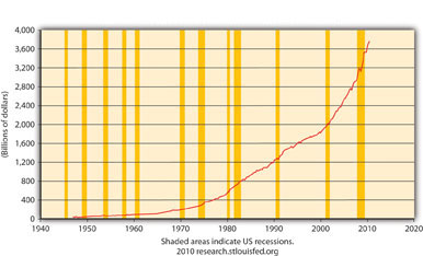
Does Figure 21.5 make sense? Why or why not? What does Figure 21.6 mean? Why is Figure 21.7 not a good representation of G?
Source: U.S. Department of Commerce, Bureua of Economic Analysis
Source: U.S. Department of Commerce, Bureua of Economic Analysis
Source: U.S. Department of Commerce, Bureua of Economic Analysis
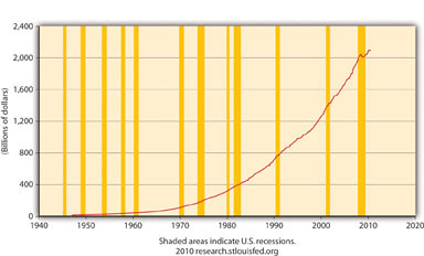
Figure 21.5 makes perfectly good sense because it depicts I in the equation Y = Yad = C + I + G + NX, and the shaded areas represent recessions, that is, decreases in Y. Note that before almost every recession in the twentieth century, I dropped.
Figure 21.6 means that NX in the United States is considerably negative, that exports < imports by a large margin, creating a significant drain on Y (GDP). Note that NX improved (became less negative) during the crisis and resulting recession but dipped downward again during the 2010 recovery.
Figure 21.7 is not a good representation of G because it ignores state and local government expenditures, which are significant in the United States, as Figure 21.8 shows.
Source: U.S. Department of Commerce, Bureua of Economic Analysis
- The IS curve shows the points at which the quantity of goods supplied equals those demanded.
- On a graph with interest (i) on the vertical axis and aggregate output (Y) on the horizontal axis, the IS curve slopes downward because, as the interest rate increases, key components of Y, I and NX, decrease. That is because as i increases, the opportunity cost of holding inventory increases, so inventory levels fall and +NPV projects involving new physical plant become rarer, and I decreases.
- Also, high i means a strong domestic currency, all else constant, which is bad news for exports and good news for imports, which means NX also falls.
- The LM curve traces the equilibrium points for different interest rates where the quantity of money demanded equals the quantity of money supplied.
- It slopes upward because as Y increases, people want to hold more money, thus driving i up.
- The intersection of the IS and LM curves indicates the macroeconomy’s equilibrium interest rate (i*) and output (Y*), the point where the market for goods and the market for money are both in equilibrium.
- At all points to the left of the LM curve, an excess supply of money exists, inducing people to give up money for bonds (to buy bonds), thus driving bond prices up and interest rates down toward equilibrium.
- At all points to the right of the LM curve, an excess demand for money exists, inducing people to give up bonds for money (to sell bonds), thus driving bond prices down and interest rates up toward equilibrium.
- At all points to the left of the IS curve, there is an excess demand for goods, causing inventory levels to fall and inducing companies to increase production, thus leading to an increase in output.
- At all points to the right of the IS curve, there is an excess supply of goods, creating an inventory glut that induces firms to cut back on production, thus decreasing Y toward the equilibrium.
- The IS-LM model’s biggest drawback is that it doesn’t consider changes in the price level, so in most modern situations, it’s applicable in the short run only.