
8.5: Interpreting the AD-AS Model
- Page ID
- 47398
Learning Objectives
- Use the aggregate demand-aggregate supply model to identify the equilibrium level of real GDP and equilibrium price level
- Interpret and draw conclusions about the macro economy using the aggregate demand-aggregate supply model
Equilibrium in the Aggregate Demand–Aggregate Supply Model
Figure 1 combines the AS curve and the AD curve from Figures 1 & 2 on the previous page and places them both on a single diagram. The intersection of the aggregate supply and aggregate demand curves shows the equilibrium level of real GDP and the equilibrium price level in the economy. In this example, the equilibrium point occurs at point E, at a price level of 90 and an output level of 8,800.

Examining the AS-AD MOdel
Table 1 shows information on aggregate supply, aggregate demand, and the price level for the imaginary country of Xurbia. What information does Table 1 tell you about the state of the Xurbia’s economy? Where is the equilibrium price level and output level (this is the SR macroequilibrium)? Is Xurbia risking inflationary pressures or facing high unemployment? How can you tell?
| Price Level | Aggregate Demand | Aggregate Supply |
|---|---|---|
| 110 | $700 | $600 |
| 120 | $690 | $640 |
| 130 | $680 | $680 |
| 140 | $670 | $720 |
| 150 | $660 | $740 |
| 160 | $650 | $760 |
| 170 | $640 | $770 |
To begin to use the AS–AD model, it is important to plot the AS and AD curves from the data provided. What is the equilibrium?
Step 1. Draw your x- and y-axis. Label the x-axis “Real GDP” and the y-axis “Price Level.”
Step 2. Plot AD on your graph.
Step 3. Plot AS on your graph.
Step 4. Look at Figure 2, which provides a visual to aid in your analysis.
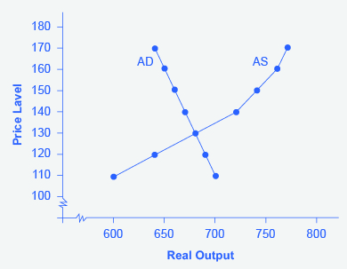
Step 5. Determine where AD and AS intersect. This is the equilibrium with the price level at 130 and real GDP at $680.
Step 6. Look at the graph to determine where equilibrium is located. We can see that this equilibrium is fairly far from where the AS curve becomes near-vertical (or at least quite steep) which seems to start at about $750 of real output. This implies that the economy is not close to potential GDP. Thus, unemployment will be high. In the relatively flat part of the AS curve, where the equilibrium occurs, changes in the price level will not be a major concern, since such changes are likely to be small.
Step 7. Determine what the steep portion of the AS curve indicates. Where the AS curve is steep, the economy is at or close to potential GDP.
Step 8. Draw conclusions from the given information:
- If equilibrium occurs in the flat range of AS, then economy is not close to potential GDP and will be experiencing unemployment, but stable price level.
- If equilibrium occurs in the steep range of AS, then the economy is close or at potential GDP and will be experiencing rising price levels or inflationary pressures, but will have a low unemployment rate.
Confusion sometimes arises between the aggregate supply and aggregate demand model and the microeconomic analysis of demand and supply in particular markets for goods, services, labor, and capital.
ARE AS AND AD MACRO OR MICRO?
These aggregate supply and aggregate demand model and the microeconomic analysis of demand and supply in particular markets for goods, services, labor, and capital have a superficial resemblance, but they also have many underlying differences.
For example, the vertical and horizontal axes have distinctly different meanings in macroeconomic and microeconomic diagrams. The vertical axis of a microeconomic demand and supply diagram expresses a price (or wage or rate of return) for an individual good or service. This price is implicitly relative: it is intended to be compared with the prices of other products (for example, the price of pizza relative to the price of fried chicken). In contrast, the vertical axis of an aggregate supply and aggregate demand diagram expresses the level of a price index like the Consumer Price Index or the GDP deflator—combining a wide array of prices from across the economy. The price level is absolute: it is not intended to be compared to any other prices since it is essentially the average price of all products in an economy. The horizontal axis of a microeconomic supply and demand curve measures the quantity of a particular good or service. In contrast, the horizontal axis of the aggregate demand and aggregate supply diagram measures real GDP, which is the sum of all the final goods and services produced in the economy, not the quantity in a specific market.
In addition, the economic reasons for the shapes of the curves in the macroeconomic model are different from the reasons behind the shapes of the curves in microeconomic models. Demand curves for individual goods or services slope down primarily because of the existence of substitute goods, not the wealth effects, interest rate, and foreign price effects associated with aggregate demand curves. The slopes of individual supply and demand curves can have a variety of different slopes, depending on the extent to which quantity demanded and quantity supplied react to price in that specific market, but the slopes of the AS and AD curves are much the same in every diagram (although as we shall see in later chapters, short-run and long-run perspectives will emphasize different parts of the AS curve).
In short, just because the AS–AD diagram has two lines that cross, do not assume that it is the same as every other diagram where two lines cross. The intuitions and meanings of the macro and micro diagrams are only distant cousins from different branches of the economics family tree.
Try It
These questions allow you to get as much practice as you need, as you can click the link at the top of the first question (“Try another version of these questions”) to get a new set of questions. Practice until you feel comfortable doing the questions.
[ohm_question sameseed=1]152135-152137-152138[/ohm_question]
Contributors and Attributions
- Building a Model of Aggregate Demand and Aggregate Supply. Authored by: OpenStax College. Located at: https://cnx.org/contents/QGHIMgmO@11.12:qPYFpWfb@10/Building-a-Model-of-Aggregate-. License: CC BY: Attribution. License Terms: Download for free at http://cnx.org/contents/4061c832-098...93a2cb31@11.11