
11.14: Modify Charts
- Page ID
- 46606
Learning Objectives
- Modify a chart
PowerPoint provides tools to modify charts in several ways. Most of these options are found in the Change Design tab after selecting a chart or in the buttons that appear to the right of a selected chart. Some of these same options are also available when the chart is selected, and the mouse right clicked. We’ll now go over ways to modify an existing chart in PowerPoint.
Chart Buttons
The three vertical buttons to the right of a chart include chart elements, chart styles, and chart filters. The Chart styles button offers the same modification options as the Chart Styles group in the ribbon and will be described with that group, but the other two offer unique modification opportunities.
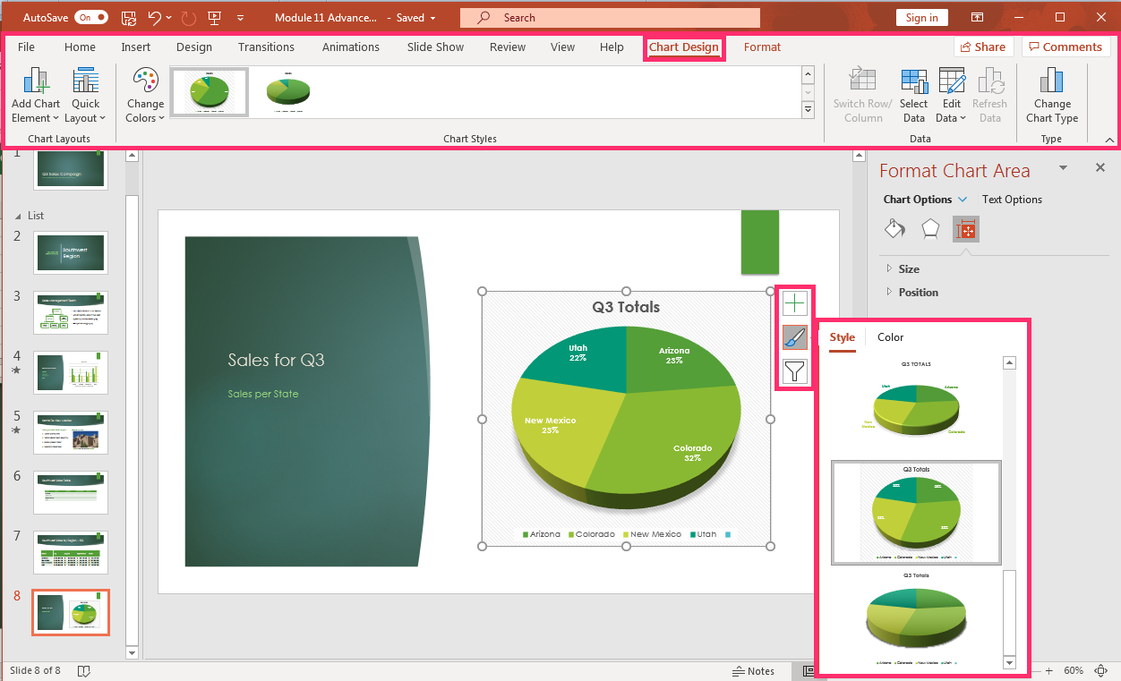
Chart Elements
Here you modify what elements are displayed in a chart. The options are Chart Title, Data Labels and Legend. Uncheck an element to remove it from the chart or select the arrow that appears to reposition a given element in the chart.
For example, to modify the chart legend position on the slide, click the + button, move the cursor to Legend and click the black right arrow that appears. Now move the cursor over each option and select the legend modification desired.

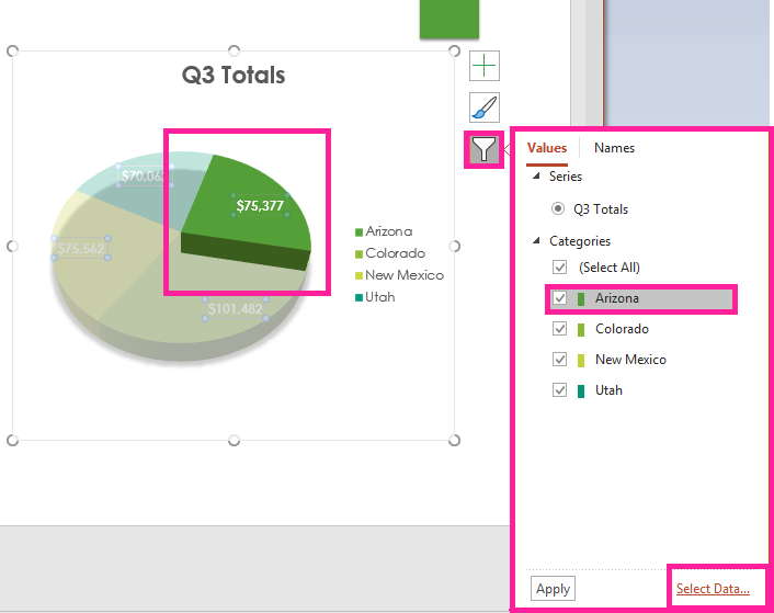
Chart Filters
This element allows modifications of chart sections or how it is labeled. Hovering the cursor over each section brings it forward highlighting which section of the chart is associated with which value. To change the data associated with the chart click the Select Data on the bottom right of the filter dialog box and the table will be opened for data modifications.
Modification Tools
Chart Design tab offers tools for chart modification: chart layouts, chart styles, data, and change chart type. Here is how to modify a chart using these tools.
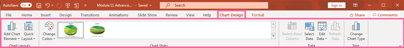
Chart Layouts
This group is like the chart elements button but offers additional options for a chart’s labels, title, and legend. Hover the cursor over each option to see how it changes a chart and select the best one.
- Add Chart Element: Modify the chart layout of labels, title, and legend.
- Quick Layout: Predetermined chart layouts are available for changing a chart.
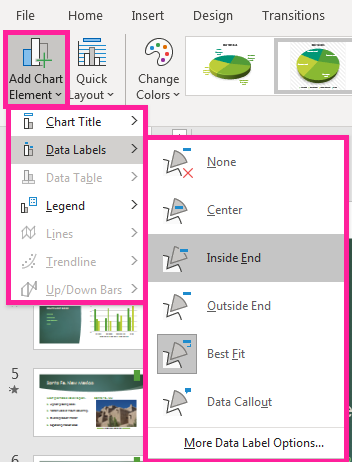
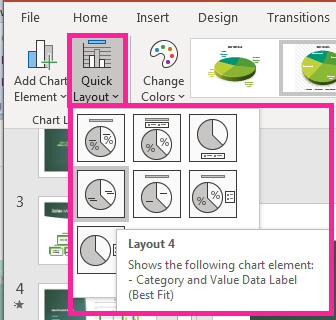
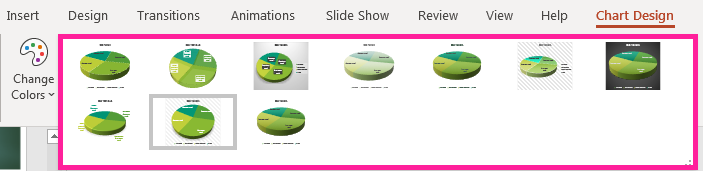
Chart Style
group in the ribbon is where Change Colors or Chart Style can be found to modify a PowerPoint chart. Hover over the various options and select which one to use. In the chart styles option, be sure to click the down arrow to open a window and see all the chart style modification options.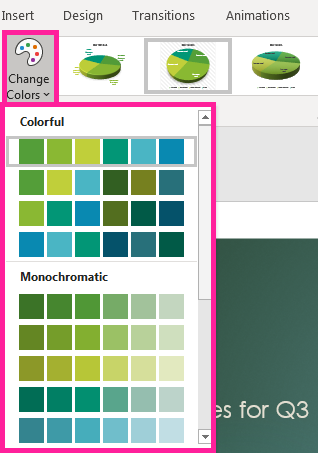
Data
Modifying chart information is one of the most important skills to know. Here are the tools to use to modify a chart’s data.
- Switch Row/Column: This tool is used with a chart plotted on an X and Y axis, but not a pie chart. If chart information needs to be swapped to modify the chart, select this button otherwise it remains grayed out until the data table is open for modification.
- Select Data: If there is a mistake or extra element needing to be deleted from the chart table, use this button to open the data table for a chart. An option to switch rows/columns in the select data source window is also available. Make any changes and they are reflected in the chart automatically.
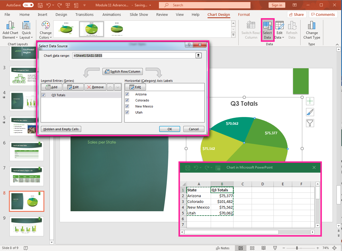
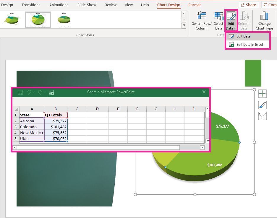
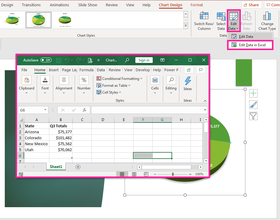
- Edit Data: Opens a data table window to use to modify or delete data. A chart is automatically updated once data is edited. The table can be opened as a regular table or as an Excel table allowing access to the tools in Excel. Another way to edit the data is by selecting the chart, right click with a mouse, and select Edit Data in the menu.
Change Chart Type
After walking through a presentation you may want to change the type of chart on an existing slide, so here is how. Select the chart and click the Change Chart Type button in the Type group. A window opens with a variety of options from which to select. Decide on the new chart type, select and click OK. The new type of chart automatically replaces the previous chart.

Practice Questions
Knowing how to change and modify a chart in PowerPoint allows you to update, edit and eliminate elements in order to make better charts for a presentation. The better you can make charts, the better the presentation information is communication.
Contributors and Attributions
- Modify Charts. Authored by: Sherri Pendleton. Provided by: Lumen Learning. License: CC BY: Attribution