Business LibreTexts

5.4: Captions and Titles

  • Page ID
    46151
  • \( \newcommand{\vecs}[1]{\overset { \scriptstyle \rightharpoonup} {\mathbf{#1}} } \) \( \newcommand{\vecd}[1]{\overset{-\!-\!\rightharpoonup}{\vphantom{a}\smash {#1}}} \)\(\newcommand{\id}{\mathrm{id}}\) \( \newcommand{\Span}{\mathrm{span}}\) \( \newcommand{\kernel}{\mathrm{null}\,}\) \( \newcommand{\range}{\mathrm{range}\,}\) \( \newcommand{\RealPart}{\mathrm{Re}}\) \( \newcommand{\ImaginaryPart}{\mathrm{Im}}\) \( \newcommand{\Argument}{\mathrm{Arg}}\) \( \newcommand{\norm}[1]{\| #1 \|}\) \( \newcommand{\inner}[2]{\langle #1, #2 \rangle}\) \( \newcommand{\Span}{\mathrm{span}}\) \(\newcommand{\id}{\mathrm{id}}\) \( \newcommand{\Span}{\mathrm{span}}\) \( \newcommand{\kernel}{\mathrm{null}\,}\) \( \newcommand{\range}{\mathrm{range}\,}\) \( \newcommand{\RealPart}{\mathrm{Re}}\) \( \newcommand{\ImaginaryPart}{\mathrm{Im}}\) \( \newcommand{\Argument}{\mathrm{Arg}}\) \( \newcommand{\norm}[1]{\| #1 \|}\) \( \newcommand{\inner}[2]{\langle #1, #2 \rangle}\) \( \newcommand{\Span}{\mathrm{span}}\)\(\newcommand{\AA}{\unicode[.8,0]{x212B}}\)

    Learning Outcome

    • Describe the impact of descriptive captions and titles when incorporating graphics into a message

    Most of the time, putting the data into graph form isn’t quite enough. In fact, it’s just the start. You created this graph to help you tell the story of your data, and to ensure your message gets across, you need to be clever about the captions and titles you include.

    You’ll find most communicators title their graphs according to the content they display. It might say “Year-over-year performance” or “Weekly Average Ticket Sales.” But if your message is about how weekly average ticket sales are down 10 percent compared to last year, you might consider calling your graph “Average Ticket Sales are Decreasing.”

    watch it

    The video below is a demonstration about how to make a graph tell your story by making it easier to read and making the title active:

    An interactive or media element has been excluded from this version of the text. You can view it online here: http://pb.libretexts.org/bcsfm/?p=244

    Captions usually indicate the source of information. If your sources and communications are not produced by people within your company, then this is an important step. Captioning the source gives your information credibility and strengthens your story.

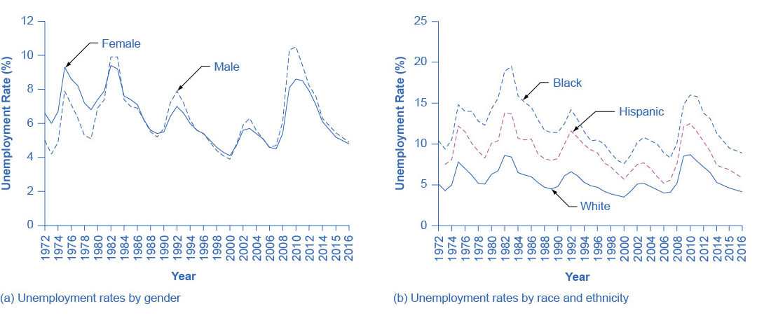
    You can also use captions to convey other pertinent information. You may want to include the sample size of a survey the graph is illustrating or additional background information about the data (as shown in Figure 1). Using captions in this manner helps the reader draw the right conclusion.

    Graph a shows the trends in unemployment rates by gender for the year 1972 to 2014. In 1972 the graph starts out at 6.6% for females. It jumps to 9.3% in 1975 for females, gradually goes back down until 2009, when it rises to 8.1%. It gradually lowers to 6.1% in 2014 for females. For males, it starts out at around 5% in 1972, goes up and down periodically, and ends at 6.3% in 2014. Graph b shows the trends in unemployment rates by race and ethnicity for the year 1972 to 2014. In 1972, the graph starts out at 10.4% for blacks, rises to nearly 15% in 1975, rises even more in 1983 to 19.5%, and ends up around 11% in 2014. In 1972, the graph starts out around 7% for Hispanics, rises to around 12% in 1975, and ends at 7.4% in 2014. In 1972, the graph starts out around 5% for whites, jumps to nearly 8% in 1975, jumps again to nearly 8.5% in 1982, and ends up at around 5% in 2014.
    Figure 1. Unemployment Rate by Demographic Group.(a) By gender, 1972–2016. Unemployment rates for men used to be lower than unemployment rates for women, but in recent decades, the two rates have been very close, often—and especially during and soon after the Great Recession—with the unemployment rate for men somewhat higher. (b) By race and ethnicity, 1972–2016. Although unemployment rates for all groups tend to rise and fall together, the unemployment rate for blacks is typically about twice as high as that for whites, while the unemployment rate for Hispanics is in between. (Source: www.bls.gov)

    A caption on a graph can go badly when there is more information captioned than is of interest to your audience, or if information included in the caption would be better displayed elsewhere.

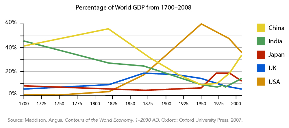
    Let’s take a look at this line graph displaying the percent of world GDP (Figure 2):

    A line graph showing the Percentage of World GDP from 1700-2008. China started at 40% in 1700's steadily increased to approximately 55% in 1825 where it sharply dropped to 10% in 1975 before it began its ascent to approximately 35% in 2000. The United States started at 0% in the 1700's, slowly increased to approximately 5% in 1825 where it then dramatically increased to 60% in 1950, and then dropped to 35% by 2000. India's percentage started at approximately 45% in 1700 and has steadily decreased to approximately 10% in 1975 where it then increased to approximately 15% in 2000. Japan was at a little less than 9% in 1700 and remained at that level until 1950 where it increased to 20% by 1975 before dropping back down to 10% in 2000. The United Kingdom started around 5% in 1700 before steadily increasing to 10% in 1625 where it then increased to 20% by 1875 and then slowly decreased to less than 5% by the year 2000.
    Figure 2. Percentage of World GPD from 1700–2008

    Imagine if the graph above, which shows the percent of the world’s gross domestic product from 1700–2000, looked more like Figure 3:

    A line graph showing the percentage of the World Gross Domestic Product by Country (the same graph as the one shown previously).
    Figure 3. Percentage of World Gross Domestic Product by Country. You will note that (1) India was officially under British rule starting in 1858, when their entire GDP was transferred to the UK. India gained its Independence in 1947 after WWII. (2) The US was colonized by the British and was not its own country until 1776.

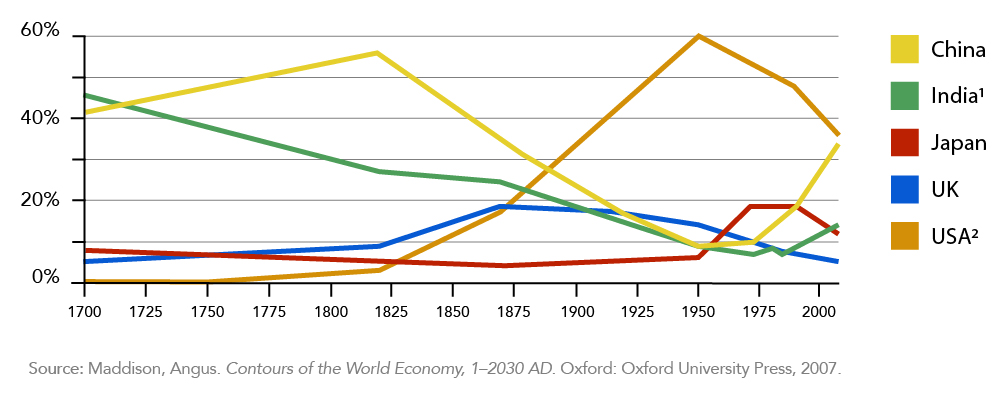
    Now the title is included in the caption, as well as some information about British colonization. How could we make it a little easier for the audience to absorb that information?

    A line graph showing Percentage of the World GDP from 1700-2008 with informational labels. At 1775 the label reads "USA gains independence from the UK". Shortly ate 1850 the label reads "The UK colonizes India". Shortly before 1950 the label reads "India gains independence from the UK."
    Figure 4. It should be noted that India’s GDP was actually considered in the UK’s totals from 1858 to 1947.

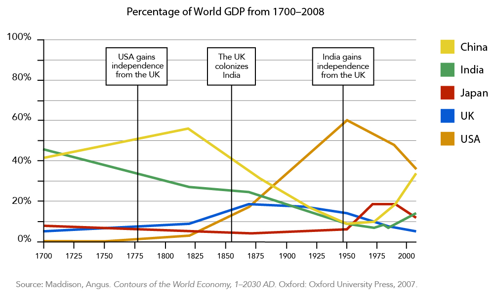
    Figure 4 is even better. Now the graph is titled, and those instances of colonization are marked on the timeline. However, let’s imagine the author is focusing on India in their report or presentation. In that case, the note about the colonization of the United States isn’t quite relevant and should be trimmed out (Figure 5).

    An exact copy of the previous line graph. The only difference is the first commentary was removed from the graph.
    Figure 5. It should be noted that India’s GDP was actually considered in the UK’s totals from 1858 to 1947.

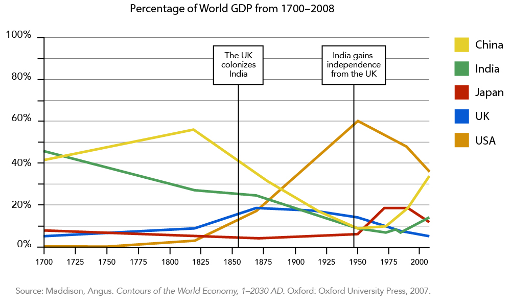
    Much better! Now the graph shows only the information relevant to the point the creator is trying to make.

    Visual media should always make a point clearer, so make sure your graph’s format, titles and captions are working for you rather than against you.

    CC licensed content, Original
    • Captions and Titles. Authored by: Freedom Learning Group. Provided by: Lumen Learning. License: CC BY: Attribution
    CC licensed content, Shared previously
    All rights reserved content

    5.4: Captions and Titles is shared under a not declared license and was authored, remixed, and/or curated by LibreTexts.

    • Was this article helpful?