
11.12: Create Charts
- Page ID
- 46604
Learning Outcomes
- Create a chart
Charts are a great way to visually present data or information in a presentation. While tables may be the best way to communicate information sometimes, often taking that data and making an understandable chart is even more effective in getting your point across.
Here is how to use charts in a PowerPoint presentation.
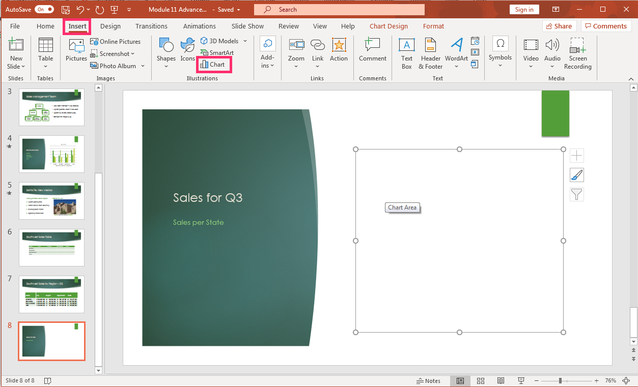
- Open a new slide in a PowerPoint deck and select a slide containing the area with the different options in it; table, chart, SmartArt graphics, picture from file or movie from file. Alternatively, choose the Insert tab, Chart button and select a Chart Option.
- Alternatively, click on the small chart icon in the content area of the slide
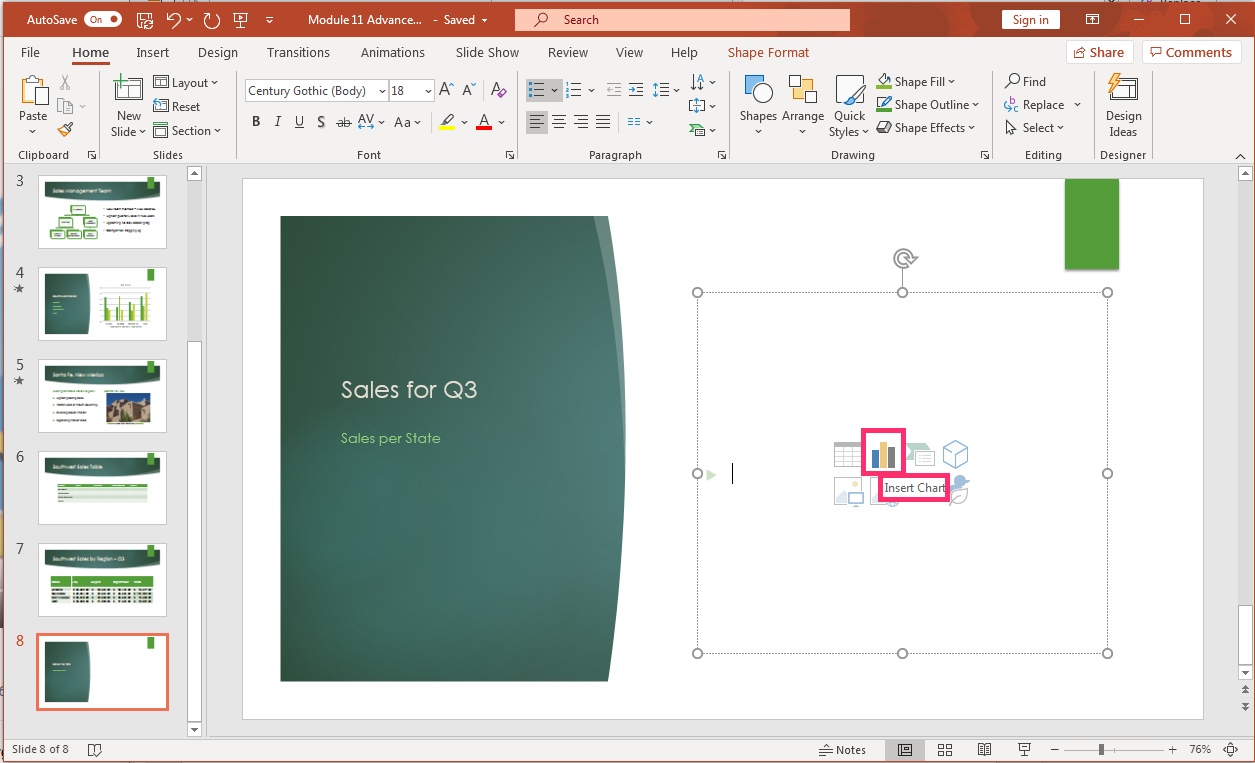
- Alternatively, click on the small chart icon in the content area of the slide
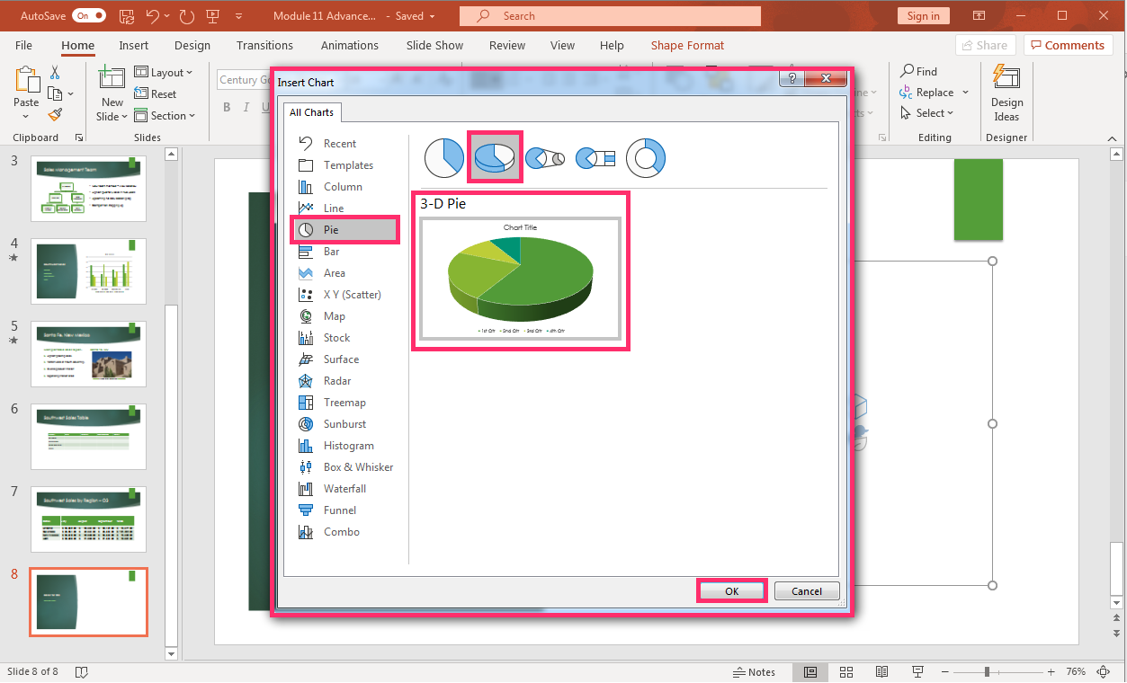
- The drop-down menu appears and gives a good variety of charts from which to select for your slide.
- Pick the slide that works best for the presentation and select it, click OK.
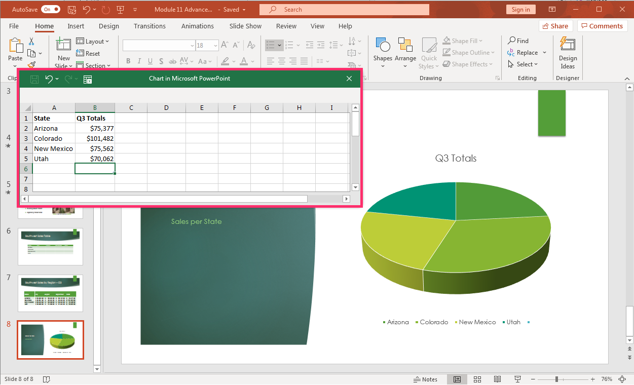
- An Excel spreadsheet for the chart will open waiting for your data input to create the chart. Input the chart information or copy and paste the information from another data source into the small spreadsheet window.
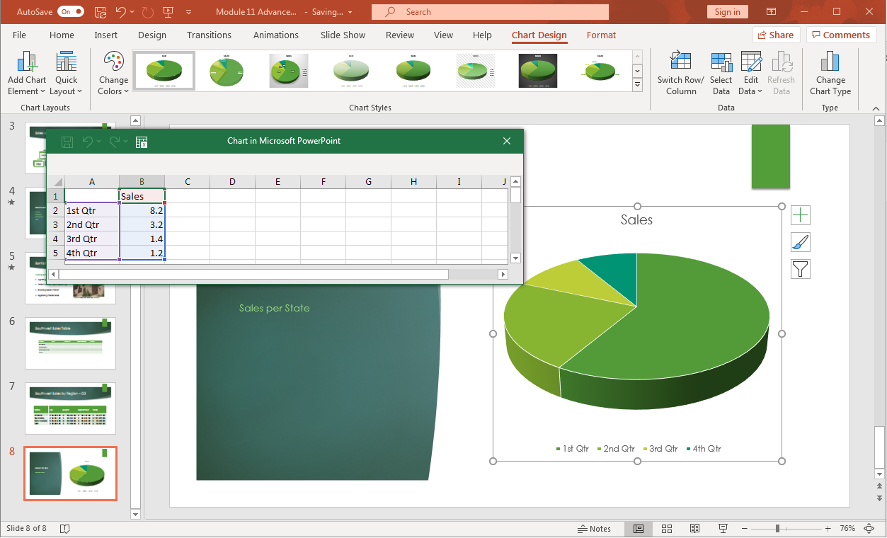
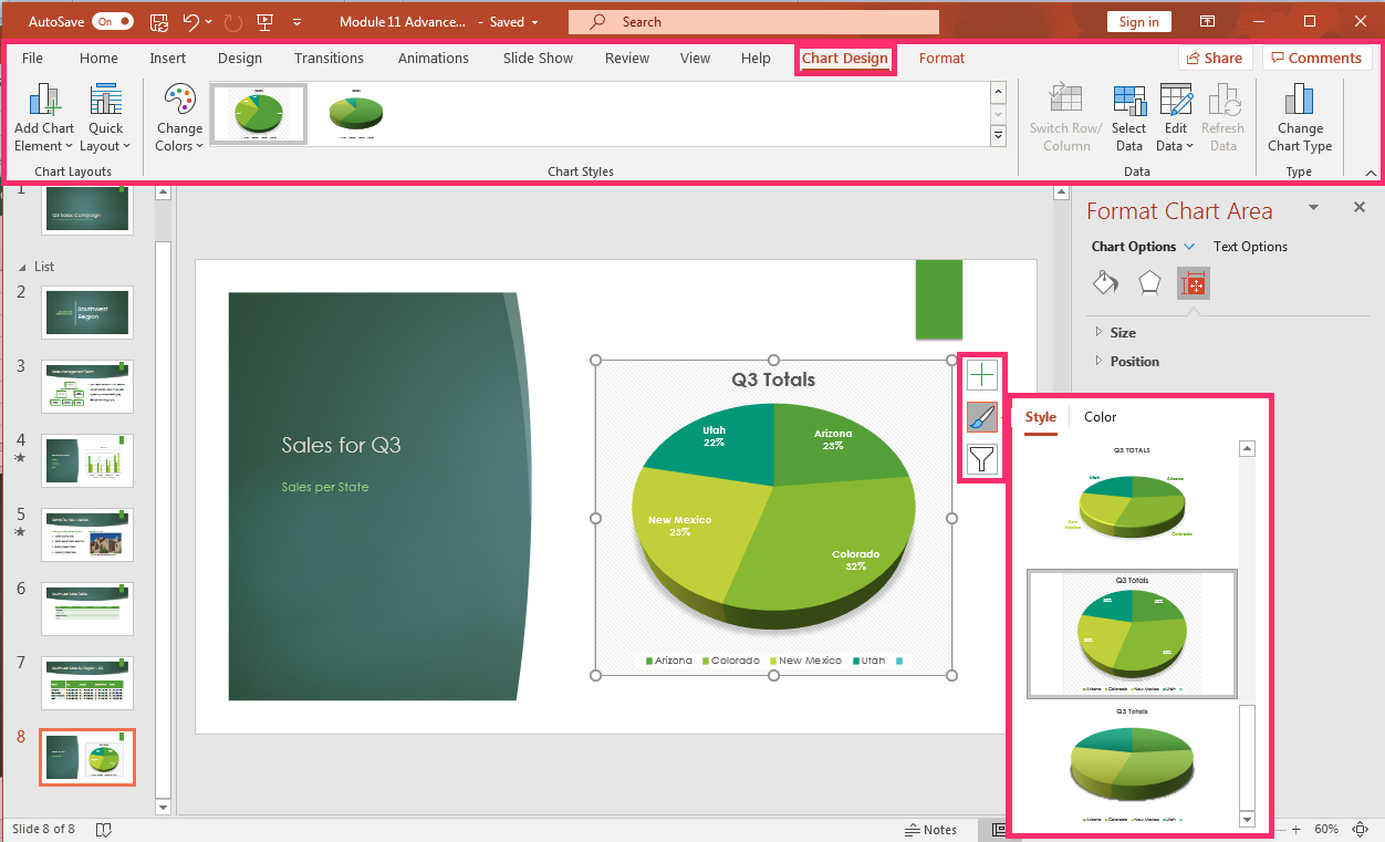
- On the right of the chart are three vertical buttons; chart elements, chart styles, and chart filters. Select the elements to use for the chart. For example, changing the chart style to be a 3-D titled style. The chart style can also be chanted in the Chart Design tab, Chart Style group in the ribbon.
- If there is a mistake or extra element needing to be deleted from the chart table, from the Chart Design tab, select the Edit Data button and the spreadsheet window opens. Another way to edit the data is by clicking on the chart, right click with the mouse, and a menu opens where Edit Data can also be selected.
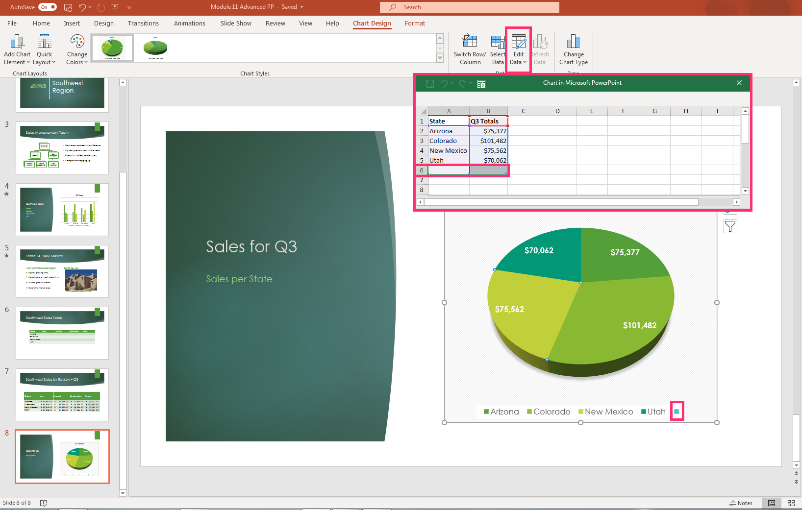
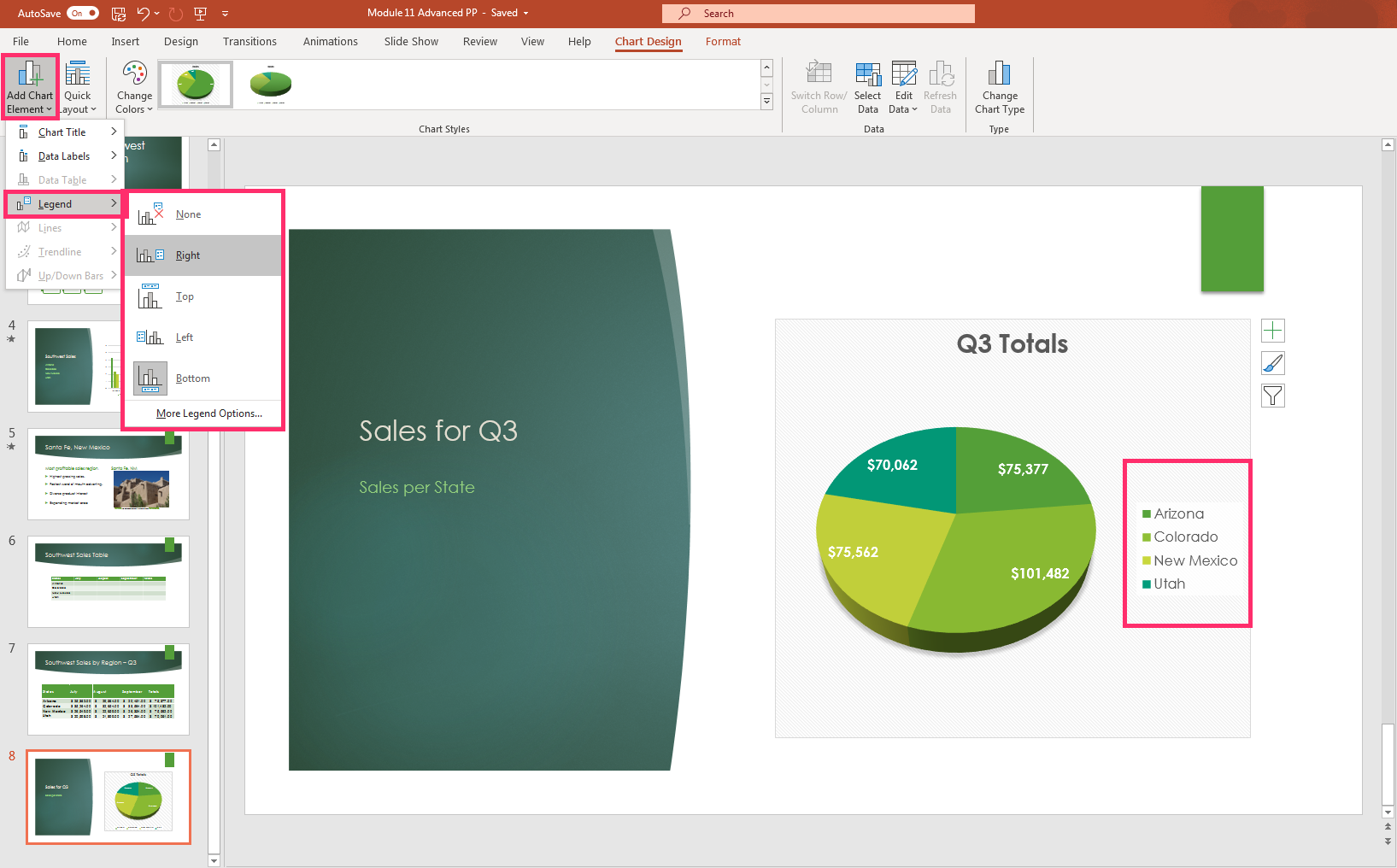
- There is an extra row in the table to highlight and delete. This cleans up the chart data and eliminates the extra, unlabeled blue dot on the chart. To change any of the elements in a chart use the Add Chart Element button under the Chart Design tab. The legend, data labels, title, lines, trendlines, and up and down bars can all be adjusted.
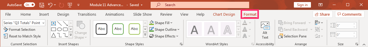
- Like with other Office products, chart formats, shape styles, WordArt styles and colors, object arrangements, and sizes can all be used to adjust a chart in PowerPoint.
Charts assist people in gaining a visual perspective of a concept or data that a presenter tries to communicate. PowerPoint supplies many types of charts to use in presentations and it is to your benefit to learn a few more types. Here is a video walking through a few of the different types of charts and how to use them in a PowerPoint presentation.

A YouTube element has been excluded from this version of the text. You can view it online here: pb.libretexts.org/cafm/?p=466
Contributors and Attributions
- Create Charts. Authored by: Sherri Pendleton. Provided by: Lumen Learning. License: CC BY: Attribution