6.3: Web design
- Page ID
- 24888

Web design is the process of creating all the visual aspects of the interface. This covers the layout, colour scheme, images, logos, type, design elements (such as buttons and links), and anything else that you can see.
The web is a visual medium, so design is an important part of creating assets that are both engaging and effective. Designers need to keep in mind the technical aspects of design, while prioritising the human factor. Digital properties shouldn’t just be beautiful. They need to create a good experience for the visitor and meet business objectives, such as increasing sales, creating brand ambassadors, as well as encouraging signups and, ultimately, conversions.
Visual identity and designing for persuasion
The visual interface or, the design of a website, is what user see and interact with. It’s the visual representation of all the hard work that goes into developing a website. It’s what the site will first be judged by and is the initial step in creating a delightful user experience. It matters a lot.
There is a close relationship between UX and visual design. Ideally the visual designer will use the documents created by the UX designer and add the visual skin, but often the designer has to manage both UX design and visual design. Design is not just about aesthetics, although looks are very important.
Design is about the visual clues we give users so that they know what to do next. It assures web visitors of our credibility and turns them into customers.
Good interface design involves many things, but here are a few basic considerations. These are closely linked to UX, and the visual designer plays a key role in defining them.
- Navigation: the signage of the site, indicating to users where they are and where they can go.
- Layout: how content is structured and displayed.
- Headers: the element with a fixed position at the top of every page. It usually includes all primary navigation items which need to be presented on every page such as main menu, login and search.
- Footers: the usually consistent bottom part of the page.
- Credibility: telling users that you are who you say you are.
Visual identity
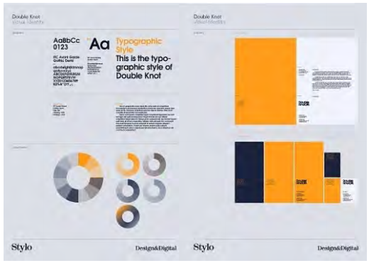
The visual identity answers the question, “How do users know it’s us?” Certain design elements should be carried through on all web assets created for a brand, as well as print and traditional communication media. Often, the visual identity guidelines for the web are codified into a digital style guide document to ensure consistency across different agencies, designers and teams. This document can include guidelines for creating all manner of web assets, including banners, social media content, and website design elements.
The logo is the most prominent way to reinforce your brand identity on the website. The logo is part of a brand’s corporate identity (CI).
The primary font is typically used for prominent headings on the site, while body copy is often set in a standard web font that closely matches the primary font.
Menu and button style, as well as icons, are also part of a site’s visual identity. Even when a user is viewing a small part of a site or page, it should look as if it belongs to the site as whole.
Design theory
Design can be a pretty precise science and there is a lot of research on what makes for effective design. A lot is also common sense and practice based on accepted web standards. Design theory is discussed in the User experience design chapter.
Collecting and collating design assets
Elements such as your logo and brand colours represent your brand and form part of your brand expression. The latest versions of these brand assets need to be available to the designer or marketing agency designing your website.
Getting the right brand assets to designers in a good quality format that they can easily access saves time and avoids expensive mistakes. Here is a list of brand assets that a designer requires to start working on a site. The quality, format (or file type) and file size are all important considerations. You need to provide:
The brand guidelines or style guide would be created in Illustrator, PS or Sketch, but saved for the client as a PDF doc.
- Brand guidelines or style guide. In Adobe Reader (PDF) format.
- Logo and other key brand elements. These could be in Illustrator format (ai) or Photoshop format (psd). Best practice is to have your logo designed using vector graphics. If your logo or other brand assets are created in this format, they can be enlarged without losing quality. If you do not have a vector version of your logo available, then you should make sure that your image is at least 1 000 pixels wide.
- Image libraries. Photographs and images can be hosted online, where the designer can access them with a login. They can also be sent via Cloud file sharing services. Make sure the images are of sufficient quality. It is best practice to provide images that are 300dpi. Although all images on the web are displayed at 72dpi, a higher quality image will give your designer room to optimise and resize and crop or cut images where needed. It may also be necessary to consider different images for mobile vs. desktop because the viewpoint on mobile is so much smaller. You may need to consider using much fewer images for mobile or even none at all.
If you do not own the image and its copyright, it is illegal to use the image on your site without permission from the owner. If you require these images, they can be purchased from stock libraries online such as iStock or Shutterstock. Avoid using images from Google Image Search on your pages.
- Fonts folder. You will need to provide both Apple Mac and PC versions of the fonts that are listed in your Style Guide. Many designers work on Macs, which use different font versions from those read by PCs.
- Brand colours need to be given to digital designers in RGB format. RGB stands for red, green and blue and is the standard for colours online.
- Any existing creative assets that have been created for your brand over time, such as:
- Print designs
- TV ads
Website copy should be made available before the final design is required. This prevents delays caused by designers waiting for material. This applies to any additional assets your designer may need that can be downloaded or sent, such as your price guides or product descriptions.
Fonts
Copy conveys your brand message to your client or customer and should be easy to read and search engine friendly. The CI is expressed through fonts, also known as typefaces.
Typographic layout can draw attention to the content users should see first. Indicate which pieces of information take precedence. Importance can be signified by text size, colour, weight, capitalisation and italics. Placement also contributes to how important text appears.
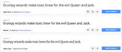
Some fonts are common to all computer users. These fonts are known as web safe fonts. Anyone accessing websites that use these fonts will be able to view them as the designer intended and search engines will be able to search these websites easily.
Some web safe fonts are: Times New Roman, Arial, Helvetica, Courier New, and Lucida Console. See the full list here: www.w3schools.com/cssref/ css_websafe_fonts.asp.
To drive impact, designers typically prefer not to be limited to using only web safe fonts, and brand guidelines in most instances don’t take web safe fonts into account. This means that fonts must be embedded by a developer using tools such as Typekit, or loaded dynamically from tools such as Google Fonts.
You can also use Google Fonts as an alternative, which are more stylish than standard fonts but which are still viewable by most people. The developer will need to implement these. See www.google.com/fonts.