
6.4: Web development
- Page ID
- 24889

Web development is the process of taking finished web designs and transforming them into fully functioning, interactive websites. Development is what gives life and movement to static designs, and enables users to access the website through their web browsers. This is done by translating the designs into web coding languages that can be interpreted and displayed by web browsers.
Learning to code your own website is not in the scope of this textbook and requires years of practice and some considerable technical know-how. But we can teach you to understand the aspects that go into creating a website, the process that should be followed, and how to help in making key choices about your website.
Assessing your development needs
It is important to identify what your development needs are as these fundamentally impact the options that are most appropriate to your site’s development. Will you use a CMS? Will you need complex content management? Is it for eCommerce, or is it simply a brochure site? For instance, if you’re building a small brochure site, you don’t need someone to come up with a bespoke development solution.
Content management
The majority of websites today are built using a content management system, or CMS. Content management simply means a system for managing any forms of content. A web CMS is a software application that assists in managing your digital assets and content for your website. It needs to facilitate the creating, collecting, managing and publishing of any material for your site.
Managing a website is collaborative and involves various people, in various roles, working on the material, such as creators, editors, publishers, administrators and even visitors to your site. A CMS provides tools to allow users with little knowledge of web programming languages or markup languages to create and manage website content. A CMS enables a business to manage and update their own website without needing a web developer (Johnston, 2015).
Ideally, the CMS becomes a set of automated processes that facilitate the functioning, updating and management of your site. Using a CMS means it is cheaper and easier to update, manage and create new content as web developers are not required for each change. A CMS also allows for the content of websites to be updated from any location in the world by means of signing in to the system.
eCommerce
eCommerce, or electronic commerce, refers to any trading of products or services on the Internet. eCommerce sites are necessary across a range of businesses, from consumer based retail, through auction, music and video subscription sites, to intercorporate trading.
Learn more in our eCommerce chapter.
Brochure site
A brochure site is a static site. It provides content that does not need to be updated regularly, and there is very little interaction with the visitor. A brochure site is essentially a brochure of a company’s offering, providing relevant information and contact details to prospective customers. The site does not ‘do’ anything. The user cannot interact with the site in any way; they are unable to place orders, make payments or engage with the site.

Brochure sites are a means of getting your business an online presence quickly and relatively cheaply, and if it meets all your business requirements then such a simple site may be sufficient. Consider the limitations of a brochure site before making a choice, as they can be difficult or impossible to build on later.
Development options
When selecting how to proceed with your website development, you have a few options at your disposal. The choice between an off-the-shelf solution and bespoke development comes down to how flexible the off-the-shelf solution is. If too much customisation is required, or it does not support the business’ requirements, it may be better and cheaper to develop a bespoke solution.
Off-the-shelf solution
The CMS you choose can be pre-built by an external company or developer. This can be bought like any other software on the market. While this option may provide fewer custom features, it’s potentially a more cost-effective option than a bespoke CMS. It is certainly quicker if little customisation is required.
Bespoke development
This involves a CMS that is built specifically for a certain website. This option is highly tailored and customised to your website, and can be more expensive than other options. It is possibly less future proof, as finding alternative agencies to support custom-built code is challenging.
Advantages and disadvantages of off-the-shelf and bespoke development
| Off-the-shelf | Bespoke | ||
| Advantages | Disadvantages | Advantages | Disadvantages |
| Cheaper | Overly complex with large sections you will never use | Created specifically for the business’ needs | More expensive |
| Sophisticated software due to wide range of resources input for development | Compromise of features | Tailored and unique | Requires experienced developers to maintain |
| Easy to find support and literature widely available | Long time to learn and in-house training required | Customised to interface with software you already use | Less future proof as tied to specific agency to maintain |
| Easy to share files as software widely used and available | Workflow may have to change to meet software design | More intuitive to your business’ way of working | Large investment of time for development, testing |
| No company time needed for specs and testing | Features you need may not be available | More flexible, can be modified and changed as required | Takes much longer to implement |
| Available sooner | Individual requests to overall developers will not carry weight | Receive better support | Difficult to get support if developer does not provide it |
| Long time to have things fixed if through the corporation that developed the software | Provide significant business advantage | Difficult to choose appropriate developer that will provide reliable and stable software. | |
| Difficult to gain competitor advantage | Option to sell application to others (if you own rights) |
Open source vs. proprietary
There are many open source, pre-built CMS options available, some of which are free. Open source means that anyone can see the code that the CMS is built with, and can manipulate or improve it and share this with everyone else using the CMS. An open source CMS can be more rudimentary than paid options, but is also easy to tailor to your needs, and there is often a community that can create the solutions you need.
Some widely used open source CMS solutions include:
WordPress (www.wordpress.com)
Drupal (www.drupal.com)
Blogger (www.blogger.com)
Joomla (www.joomla.org)
| Proprietary | Open source | ||
| Advantages | Disadvantages | Advantages | Disadvantages |
| Predictability | Less current so large investments in legacy systems | Customisation | Upfront cost can be high if you want highly customised product |
| Plenty of options | Licensing fees | Flexibility | Less ‘Out of the box’ features and features you need may be expensive to create |
| Robust and filled with features | Supported only by the company that sells it or its agents | Supported by an online community and not a company | Less predictable support which only happens as needed and not regularly |
| Relatively cost effective to implement | Lack of customisation | Existing frameworks to work from | Less predictable |
| Lack of flexibility | New technology helps to stay up to date with bugs and fixes | ||
| You own the customised versions |
A CMS should be selected with the goals and functions of the website in mind. A CMS needs to be able to scale along with the website and business that it supports, and not the other way around. Many content management systems have become famous for certain needs.
Examples include:
- WordPress for personal blogs or brochure type sites
- Drupal for more complex community and publishing sites
- Magento for eCommerce sites.
Development frameworks
The back-end of a website refers to the server-side layer. This layer is hidden from the user’s view. The interaction between the user and the back-end is handled via a presentation layer known as the front-end or client-side layer. A website is a marriage between these layers (Ferguson, 2016).
Back-end/server-side languages and frameworks
Server-side languages are the hidden web coding languages that determine how your website works and communicates with the web server and your computer.
When choosing a server-side language, you need to consider:
Cost: The cost varies depending on the language you choose for your web development project, as some are more intricate than others, the developer may charge more. So the language chosen may directly influence the salary of the developer. If information is processed where your website is housed, as opposed to on the client’s computer, it increases the costs. Some languages also require ongoing website management and maintenance, which is an additional cost to consider.
Scalability: When planning a project where scalability is a factor, consider whether there are developers readily available to develop in this language. Also find out if there are supporting libraries and frameworks available that may suit possible changes to your project.
Some of the most common and popular server-side languages include PHP, Java, Ruby, .NET and Python. Ask your web developer to advise you on the best language for your specific project (Ferguson, 2016).

Some common back-end frameworks are Django, Zend Framework and Ruby on Rails.
Front end/client side development languages and frameworks
There are many free resources online that teach you how to code. One is Codeacademy: www.codeacademy.com
Web users have come to expect rich, interactive experiences online, and interactive website interfaces are a part of that. Front-end languages, or client-side languages, are languages that are interpreted and executed in users’ browser rather than on the web server.
These experiences range from simple animations through to highly responsive interfaces that require input from the user. There are several technologies available to create such experiences, each with its own opportunities and challenges.
As with server-side languages, you need to consider a few properties of the front-end language you want to use. Bear in mind that server-side languages and front-end languages are often used together, as all web projects require front-end languages for development.
Cost: Front-end language development costs are comparatively lower than backend costs; although rich interface developers often demand premium rates.
Features: HTML, CSS and JavaScript open source languages are often used together and are compatible with most hardware and software. Content developed in these is also more search engine friendly. Today, Flash is rarely used despite its interactive multimedia capabilities. In many cases, richer experiences can be achieved with HTML, CSS and JavaScript. What your end users will be able to view should always be the most important consideration.
Scalability: Depending on the capabilities of the device executing the language, certain features may not be available or certain code may run too slowly to create a good user experience. The development of front-end code needs to take all the considered devices into account.
Browser and OS support: With front-end languages, you have to cater for browser and operating system support. A website will look different on each browser and operating system, and this needs to be factored in. If a feature cannot be displayed under certain conditions, workarounds have to be implemented. This is typically the case for older versions of Internet Explorer.
Open source or proprietary software: Any developer can create add-ons for or improve on open source software, while proprietary software is owned and its use is restricted. It can be cheaper to develop in an open source front-end language such as HTML, but as HTML is needed to host all web pages, combinations of open source and proprietary software are sometimes used. However, in most cases and for the languages we cover this is not a major consideration.
There are several front-end language options to choose from although the most popular by far is HTML coupled with CSS and JavaScript.
HTML5
HTML is the language for creating websites, and HTML5 is the fifth iteration of the language. It is also the name for a range of technologies that enable modern web browsing features. It’s a specification published by the web standards body, W3C, describing what features are available and how to use them. HTML5 is different from proprietary web software such as Adobe Flash in that the specification is the result of contributions from many organisations and can be implemented by anyone without having to pay for royalties or licensing fees. You do, however, pay for the development tools provided by the companies.

HTML5 simplifies many common tasks when building a web page, such as including multimedia content, validating forms, caching information and capturing user input data such as date and time.
HTML5 allows browsers to play multimedia content without the use of Flash or a similar plug-in. There is also a technology called Canvas, which allows developers to create rich, interactive experiences without the constraints that came with previous versions of HTML. For example, a 3D animated video can now be played, something that used to require the use of Flash or Silverlight.
The goal is a website that just works, without the need for particular browsers or plug-ins to enable certain functionality. Having a standardised way of implementing common features means that the web is open and accessible to all, regardless of competency.
CSS
CSS stands for Cascading Style Sheets and is a style sheet language used to instruct the browser how to render the HTML code. For example, the plain text on a web page is included in the HTML code, and CSS defines how it will appear. CSS can set many properties including the size, colour and spacing around the text, as well as the placement of images and other design-related items. CSS pre-processors such as LESS, SASS and Stylus are also available to make CSS more easily maintainable and scalable. They allow for more functional CSS compilation. The latest standard of CSS is CSS3. It is backwards compatible with all versions of CSS and provides many more useful features such as text effects, 2D/3D transformations and animations to name a few (w3schools, n.d).
JavaScript
This is the most common client-side language used to create rich, dynamic web properties. Because it is an open source language, many developers have added functionality that can be more quickly implemented. For example, there are over 1 000 different gallery systems created by JavaScript developers for JavaScript developers.
Flash
Adobe Flash is a language for creating rich, interactive experiences. It supports video and is often used to create game-like web experiences. Although widely supported by desktop browsers, it has limited (and lessening) support on mobile devices and is not usable on Apple devices such as the iPhone and iPad. It has a history of being problematic for SEO, although there are ways to work around much of this.
Flash usage has been on the decline since some security holes were exposed, and many believe that it is on its way out. In February 2016, Google announced that its advertising networks, AdWords and DoubleClick, would no longer be supporting Flash. The ads would have to be updated to HTML5 (Google AdWords, 2016). YouTube announced that it would not be using the Flash player by default anymore. It switched to HTML5 for all the latest browsers. Adobe discontinued Adobe Professional CC and released Adobe Animate CC which is now Adobe’s premier tool to support HTML5 content. There are still a few traces of Flash left as it is still used as a video player and for the creation of online games.
Frameworks
Frameworks are packages that are made up of a structure of files and folders of standardized code (HTML, CSS, and JavaScript for example) which can be used as the basis for developing websites. Essentially, frameworks are templates to provide the common structure for websites so that developers don’t need to start from scratch each time. Frameworks save a lot of time and money.
Some examples include Backbone.js, AngularJS, EmberJS, React.js and the very popular jQuery libraries. Bootstrap is also increasing in popularity as a front-end framework.
Development best practice
Meta and title tag customisation
The CMS you have either selected or created should allow you to enter your own meta tags for each page, as well as allow full customisation of title tags for each page. It is important to note that Google does not use keyword meta tags for ranking anymore (Lincoln, 2015).
URLs
Instead of using dynamic parameters, the CMS should allow for clean URLs by using server-side rewriting. Clean URLs consist only of the path to a webpage without extra code. A clean URL could look like this: example.com/cats, while an unclean URL could look like this: example.com/index.php?page=cats. It should allow for the creation of URLs that are:
- static
- rewritable
- keyword rich.
Be careful when building clean, descriptive and dynamic URLs from CMS content. Should you use a news heading, for example, ‘Storm’, as part of your URL (www.site.com/cape/storm) and someone changes the heading to ‘Tornado’ (www.site.com/cape/tornado), this will alter the URL and the search engines will index this as a new page, but with the same content as the URL which had the old heading. Bear this in mind before adding dynamic parameters to your URLs.
Customisable navigation
A good CMS will allow for flexibility when creating the information architecture for a website. For the purposes of adding additional content for search engines, a CMS should not require that all content pages be linked to from the home page navigation. Responsive considerations also need to be in place for mobile devices.
The CMS needs to have good support for managing SEO considerations such as URL rewriting and avoiding duplicate content issues.
Customisable image naming and alt tags for images: A good CMS will allow you to create custom alt tags and title attributes.
robots.txt management: robot.txt files are .txt files that restrict search engines from indexing certain pages of information Ensure that you are able to customise the robots.txt to your needs, or that this can at least be managed using the meta tags.
Finally, using a CMS that supports standards compliant HTML and CSS is very important, as without it, inconsistencies may be rendered across various browsers. It also ensures faster loading time and reduced bandwidth, makes markup easier to maintain, supports SEO efforts and ensures that every visitor to a website, no matter what browser they are using, will be able to see everything on the site.
Developing for multiple screens
Read more about this in the User experience design chapter.
Accessing the Internet has changed drastically over the last few years. Desktop is no longer the only or even primary means of accessing the web. Mobile Internet usage surpassed desktop in 2014 and continues to grow year on year, while desktop usage is declining (Chaffey, 2016).
Because of this, it’s important for all brands to be accessible on mobile devices. As you learnt in the User experience design chapter, mobile devices can fall into a range of categories, and not all mobile devices have the same features and screen size. This means that websites need to be designed to be accessible and are optimised for a variety of screen sizes and devices.
Developing for a variety of screens and mobile requires an understanding of the opportunities and challenges presented by mobile technology. Challenges include the obvious, such as a smaller screen and navigation limitations, different operating systems as well as more complex issues such as file formats and bandwidth restrictions.
Mobile devices
A mobile device is a small device with computer-like functionality. It allows for an Internet connection and various features such as Bluetooth, NFC, Wi-Fi and GPS. These include smartphones and PDAs (MDN, 2016). Remember, mobile goes beyond just the mobile phone, also consider tablets, game consoles, netbooks, wearables and a range of other web-enabled devices.
The constraints with developing for a range of devices [c head]
Due to the size constraints of mobile device screens, various considerations must be taken into account to allow your website to render correctly.
Fluid CSS layouts will allow the site to manipulate its contents based on screen size. Additionally, CSS media queries can use target styles for a specific screen width, height and pixel density.
Working with touchscreen means that no hover effects will work. Adequate space must be allowed around inputs due to the touch-area of some user’s fingers being larger than a mouse cursor.
Images must be optimised for mobile screens and bandwidth restrictions.
A great online JPEG/ PNG compression tool is tinyPNG.org. Simply upload your images and let them compress it for you (MDN, 2016).
Development approaches
Specialised mobile development
Mobile devices allow users to access information about your brand on the move. Because mobile penetration is so heavy and many users worldwide will access the Internet first and primarily through mobile (Chaffey, 2016), every website needs to be designed with the mobile device in mind. Mobile website interfaces demand a simpler approach and a consideration of screen size and input method. A specific design for various mobile screen sizes in the form of an adaptive design may be an option. However, Google prefers responsive to adaptive sites, so creating an adaptive site may not be within the best interest of your business in terms of SEO.
A native mobile app is software designed to help users perform particular tasks. Examples include a tool for checking the weather, a fuel calculator, or an airlines app to check-in or to track flight progress.
Mobile apps can be sold or made available for free. Many developers create apps to derive an income, while free apps that offer users value are often sponsored by brands or advertising. An app can be an excellent tool for connecting with your customer.
The key difference between native applications and mobile-optimised websites is that native applications are designed for particular handsets and operating systems and have to be downloaded to the mobile device. Whereas mobile-optimised websites can be accessed using any Internet-enabled mobile device. That said, mobile apps can allow for more integration with the device and hence a better user experience, depending on the complexity of the functionality.

It is a good idea to focus on mobile-optimised sites when targeting a broader group and building an application when wanting to reach a niche or targeted audience.
Some brands still create a separate mobi site just for their mobile users, but this is falling out of fashion as Internet access via mobile increases. Google recommends responsive sites as best practice.
Read more about mobile-optimisation in the Mobile channels and apps chapter.
A responsive site
A responsive website is a website that changes its layout depending on the device it is displayed on so it looks one way on a desktop computer, but then adapts to the smaller screen size and layout on a tablet or mobile phone. In this way, a single development project can cater for multiple device form factors.
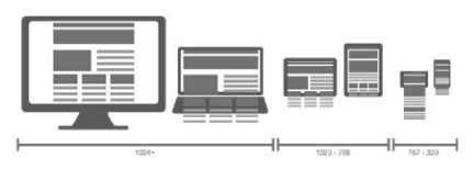
A responsive website is not the same as an adaptive website. A responsive site uses the browser’s screen space to determine how to reflow the original design content that was probably optimised for desktop, while an adaptive site provides a specifically tailored design for the device you are using. Designing an adaptive site requires multiple fixed layout sizes, usually the six most common screen widths, and the relevant one is deployed depending on the screen size of the device.
Many users prefer responsive design as it provides familiarity, uniformity and seamlessness, which are important considerations in user experience (Soegaard, 2016). Responsive design should be mobile friendly. This helps to maintain usability when reflowed for a mobile device’s screen.
Adaptive designs are more labour intensive and more expensive. As an approach it’s being used less and less. Although industry professionals often prefer adaptive sites, industry preference won’t translate into higher listings on SERPs while Google’s ranking methodology favours responsive design.
Try visiting http://roxik.com/cat/ and resize your browser to see the cat change shape based on the screen width. This is a great illustrative example of a fluid responsive layout.
Creating a responsive website means you only need to build one website for the full range of devices, from desktop to mobile. This can be a technically challenging exercise and will require a lot of planning upfront to make sure that the site displays correctly on each device.
Here is a table that compares the relative strengths and weaknesses of each option. There’s no right or wrong answer on which one to pick. Choose the option that best suits your brand, target audience and digital objectives.
| Strengths | Weaknesses | |
| Mobile-specific adaptive sites |
|
|
| Native app |
|
|
| Responsive site |
|
|
Designing for multiple screen sizes
Designing a site that will display consistently across multiple devices and screen sizes is difficult, but understanding and sticking to web standards will bring you closer to this goal.
Design your site so that the information your users want is not only on display, but also easy to get to. The limited screen space is valuable, so you can’t necessarily have the full site navigation on every page. Well thought-out information architecture is essential to ensuring you make the most logical use of navigation in line with what your site visitors need.
Standards
There are few standards currently in place to ensure your design will be optimised across multiple screens. Creating content including images, text and beyond that can be correctly formatted on most mobile devices, or at least legible on phones where formatting is flawed, is still not entirely possible. There is therefore a certain amount of trial and error involved in designing a site optimised across a variety of devices. The process is certainly worth it, though, considering that there are 4.7 billion unique mobile subscribers, and the majority of these are accessing the mobile web (GSMA Intelligence, 2016).
Web standards are managed by the W3C. The standards were created to promote consensus, fairness, public accountability and quality. Complying with web standards means the site uses valid code and adheres to stipulations from the W3C. Read more about web standards at https://www.w3.org/standards/ about.html.
Mobile handset emulators allow you to see how your work-in-progress website will be formatted, depending on which device you are emulating. It has been suggested that nothing can replace testing on actual mobile devices, so if you are doing the testing, recruit contacts with different handsets to show you the difference in display. Some emulators:
- BrowserStack – www.browserstack.com
- TestiPhone – www.testiphone.com
- Mobile phone emulator – for Samsung, iPhone, BlackBerry and other - www.mobilephoneemulator.com
Safari on the iPhone can be tested with IOS simulator.
Responsive design
Responsive websites are designed for a range of screen widths. When deciding whether to create a responsive site or adapt desktop sites, consider your customer first:
- How much of your website traffic comes from specific mobile devices? If this is a large percentage, consider building a responsive site designed for optimal viewing on mobile screen sizes.
- Do your desktop users have the same goals as your mobile users? Here you need to keep in mind your CTAs, drop down menus and the like and ensure they can be accessed correctly by the relevant device.
- What is your budget and how quickly do you need your website to be built? Responsive websites take a while to build and can be expensive. You could save money long term by going this route, but there is a sizeable upfront investment.
- Do you have an existing site, and can it be converted into a responsive website, or will it need to be rebuilt (Du Plessis, 2012)?
- Responsive design comes with a fair bit of terminology, but you should be familiar with three key concepts.
Flexible grid
Typical websites are designed as large, centred, fixed-width blocks. With responsive design, the page elements such as the heading, the text or copy, the main image, and other blocks of information are arranged in a grid of columns that have predefined spacing. Each element relates proportionally to the other elements. This allows elements to rearrange or resize in relation to each other whether the screen is tiny or huge and the screen quality is high or low. Although this system allows for flexibility, an extremely narrow screen can cause the design to break down. In this case we can make use of media queries.

Media queries
Media queries are bits of code that allow websites to ask devices for information about themselves. The website style that will suit the device best is then selected from a list of styles defined in a CSS. Media queries ask for information about the device’s browser window size, orientation (landscape or portrait) and screen display quality.
Is responsive design right for your company or client? See how some companies tackled this question here: www.zdnet. com/does-yourcompanys-websiteneed-responsivedesign-7000021417
Flexible images
Images are designed to move and scale with the flexible grid. How fast the website loads is an important consideration, so high-quality images are made available for larger screens and lower-resolution images are made available for smaller screens. Parts of images can also be displayed for smaller screens to maintain image quality. Images can even be hidden completely. Image optimisation is done in CSS, which queries the screen height, width and pixel ratio of the device and then adjusts the images accordingly (MDN, 2016).
For more information about responsive websites watch Methods for mobile (Responsive vs. Adaptive) from Brian Wood Training: https://www.youtube.com/watch?v=IgojC1D3QpU [Accessed 30 October 2017]