
5.5: Implementing UX design
- Page ID
- 24883

The UX design process happens before, during and after the website is being built. It ties in very closely with strategy and research, web development and design, SEO, content strategy and creation, and later conversion optimisation.
As discussed in section 5.4, Core principles of UX design, mobile should not be an afterthought, in UX or any other digital endeavour. It should be prioritised in strategy, design and implementation. The ‘mobile first’ movement supports this notion, and aims to create mobile user experiences first, and then adapt these for the web (instead of the other way around). Designing this way has many advantages, since the principles of good mobile UX works just as well on full sites using simple designs, linear interfaces and clear buttons and features.
Conduct research and discovery
Step one involves conducting detailed research on the business, the users, and the technology involved. This is covered fully in the Data driven decision making chapter, which includes user research. Doing this lets UX practitioners know exactly what they need to do to address the needs of the business and audience. This will generate a lot of data that needs to be filtered and organised.
Create the site’s basic structure
Information architecture (IA) is about managing information, taking a lot of raw data and applying tools and techniques to it to make it manageable and usable. Categories and pages should flow from broad to narrow. An intuitively designed structure will guide the user to the site’s goals.
IA operates on both the micro and the macro level covering everything from the way individual pages are laid out, for example where the navigation and headings are, to the way entire websites are put together.
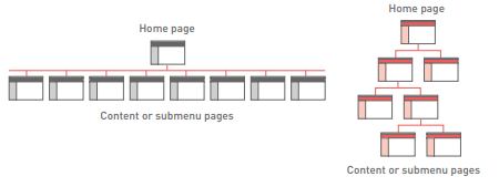
Most websites have a hierarchical structure, which means there are broad, important pages at the top, and narrower, more specific and less important pages further down. Hierarchical structures can be very broad and shallow having many main sections with few lower pages or very narrow and deep with few main sections and many pages below. It’s up to the UX practitioner to find the right balance of breadth and depth.
Analyse content
If you’re working on a website that already exists, it will be populated with a wide variety of content. In this case, you need to perform a content audit, which is an examination and evaluation of the existing material.
If the website is new or if you plan to add new content to an existing website you need to put together a content strategy. This is a plan that outlines what content is needed and when and how it will be created. There’s no single template or model for this so every content strategy will be unique.
The content strategy is largely the responsibility of the strategy, copy and concept teams, but the UX practitioner needs to get involved in a few key roles. The points that UX needs to address are:
Read more about this in the Content marketing strategy chapter.
- What the site should achieve. Naturally, the content should work towards achieving the site’s and business’ objectives.
- What the user wants and needs. By conducting thorough user research you should be able to answer this question. Provide only content that will add real value to the user.
- What makes the content unique, valuable or different. Content needs to provide value to the user. A content strategy will help ensure content is updated regularly and will include up to date information.
- The tone and language used. You need to consider the tone, whether it’s fun, light or serious, the register, whether it’s formal or informal and the style you will use across your content. Make sure tone, style and register are consistent across text, images, videos and other content types. Correct grammar and spelling are important considerations as they speak to the credibility of the site.
Principles of creating content
There are three key points you should consider here.
1. Structure
Content needs to be written so that users can find the information they need as quickly as possible. The chapter on Digital copywriting will cover this in more detail. Copy can be made more easily readable by:
Don’t forget SEO. There are lots of ways in which a website can be optimised during the UX planning process. Have a look at the SEO chapter for some guidelines on what to include.
- Highlighting or bolding key phrases and words
- Using bulleted lists
- Using paragraphs to break up information
- Using descriptive and distinct headings.
2. Hierarchy
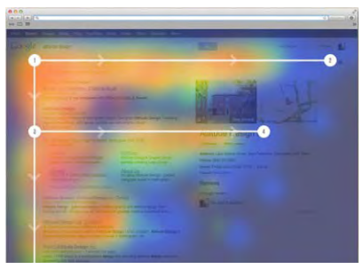
On the page, use an inverted pyramid style or F structure for your copy. The important information should be at the top of the page, to make for easy visual scanning. The heading comes first and is the largest and boldest type on the page. The subheading or blurb follows this, and then the content is presented in a descending scale of importance. Sentences should be short and important words should appear early in the sentence, especially in bullet points. Eye-tracking research has shown that the F structure is the still the most user friendly structure, as this is the natural flow of the eye (Hanes, 2016).
3. Relevance
Above all, the content on the page must be relevant to the user and the purpose of the page itself. If a user clicks to read about a product but ends up on a page with content about the company, their experience is going to be tarnished.
Create a sitemap
In UX terminology, a sitemap is the visualised structural plan for how the website’s pages will be laid out and organised.
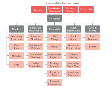
To create the visuals for your sitemap, you can follow this process:
- Start by defining your home page. This should be the top item in the hierarchy.
- Place the main navigation items below this.
- Arrange your pages of content below the main navigational items, according to the results of your user testing and insight, and your information architecture structure.
- Add pages below this until you have placed all your content. Make sure that every page is accessible from at least one other page. It may seem obvious, but you’d be surprised how often this is overlooked!
- Define any other static navigation elements i.e. the footer, sidebar, header navigation, search tools. Place these in your diagram in a logical place possibly branching off directly from the home page, or as separate blocks.
The term ‘sitemap’ can have two meanings. One is the way it’s defined above – the structural plan of the website. The other is a page on your website that lists all the pages available in a logical and accessible way. An example is the Apple website’s sitemap: www.apple.com/sitemap. This sitemap should be available from every page. Dynamic sitemaps can be employed so that the sitemap is updated automatically as information is added to the website. Different sitemaps exist for different purposes, so investigate what your users would find most useful.
Build the navigation
The navigation should guide users easily through all the pages of a website; it is not just about menus. Successful navigation should help a user to answer four basic questions:
1.Where am I?
Navigation should let the users know where they are in the site. Breadcrumb links, clear page titles, URLs and menu changes all help to show the user where he or she is. The larger your site is and the more levels it has, the more important it becomes to give your users an indicator of where they are in relation to everything else on the site. This helps the users to understand the content of the page that they are on, and makes them feel more confident in navigating further through the site.
2. How did I get here?
Breadcrumb navigation often indicates the general path a user may have taken. In the case of site search, the keyword used should be indicated on the results page.
3. Where can I go next?
Navigation clues let a user know where to go to next such as ‘add to cart’ on an eCommerce site, or a contextual link that indicates ‘read more’. The key is making the options clear to the user.
There is a tendency, when thinking about navigation, to plan in only one direction, from the home page down the chain of pages in the hierarchy. But very often, users arrive at the site from a link or search result that drops them deep in the website. This makes it equally important to look at reverse navigation getting from the bottom level pages back to the top.
4. How do I get home?
It has become convention that the logo of the website takes the user back to the home page, but many users still look in the main menu for the word ‘home’. Make sure that they can get back to the beginning quickly and easily.
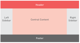
Create the layout
A web page can be broken down roughly into four zones:
Each of these typically contains certain types of elements and content, such as:
- The header (at the top of the page) – used to identify the site and provide basic tools: Logo or identifying mark (possibly including the brand’s tagline) Main navigation Login feature Search bar
- The central content area – used to present the main content The actual content specific to the page such as text, images, videos and more (this can be broken into several columns) CTAs of various kinds such as “Sign up”; “Get started”; “Claim your free trial”
Users consider information in side bars to be less important, so don’t put your key message here.
- The sidebar (either on the left or the right, or sometimes on both sides) – used to present secondary content and tools Secondary navigation bar, or other navigation features (for example, blog article archive by date)
CTAs, including buttons and signup forms
Additional content, like links or snippets.
- The footer (at the bottom of the page) – used for important but non prominent content and resources
Legal information, privacy policy and disclaimers
Additional navigation elements.
The most important consideration for any page layout is the content i.e. what needs to be included, what is the most important action or piece of information, and how can this be structured to meet the user’s needs? After all, web pages are created to support a user’s journey. All pages on your site should not necessarily look identical.
Creating sketches, wireframes and prototypes
Wireframes are the skeletal outlines of the layout of a web page. Their purpose is to map out the placement of various elements on the page as a guide for the designer to create the visual design, and the web developer to create the code and interactivity required. Wireframes can be low fidelity (very rough and basic sketches, barely resembling the final output) or high fidelity (very detailed, complex layouts including creative elements). Any website project will have several wireframes, at least one for each template page. Capture your first ideas on paper; it’s the fastest and best way to capture good ideas.
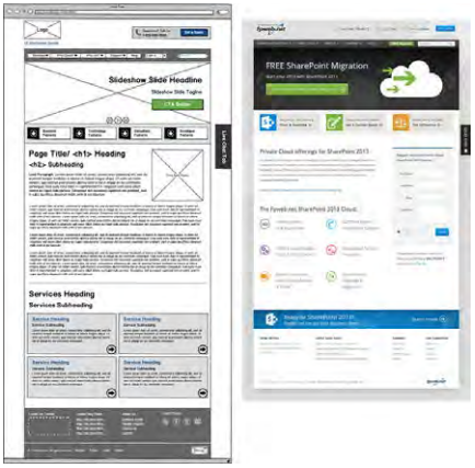
Prototypes are a step up from wireframes, in that they are interactive. Prototypes are essentially sets of wireframes that have been linked together like a website, so that they can be navigated through by clicking and scrolling.
Prototypes are excellent tools for testing the flow and function of a proposed website before diving into the costly and lengthy design and development phases. They can save a lot of time, money and effort by helping to identify problems and improvements upfront. Again, paper prototyping is the best method for fast, iterative UX design.
Assemble the other elements
Once you’ve defined your content and mapped out the basic layout of each page, you need to add all the extra elements that your website will need. Remember that the page should only ever contain the elements a user might need to support them in their task. These can include:
Paper prototypes make testing quick and easy. They’re portable, easy to use, and don’t require complex tools, Internet connections or user skills. Mobile Apps like Pop (popapp.in) easily turn paper prototypes into clickable demos. See section 5.8, Tools of the trade for more information on the Pop App
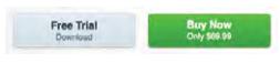
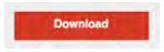
Calls to action. CTAs can take a variety of shapes and forms, from in text links to large buttons.
Forms. These are interactive fields where users can enter their contact details or other information, for example, to sign up for a newsletter or enter a competition.
Search. Many sites can benefit from having a search function, both to help users navigate and to make finding specific information easier.
Calls to Action
Successful CTAs are simple, quick, clear actions that don’t require the user to do anything scary or to make a commitment. They should always do exactly what they state in order to instil confidence and clarity. It’s all about managing user expectations, do they actually go where they think they will, or perform the action users expect?
Positioning
The primary CTA should usually appear above the fold to capture the attention focused here. Other CTAs can appear below the fold, and the main CTA can also be repeated lower down.
Prioritisation
A single web page can be built around one CTA, or could incorporate a wide range of possible desirable actions. This all comes down to what the page and website overall is seeking to achieve, based on the business requirements.
When multiple CTAs are used, there should be one primary one that stands out strongly and the others should be more muted, playing a supporting role. CTAs can be differentiated through colour, shape, placement and size; the fewer choices, the better.

Clickability
Any CTAs that can be clicked must look tactile or touchable. This means they must stand out somehow from the background and from static elements. One approach is to make the button look like a real button, standing out from its environment. Another train of thought advocates for the flat design approach as a more elegant and modern expression of this.
Quantity
Finally, be sure not to overwhelm users with too many choices. Stick to one central CTA per page, making it obvious to users what the main goal, action or outcome of the page is.
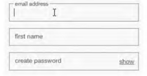
Forms
Forms are extremely useful tools for gathering user information and encouraging interaction on the site. Users are generally familiar with them and have some experience filling them out, and there are lots of web conventions that govern how these should be set up. As a general rule, the shorter you make your form, the better. The fewer fields users have to fill out, the more likely they are to complete the process.
Steps and sections
Simple forms with only a few fields can be assembled as a series of boxes. For forms that are longer, for example, those in eCommerce checkouts or complex registration processes, it makes sense to split them up into manageable portions. Manage users’ expectations by clearly indicating what the next step is.
Relevance
Simplicity is a key consideration, forms should be as short and clear as possible. The effort must be equal to the reward gained. All of the fields included must be clearly relevant to the purpose of the form, otherwise users may get confused or suspect that you are harvesting their information.
It is important that users are notified about which fields are required and which are optional. If all the fields are required, then the form should indicate this clearly.
Be aware of local laws that define what information you’re allowed to collect, and how you can use it.
Assistance
It is a good idea to include help for users filling out forms. This is especially the case where a specific field requires inputs to be entered in a certain way and doubly so for password fields with special rules. Users will not instinctively know the rules associated with specific fields, so you must provide plenty of guidance along the way.
A form should be well designed and intuitive rather than provide tips and text to users on how to complete it. Ideally, users shouldn’t need any help at all.
Validation
Validation means giving the user feedback on the inputs they have submitted whether correct or incorrect. Validation can happen at two points, after the user has submitted the form, which is submission validation, or during the process of filling out the form which is live inline validation. Submission validation is essential for protecting the database, but will also assist in catching user errors. Live inline validation usually results in much better user experiences as the users then know that their information is correct before submitting the form.
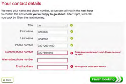
Error messages are an important part of validation that is shown to users. Error messages are often ignored in UX development and are a huge source of frustration for users.
Some best practice to consider:
- These messages should be easy to understand meaning the user should not struggle to understand the error or how to fix it.
- The error message should stay visible until the error has been corrected.
- The tone of the message should match the rest of the site.
- It is important to remember that a form is a conversation with users. It’s an interactive dialogue even though you are not present.
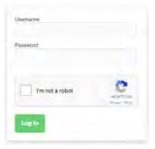
reCAPTCHA
reCAPTCHA is a free service offered by Google that requires users to answer questions to prove they are not bots. It helps to protect websites from spam and abuse, but does reduce conversions and in certain instances can render the site unusable for users. Despite these accessibility issues, reCAPTCHA is still an important factor when developing forms in order to protect your website.
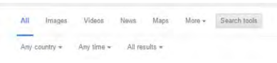
Search
Search has three useful functions on a website. Not only does it help users to find specific things, it also serves as an essential navigation aid for larger sites, and collects valuable data from keyword research about what the user is looking for. From the UX practitioner’s perspective, there are some important non-technical principles to bear in mind.
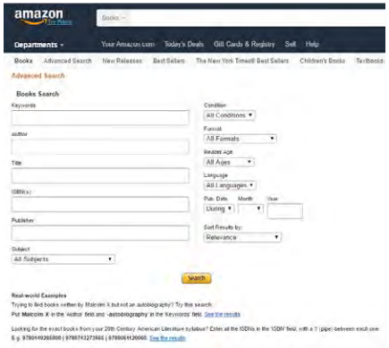
For large sites, it can be useful to allow users to search within categories. On Amazon, for example, you can search just within the category ‘books’.
Positioning
Search will either be the primary starting point for your site, or it will be a useful additional tool. In the former case, for example, on a large eCommerce site such as Amazon, the search tool should be positioned centrally and visibly to encourage the user to use this as the main navigational tool. In the latter case, best practice dictates that it should be in the top right corner, or easily accessible in the sidebar.
Accuracy
The better you can interpret what your user is searching for, the more relevant and accurate the search results can be. Google works very hard to fine-tune its search algorithm to ensure that users don’t just get what they searched for, but what they actually wanted in the first place.
User research can suggest why users would search your site in the first place, and what they would typically be looking for. Popularity and recentness of content are other key considerations.
Results
When it comes to displaying search results, there are a few key questions to ask:
How many results should be displayed per page?
Ten to 20 results per page is generally a good benchmark.
What order should results be in? Most popular first? Cheapest? Newest? Closest match?
This will depend on the nature of the site.
Can results be filtered?
Some websites allow users to do a second search constrained to the results of the first one.
What happens if there are no results?
If no search results are found, the search function should provide hints and tips to the user on how to search better on the site. The fact that there are no results should be stated clearly, followed by a list of the closest match of content to the search query. It’s quite possible the searcher didn’t know the exact term from what they are looking for or made a typo, though the site should be forgiving of these. Hints could include wildcards or breaking up the terms into smaller pieces. The message shown to users should be helpful and relevant, and not simply copied from Google’s advice.
Define the visual design
Before users interact with your carefully considered content, your excellent navigation structure and slick search bar, their first impression comes from the look of the website such as the colours, graphics, and overall design elements. As people are spending more and more time on the web, they are less tolerant of websites that don’t look good or credible. While a website is not an art installation, it is a design project, and the fundamentals of good design apply.
Read more about this in the Web development and design chapter
While much of the visual design expertise will come from the graphic designer, it’s valuable for the UX practitioner to know the following principles of visual design:
Colour
Colour has an incredible psychological effect on people. Based on our culture, preferences and learned cues, people interpret colours in very specific ways and this can be used to inform and steer user experience. When choosing the colour palette for your website, be aware of legibility and accessibility concerns. Using a lot of open or white space often makes sites appear simple and easy to read.
Imagery
The choice of images used on the website can have a massive effect on how users behave and interact on the page. You can never be quite certain which images will have the best results, so this is one area where you will need to do a lot of testing (more on that below). Humans tend to gravitate towards and identify with pictures of other humans. Content strategy should include an image strategy, especially if the site is rich in images. Camera angles, content, brand strategy and the tone of the visuals all need to be considered. Images must always be relevant and not used as fillers or pure decoration.