
4.3: Internal Data
- Page ID
- 4115
What you’ll learn to do: Process information from internal sources
Barron’s defines internal data as:[1]
Information, facts and data available from within a company’s information systems. Internal data is normally not accessible by outside parties without the company’s express permission.
While this definition seems straightforward, the complexity of gathering and analyzing these types of data can be more complicated than one might think. Processing data from internal sources requires patience, diligence and care. There are two primary concerns:
- The act of gathering information about your own organization is not without political and ethical considerations. When a person from one part of the organization seeks data about another–or about the enterprise as a whole–it can have implications for the well-being and security of people’s circumstances. Think of a salesperson who is having their volume studied by an HR analyst or an accountant being questioned about how quickly their division processes invoices—inquiry into organizational phenomena can be a charged event.
- Data can be dynamic and often hard to find. Some data are relatively straightforward and can be captured in time, or the gathering and publishing of the data is mandated by an outside element. For example, studying Apple from their 10-K is straightforward; however, learning more about their culture from people who currently work there is far more complicated, as illustrated by this Business Insider UK article here. The reasons an organization would be so close-hold about their culture is usually justified by the competitive landscape in which it operates.
think about it
How would you address gathering data on your organization if you worked in a competitive and closely-guarded industry?
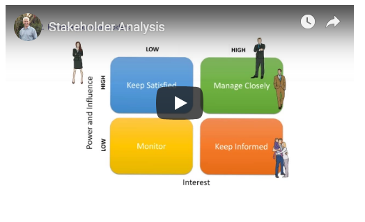
For our purposes here, the right approach to processing your data is to ask yourself early in your study, “is there any part of this project that could be problematic for any stakeholders involved?”
So, what is a stakeholder? A stakeholder is someone who has a particular interest in the organization; people who work in the organization are clear stakeholders as are customers, shareholders, suppliers and vendors. In short, conducting a (brief, at minimum) Stakeholder Analysis before your research is wise. While these types of analysis can become their own in-depth reports, your goal here is to address political, turf, and strategic sensitivities with regard to the gathering of your data; your stakeholder analysis does not need to be perfect or exhaustive, but consider it an important part of processing your data.
Learning Outcomess
- Identify types of primary sources and internal data
- Discuss methods for collecting and analyzing internal data
- Create workbooks and format data in Microsoft Excel
- Create workbooks and format data in Google Sheets
Primary Sources
Ithaca College Library defines primary sources as:[2]
[Direct] or first hand evidence about an event, object, [or person, and could include] historical and legal documents, eyewitness accounts, results of experiments, statistical data, pieces of creative writing, audio and video recordings, speeches, and art objects. Interviews, surveys, fieldwork, and Internet communications via email, blogs, listservs, and newsgroups are also primary sources.
Practice Question
Which of the following best defines the term primary source?
- Social media
- first hand evidence about an event, object, or person.
- New accounts of an incident.
- Answer
-
first hand evidence about an event, object, or person.
Internal Data
Internal data are data about your organization derived from internal primary sources. A report by HR about turnover and hiring or financials from Accounting or Finance are common examples. Note how an article in a business magazine about your organization’s talent management would be a secondary source, even if it referenced internal data–originally a primary source. Internal data are usually not available outside the organization unless the organization is mandated to produce such reports, for example publicly-traded companies must file a variety of reports with the U.S. Securities and Exchange Commission (SEC). Depending on the size of your organization, its own public filings may be a great source of material for your business reports.
Let’s take a look at Apple’s 10-K, which is a report that publicly traded companies must make annually about their organizations. Apple’s annual 10-K reports can be found online.
While Apple’s data are published publicly for large investor oriented firms (i.e., “publicly traded”), similar data would be interesting and meaningful for other companies in any business environment. We might argue that the most fundamental data are the financials, but other data, such as those around employee hiring practices, leadership bios, and other more qualitative information would still prove beneficial. In this, we can argue that quantitative and qualitative data are both desirable; both are needed to gain the best picture of the reality of a given firm’s situation.
Collecting Internal Data
Gathering data on your own organization is a much more complicated phenomenon than we might suspect. Depending on your project or business report, the politics of the event may be quite substantial. Internal data can come from a variety of sources and departments—from sales reports, financial documents, human resources information, or elsewhere.
If we return to Martha’s case, we remember that her project involves studying The Human Fund’s impact on people who are homeless in downtown Chicago. Her background reading would certainly involve looking at any available data on-hand in her own organization. Depending on where she sits, and for whom she works, this data may be readily available, or using it might necessitate some sort of cross-divisional—or at least team—privilege and access. Hopefully she can get her hands on internal information such as the number of participants in the Human Fund, find information about how long individuals participate in the program, or get numbers on the cost of the program to the company, etc.
Research in the Social Sciences
Access is a key concept in social science research. Anthropologists, who often immerse themselves with sub-cultures to observe their lives, probably understand access issues better than most other researchers. If they do not have good access to a group, their ability to conduct their study is compromised. Anthropologists studying the homeless population in Chicago might live among them for a time. Since this is impractical for Martha, she decides to do research more like a sociologist, who tend to use surveys and have less need for direct, prolonged access. Surveys can be difficult to use, however, as they may be completed incorrectly, incompletely, or not at all. When you are participating in “How did we do?” surveys after a customer service phone call or other service event, you are participating in sociological research.
watch it
Check out the following two videos that discuss anthropological and sociological data gathering:


Note the difference in attitude and goals. While this explanation is a bit simplified, the anthropologist is interested in observing and understanding culture; the sociologist surveys and tests ideas through the use of less personal, but more structured, tools. For our purposes, we may consider how both types of data collection, and both types of attitudes towards data, are useful for business report writing. The goal is getting as much insight into a problem as possible. Depending on your time available, using multiple methods is wise.
Practice Question
Broadly speaking, sociologists tend to use surveys to study organizations, while anthropologists tend to ________.
- watch from a distance.
- rely on secondary sources.
- embed themselves in the organization.
- Answer
-
embed themselves in the organization.
Analyzing Data
Your analysis of a given data set, whether internal or external, is based off of the data gathered. Anthropology tends to view the following as types of data:
- the types of interactions, often called “transactions” that the population engages in
- topics and themes of the transactions
- occurrence/recurrence of the transactions
- tensions between what the group represents as “truth” versus observations the researcher or analyst perceives differently
Anthropologists attempt to make connections and meaning by linking these data to stories and accounts of a given culture or experience. In an interview with CBS News, Dr. Genevieve Bell, an anthropologist, discusses her interest in people and how studying them is, “about spending time with them.”[3] While these data can appear “squishy” at times, or too reliant on the researcher’s interpretation, this type of study is very useful for most business circumstances. Provided the business report writer or researcher is aware of their bias(es), and has thought about the ethics of their research (i.e., stakeholder analysis), the type of insights derived can be quite helpful.
Sociological data sets can be similar, but the analysis will be more quantitative and broken down into categories and variables for statistical analysis. Surveys are the most common tool to gain sociological data. You’d naturally be familiar with many of them, for example, customer-satisfaction surveys, expressing your opinion around a particular product. Usually you’re asked to express the opinion along a Likert scale: something like “7 means you’re extremely satisfied, 1 means you’re extremely dissatisfied.” Depending on how elaborate you would like your analysis to be, working with statistical data sets can become quite complex. There are also issues around quantifying human behavior and opinion. Clearly one person’s 7 is likely to be different from another’s, even if they are similar enough conceptually. For our purposes here, we recommend you emphasize simplicity in your business data analysis. Professional sociologists, trained in skills such as multivariate analysis, can help when required, but generally this type of analysis is unnecessary for day to day decision-making and information dissemination.
If you decide to analyze data sets using statistical methods, manipulating the data through a third party platform like Qualtrics or Survey Monkey can be helpful. Develop simple surveys, and use very simple Likert scales to help quantify your data. Note that surveys present qualitative data in a quantified form; take care when representing these types of data as accurate and representative of human sentiment or behavior.
Practice Questions
What insight from qualitative anthropological study can be applied to research in business?
- Learning how to reason your way out of any situation.
- Understanding that everyone has biases, and it's typically better to acknowledge them than to pretend they don't exist.
- Understanding the variety of survey methods available and when to use which.
- Answer
-
Understanding that everyone has biases, and it's typically better to acknowledge them than to pretend they don't exist.
Working in Microsoft Excel
Imagine that you have a lot of business data. Perhaps you have names and addresses for a mailing list. Maybe you have inventory data or quarterly sales values. All this information could be kept in a Word document, but Microsoft Office actually has an extremely useful program for organizing, storing, and even manipulating data: Microsoft Excel.
Learning to use Microsoft Excel is one of the most helpful and versatile workplace skills you can acquire, and creating a worksheet in a workbook is the first step. Many of the skills you learned for Microsoft Word can also be applied to Microsoft Excel, such as basic text formatting and file extensions. The file extension for a Microsoft Excel workbook is .xlsx, although pre-2003 versions of Excel might use .xls.
In this page, we’ll focus on the manipulation of data, rather than the appearance of the worksheet. Additionally, while this page only provides one method of completing each task, there can be multiple ways to accomplish a single goal. For more in-depth instruction, check out this online course covering the basics of Microsoft Excel.
Using Excel
Before using a workbook, it is helpful to know a few key terms.
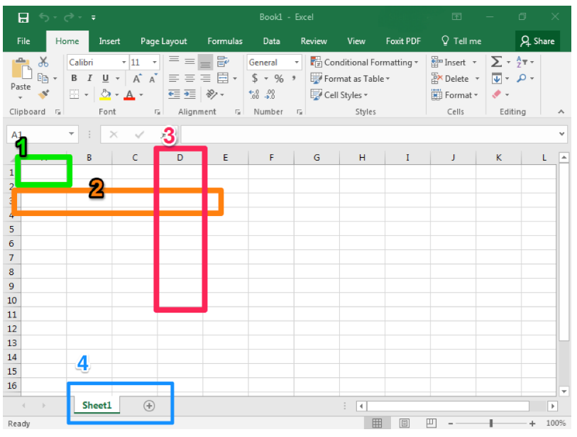
- Cell. This is the area where you will enter data.
- Row. Rows are cells aligned horizontally.
- Column. Columns are cells aligned vertically.
- Worksheet. A worksheet is a single page within a workbook. Like the tabs in an internet browser, the tabs in an Excel workbook show different pages, or worksheets. A workbook may have many worksheets included in it. In this screenshot, the workbook only has one worksheet and one tab, which is labeled Sheet1. The selected tab shows the selected worksheet. Clicking the + button will add another worksheet. When you save a workbook in Excel, all of the worksheets in that workbook are saved.
Comma Styles
At times, you may also wish to use a specific comma style with numbers entered into an Excel worksheet. For example, you may wish “1234” to display as typed or with a comma like “1,234.”
Comma styles are easy to change in Excel using a quick select option in the Number group in the ribbon. Simply to click on the Comma Style button in the Number group.
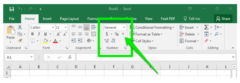
When clicking the comma style button, the comma style default is to display numbers with a comma in the thousands place and include two decimal places (Ex: “1200” becomes “1,200.00). This will also change the visible cell styles in the Style” area of the ribbon so you can easily select different options for comma and display format.
Listed below are the three most common options for comma and display format.
- Comma: Comma with two decimal points (e.g., 1,234.00)
- Comma [0]: Comma with no decimal points (e.g., 1,234)
- Currency: Comma with two decimal points and a dollar sign (e.g., $1,234.00)
Cell Format
As mentioned previously, Excel will default to certain styles when you create a new worksheet. In particular, this includes the way that numbers are displayed and whether or not commas are automatically included. In this section, we will take a look at changing these defaults.
When you type numbers into an Excel workbook, it will often default to a specific format. For example, if you type “12/15/17,” Excel will convert this to read “12/15/2017,” assuming you were entering month, day, and abbreviated year. Similarly, “3/4” will display at “4-Mar,” the fourth day of March. However, it is possible that you may have been entering fractions, so “3/4” was meant to indicate three-quarters instead.
If this is the case, you will need to format your cells to properly display the information you are entering. When possible, consider formatting your cells before you enter the data. Otherwise, Excel may convert some of the entries and you will need to re-enter that information.
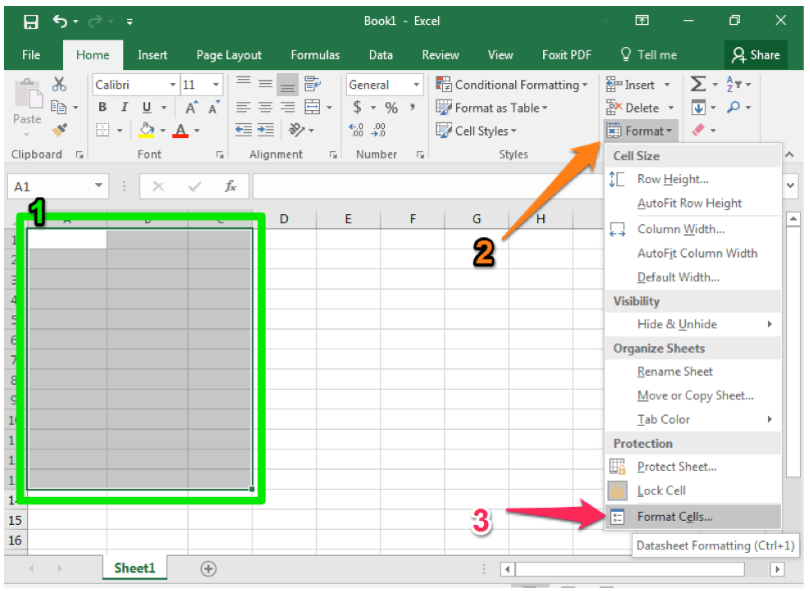
- Begin by highlighting the cells you plan to use.
- Select the Format dropdown from the Cells group of the ribbon.
- Select the Format cells option at the bottom of the dropdown menu.
Flash Fill
Like many modern software programs, Excel is designed to recognize certain patterns. For example, perhaps you are creating a table that lists the last and first names of attendees at a company training session. After all the names have been entered into two separate columns, you realize you would like a single column to correctly display the full name. An easy way to achieve this without having to manually retype the entire list is to use Flash Fill.
- Create a new column for the combined information you wish to display.
- In the first cell, type the name as you wish it to display. In our screenshots, this would be “John Smith.”
- Begin typing the next piece of data in the next cell. Excel should automatically suggest a Flash Fill option.
- If the Flash Fill suggestion matches how you would like the information displayed, simply hit the Enter key and the rest of your column should fill in automatically.
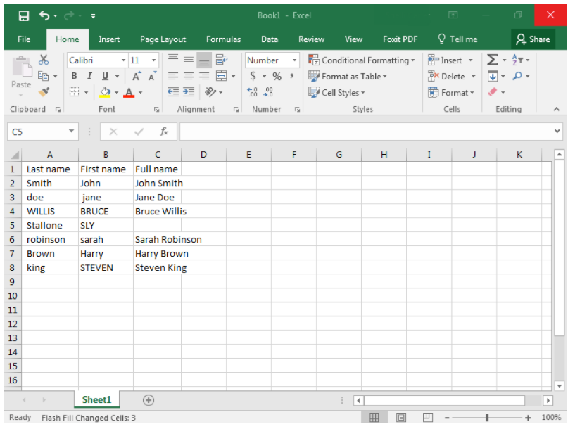
Flash Fill is especially helpful if your data is initially in different forms but you want the final information to display in the same fashion. For example, in our attendee list, some of the names were capitalized, in all caps, or had no capitalization. Sometimes you may need to manually update more than one option but Excel will detect your pattern.
Flash Fill should automatically be turned on in Excel but if it is not, you can turn it on using the File > Options > Advanced menus. You can also turn Flash Fill on or off using the shortcut Ctrl+E. Be aware that the Mac version of Excel does not have Flash Fill.
SUM Data
One of the main uses for Excel is to organize and manipulate numerical data. Often you may wish to add up all the numbers in a column or row. Excel has formulas and commands to automatically add your data, and the easiest way to use this feature is the AutoSum button.
- Once your numbers are organized in either a row or column, click on the cell where you would like the total sum to display. In the screenshot below this was A13.
- Click on the AutoSum button from the Editing group of the ribbon.
- Excel will highlight the cells that it is adding up and will apply the SUM formula.
- Hit Enter to accept the highlighted cells and see the total value of your data.
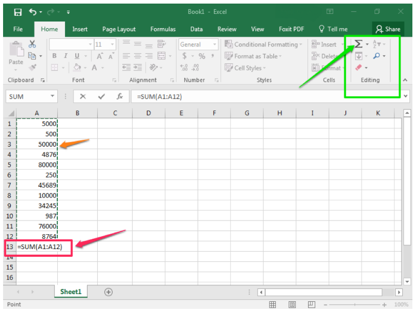
Note that it is possible to SUM several columns (or rows) at once. Select all the cells you wish to display a SUM and click AutoSum. Excel will individually add up the columns.
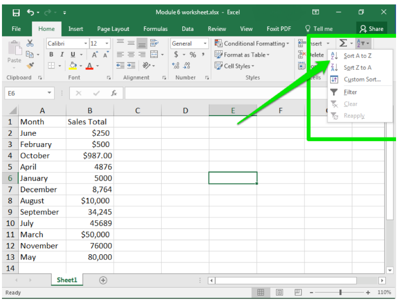
Sorting Data
- Select the column or row you wish to sort.
- From the Sort & Filter button in the Editing group in the ribbon, click the Sort button.
- From the menu, choose how you would like to sort the data. For example, A to Z or Z to A. Note that A to Z is equivalent to Smallest to Largest and Z to A is equivalent to Largest to Smallest.
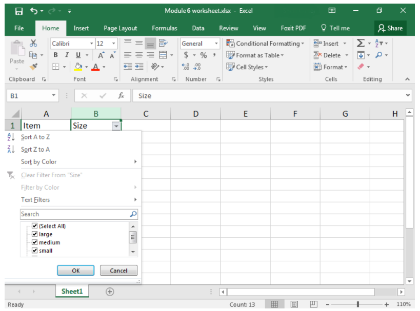
Filtering Data
After entering data in Excel, it is also possible to filter, or hide some parts of the data, based on user-indicated categories. When using the Filter option, no data is lost; it is just hidden from view.
- Select the column or row you wish to sort.
- From the Sort & Filter button in the Editing group in the ribbon, click the Filter button.
- When the Filter menu appears, you can choose which categories of data to hide and deselect the appropriate buttons. For example, you can deselect the button next to large and you will no longer see the large cells in your table.
Functions
Excel can perform a variety of really nice data analysis features for you. We’ve already touched upon how you can filter data. But you can also look for other connections, or screen large numbers of cells to determine how often something occurs.
COUNTIF
COUNTIF is a way for you to ask Excel to count how many times a certain piece of information appears in your worksheet. For example, perhaps you want to know how often “shirt” appear in an inventory list. All you need to do is ask Excel to count the number of cells that contain the word “shirt.”
- Determine which cells you want Excel to look at. In our example, we will look at A2 though A13.
- Click on the cell you wish your count to be displayed in.
- Type the formula for a count
=COUNTIF(A2:A13, “shirt”)
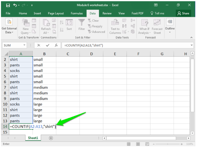
Here you are telling Excel which cells to examine—A2 through A13—and what to look for: “shirt.” Note that your text must match exactly what is typed in the cells, and if you are looking for a specific word it needs to be enclosed in quotation marks (so “shirt” instead of shirt).
- Hit enter and your results will appear.
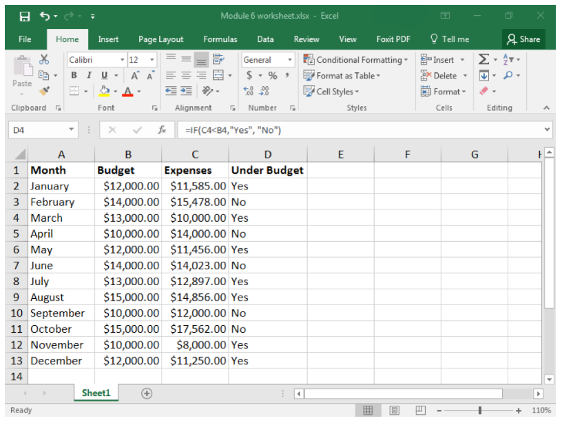
IF
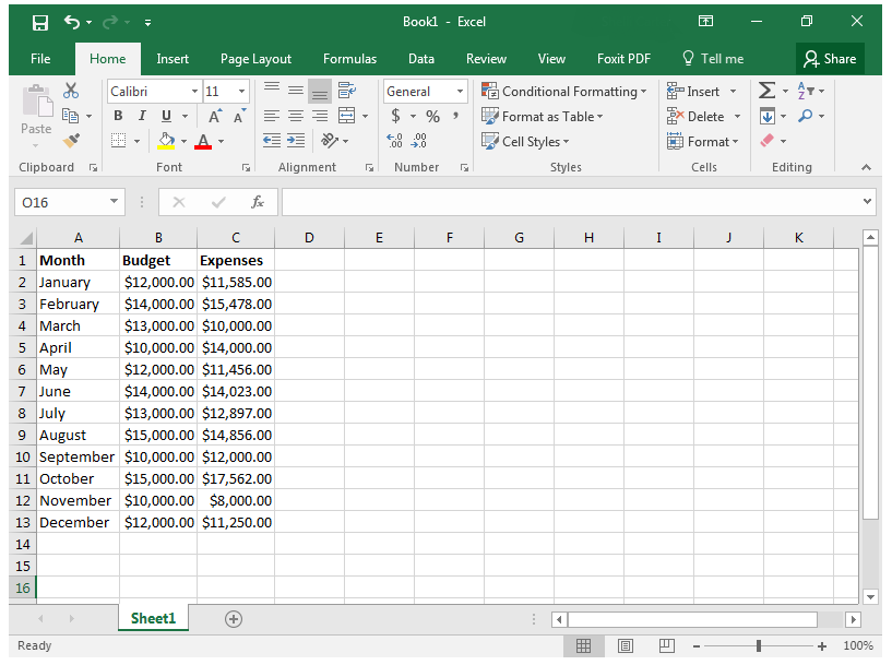
Another commonly used function in Excel is the “IF” function. In this case, you are asking Excel to look for something and then tell you if that something occurred. For example, perhaps you want to compare whether your monthly expenses were under your monthly budget. That is the scenario we will look at in our example.
In this case, let us just ask for a simple “yes” or “no” answer. Looking at the screenshot below, you can see how the worksheet has all the data at hand. We are looking for whether the information in the C column is less than the information in the B column. We would like the D column to display the answer (yes or no).
- Click on D2 and enter the “IF” function for what you want Excel to compare and do.
=IF(C2<B2, “Yes”,”No”)
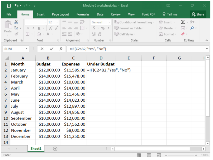
- You do not have to manually reenter the formula into the other cells in D. Instead you can copy and paste the formula from D2 into D3, D4, and so on. Each time you do this, the formula should automatically update with the correct cell number to compare.
As you can see, the D cells begin to display “Yes” or “No.” “Yes” means that the expenses in the C column were less than the monthly budget entered into the B column. “No” means that expenses were higher than the budget. Just as in the COUNTIF function, you need to enclose text in quotation marks.
Practice Questions
Amy just received a worksheet from the automated call center. She is interested in seeing how many calls Mike, the newest employee, was able to process. What Excel feature should she use to determine this information?
- "IF"
- "COUNTIF"
- Filter
- Answer
-
"COUNTIF"
Practice Questions
Randy is trying to determine if customer complaints are still active in the tracking system and then why. After he receives a worksheet with all the complaints and their status listed, he first wants to indicate on the spreadsheet which ones are still active with a new column that shows ‘yes’ or ‘no’. Which Excel function should he use to do this?
- Filter
- "COUNTIF"
- "IF"
- Answer
-
"IF"
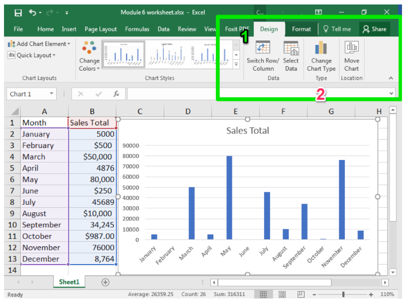
Clustered Column Charts
Excel is not just used for organizing and processing data and formulas. It also can be used to visually represent data in the form of charts and graphs. In this page, we will work on creating a basic chart, the clustered column chart, and then modifying a chart style.
A clustered column chart is sometimes called a bar graph, because it shows data organized in solid shapes like pillars. A clustered column chart organizes these pillars up and down, so they are “columns.” On the other hand, a clustered bar graph organizes these pillars left to right, so they are “bars.” Bar graphs are useful charts when looking at changes from month to month or across employees.
The first step to creating any chart is to organize your data. It is definitely a good idea to include headers in the first cell of each column. By default, a clustered column chart will cluster the data by the columns in your table, so try to keep that in mind when setting up the worksheet.
- After organizing your data, select the cells you wish to include in the chart. This should be at least two columns.
- Click on the Insert tab and find the Charts group of the ribbon.
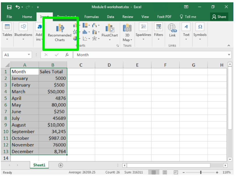
- “Clustered column chart” is actually a recommended chart. Click on that chart.
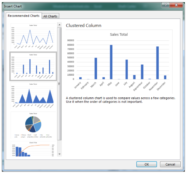
- When you select the chart, you will see colored boxes surrounding the data that connect to the different categories of the chart.
Practice Question
Lorenzo has returned item data organized by month. If he wishes to visually see which month had the most returns, what should he do?
- Sort the data
- AutoSum the data
- Create a clustered column chart
- Answer
-
Create a clustered column chart
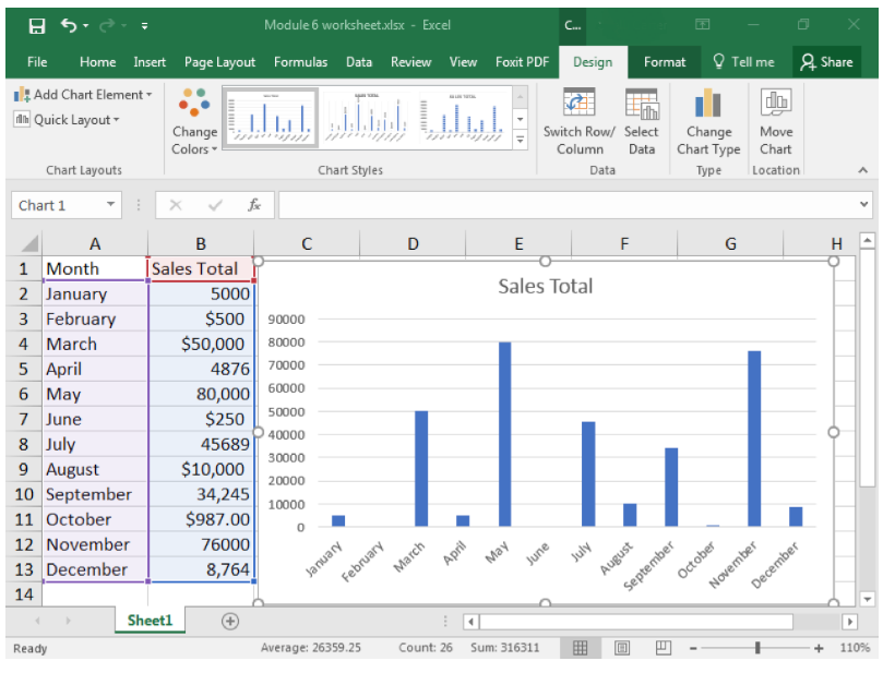
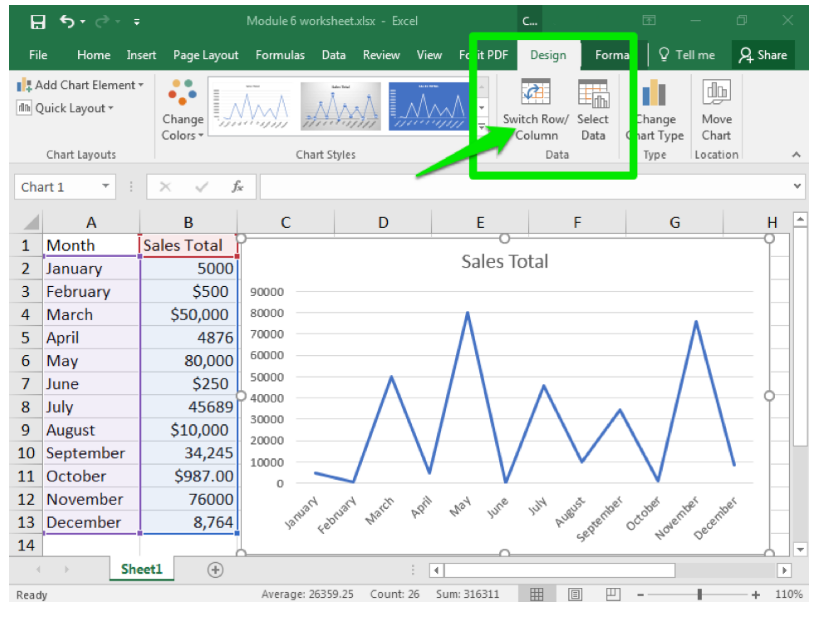
Chart Styles
Once you have created a chart, or if you are given a worksheet that contains a chart, it is very easy to change the chart style.
- Click on the chart you wish to change. The Design tab should appear in the ribbon area.
- Click on Change Chart Type button
- Click on the type of chart you would like.
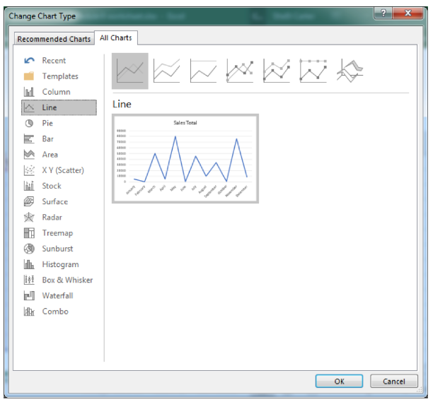
From this same window, you can also switch the data that is being charted. For example, you can switch which data from a row to a column or change which data is arranged on the x- or y-axis.
Conditional Formatting
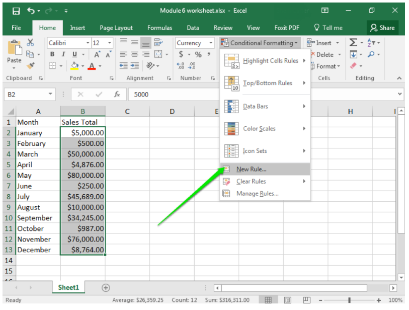
As we have learned so far, Excel has a wide variety of easy to use tools for organizing, sorting, and otherwise marking information. Think back to when we applied styles to a cell to indicate good information or information that needs to be verified. Excel also has the ability to automatically apply such markings through conditional formatting.
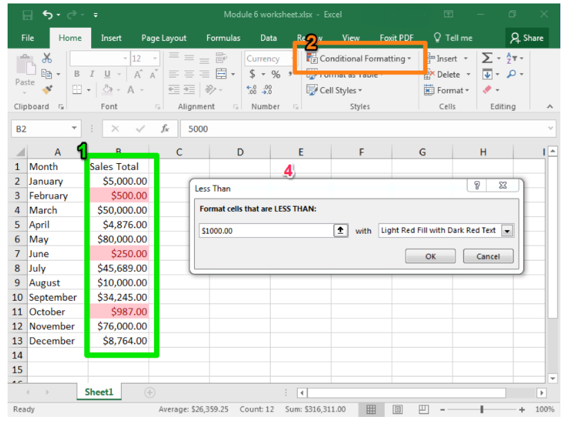
With conditional formatting, you provide Excel with a rule, such as “less than 10,” and the program will scan through your data and highlight all the cells that meet that rule. There are several rules already available, but you can also create and apply your own rules and visual clues.
- Select the cells, rows, or columns you wish to have conditional formatting.
- From the Styles group, click on the Conditional Formatting button
- Select the style of formatting you would like. Here we have Highlight Cell Rules.
- Select the specific type of rule you would like to use and then apply your target value. Here we have selected Less Than.
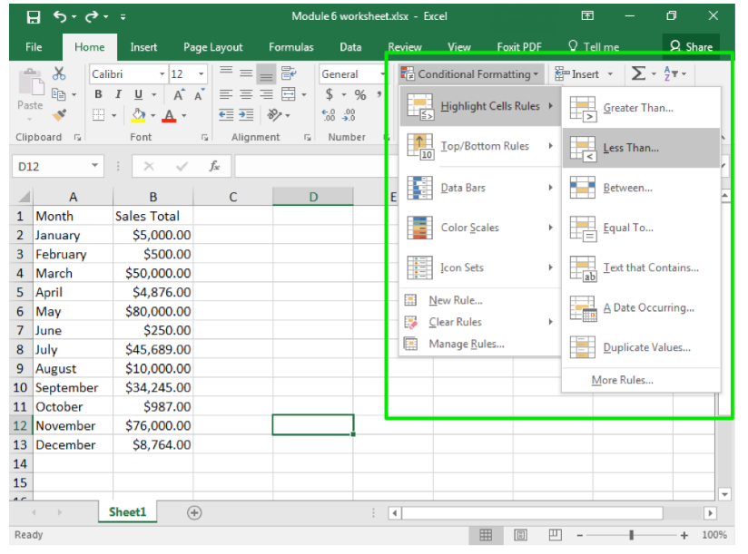
- The formatting will appear automatically so you can see what it will look like. Note that Excel will automatically provide a value, but you can manually change it.
- Hit OK if you wish to apply the formatting. Otherwise, when you leave the formatting menu, it will disappear.
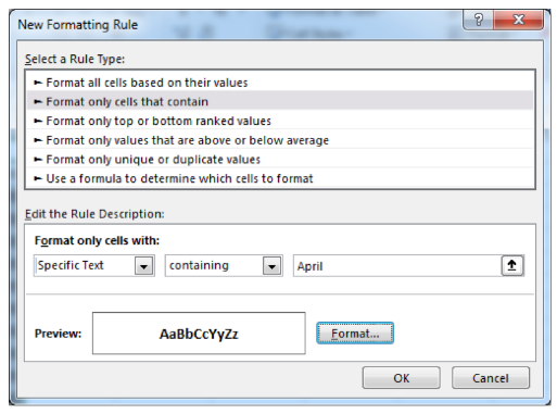
One important tool to keep in mind is the ability to enter your own rules. This can include applying formatting to specific date ranges, to specific text (like names), or even cells that are blank. In this case, you also set the format, so instead of highlighting cells you can choose to strikethrough text or change the font, change the size, or bold the text.
Practice Question
Marisa just received a large worksheet with the last five years of names from the monthly mailers. She wants to quickly determine how many duplications there are in the list. What should she do?
- Conditionally format with "Highlight Cells Rule">"Duplicate Values"
- Manually search through the text for duplicate addresses
- Conditionally format with her own specific rule for specific addresses
- Answer
-
Conditionally format with "Highlight Cells Rule">"Duplicate Values"
Working in Google Sheets
Google Sheets is very similar to Microsoft Excel. Perhaps the greatest difference between the two is Google Sheets’ online functionality, which allows for real-time collaboration. Additionally, as Google Sheets is a free online tool, you can be assured everyone you’ll work with has or can get access to Google Sheets, as long as they have the internet.
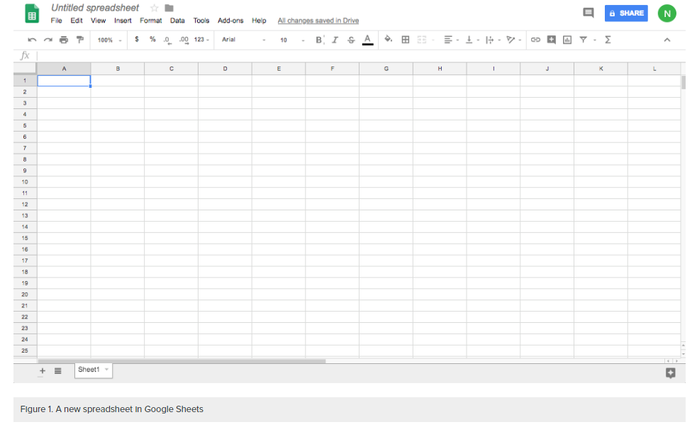
In Google Sheets, the creation of a spreadsheet, the manipulation of data, and the type of use and results are all very similar to usage in Microsoft Excel. Below is a screenshot of a raw and unused Google Sheet. Note the same columns and rows orientation, various ways to adjust the display of numerical data via the menu bar buttons, and formula buttons along the top bar (Figure 1).
Learning to use Sheets is similarly helpful to learning Excel; both use the same type of data organization and manipulation, and creating a worksheet is nearly identical. Many of the skills you learned for Excel can also be applied to Google Sheets, such as basic text formatting. File extensions for Google work differently, and arguably a strength of Google Sheets over Microsoft is the ability to collaborate in the cloud real time on a given sheet.
In this page, you will learn the basics of using Google Sheets, focused on rearranging information into tables and changing style elements.
Practice Question
What is arguably the best feature of Google Sheets?
- Integration with other office apps.
- Real time collaboration
- Visually simple and easy to use.
- Answer
-
Real time collaboration
Creating a New Speadsheet
You can open Google Sheets by logging into Google Drive on any web browser or by going directly to sheets.google.com. Once there, you’ll be taken to the Google Sheets home screen (Figure 2).
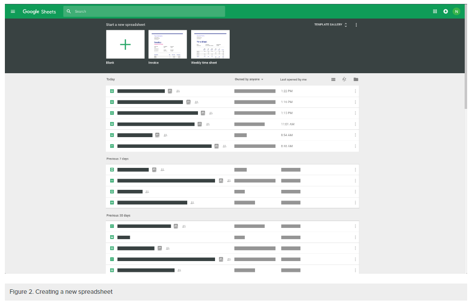
To create a new Google Sheet, click on the blank tile with the large green + symbol (as seen in the upper left of Figure 2). This will open a new sheet identical to the blank sheet seen in Figure 1.
Using Google Sheets
Most of what you see is very similar to Excel. Arguably, Excel has more functionality, and it probably should be used if large data crunching—pages and pages of data—is necessary. For minor data analysis, or for looking at flow charts or other data visually, Google Sheets is probably better than Excel. This is true particularly if you consider the robust sharing features that come with Google Drive. Microsoft Office also has online, cloud-based sharing. Our recommendation would be to experiment with both for your research needs.
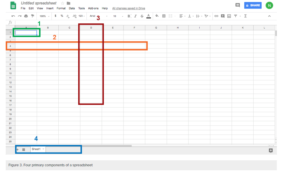
Like Excel, Sheets has the following exact terms:
- Cell. This is the area where you will enter data.
- Row. Rows are cells aligned horizontally.
- Column. Columns are cells aligned vertically.
- Worksheet. A worksheet is a single page within a workbook. Like the tabs in an internet browser, the tabs in a Google Sheets workbook show different pages, or worksheets. A workbook may have many worksheets included in it. In this screenshot, the workbook has only one worksheet and one tab, which is labeled Sheet1. The selected tab shows the selected worksheet. Clicking the + button will add another worksheet. Saving is automatic in Google; when you build more sheets, they will all be saved in that workbook.
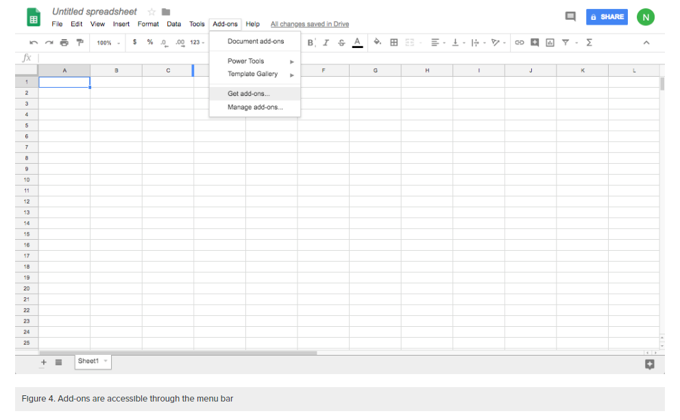
Add-ons
While the majority of Google Sheets is almost identical to Microsoft Excel, there are notable differences. The primary difference we’ll focus on here are Google Sheets add-ons, which you can access in a drop-down menu (Figure 4).
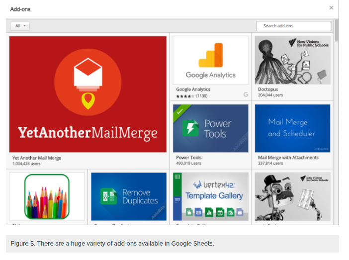
A strength of Google Drive, and Google’s office suite writ large, is the addition of third party add-ons. These range from styles that can change the look and feel of a given Sheet (see Figure 5), to the addition of macros or tools that help with grading or other type of data analysis. Depending on your data and goals for using the data, you can choose from literally thousands of options. If you are looking for a particular functionality, you can use the search bar in the upper-right corner of the add-ons window (Figure 5).
These add-ons can be used for a variety of purposes, most of which revolve around adding or “popping” functionality into the spreadsheet itself.
vertex template gallery
The Vertex Template Gallery (seen in the bottom row of Figure 5) gives you the option to use several pre-built templates ranging from project management/waterfall planning tools, to budget sheets and even survey forms.
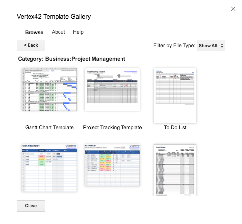
Figure 6. Templates available through Vertex Template Gallery
For your business research needs, there are a few key strengths of Google Sheets to consider. Michael Ansaldo, of PC World, wrote that users should consider Sheets when the following are key aspects of your project:[4]
- Cost: Google is free to use, which can be particularly useful for smaller or newer teams where money is often much tighter.
- Collaboration: Google Sheets is better suited to collaboration between multiple parties, particularly if you need to write on the same spreadsheet in real time from various computers and places. Using a shared spreadsheet can cut down on time and confusion.
- Google Integration. Google has created a host of tools that provide unique functions, and these tools can integrate seamlessly with Google Sheets.
- Tracking Changes. Google Sheets automatically keeps track of the version history of a document, as well as keeping track of who made changes (as long as a user is signed in).
In his article, Anslado expands on the utility of Google integration:[5]
Because of its tight integration with Google, Sheets can import all kinds of data from other Google services and the web at large. You can translate the contents of a cell using the function GOOGLETRANSLATE(), or you can fetch current or historical securities info from Google Finance with the function GOOGLEFINANCE(). And with Sheets IMPORTFEED and IMPORTDATA functions, you can pull information from the internet directly into your spreadsheet.
in summary
Both Microsoft Excel and Google Sheets are excellent spreadsheet tools. Both have similar functionality, and use formulas to “crunch” quantitative data. Arguably for business report writing, Google Sheets might be better, especially if there is a need to collaborate on the same sheet in real time.
- All Business, "Internal data." Barrons Dictionary. Web. 12 June 2018. ↵
- Ithaca College Library. "Primary and Secondary Sources." Web. library.ithaca.edu/sp/subjects/primary. 18 June 2018. ↵
- CBS News. "Intel's cultural anthropologist talks life and technology."16 May 2013.Web. https://youtu.be/ntnyl2V0U9g. 18 June 2018. ↵
- Ansaldo, Michael. "Microsoft Excel vs. Google Sheets: The 4 key ways Sheets beats Excel." PCWorld. Sep 28, 2015. Web. 12 June 2018. ↵
- Ibid. ↵