
5.4: Charts, Diagrams, and Graphic Organizers
- Page ID
- 4123
What you’ll learn to do: Discuss how to most effectively use charts, diagrams, and other graphics in business messages and identify potential sources for these visual aids
When you communicate data, you can’t just throw a whole bunch of numbers on a page and expect that readers will understand what you want to say. Charts, tables, and graphs help communicators organize that data in a way that helps their audiences understand the story the data tells and, hopefully, interpret it correctly.
In this section, we’ll discuss the types of charts, graphs, and diagrams available to help you show off your data in ways that make it accessible to your audience. We’ll look at specific communication challenges and determine which kind of chart or graph best illustrates your message, and finally, we’ll discuss how to format your chart so that your story is easily and quickly understood.
Learning Outcomes
- Discuss the appropriate use of common tables, charts, and infographics
- Describe factors in deciding which type of visual aid and graphic will best report your data
- Describe the impact of placement, style, and coloring when incorporating graphics into a message
- Describe the impact of descriptive captions and titles when incorporating graphics into a message
Tables, Charts, and Infographics
In this age of information, there are huge amounts of data to process and an equally impressive number of graphs and charts you can use to tell the data’s story. Here are some of the more commonly used graphs and the kinds of stories they can help you tell.
Practice Question
When should you use a chart or graph?
- Only if you have numerical data to communicate to your audience
- To simplify data of any kind, whether it's represented in numbers or in words
- Only without any text to explain what it is
- Answer
-
To simplify data of any kind, whether it's represented in numbers or in words
Numerical Data Charts
Let’s talk about a few of the most common types of numerical charts:
- Bar graphs
- Line graphs
- Pie charts
- Stacked comparison charts
Bar Graphs
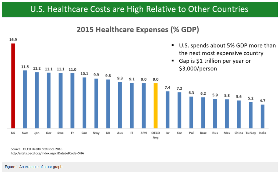
Bar graphs are used to compare categories. The x-axis (the horizontal line at the bottom of a graph) is usually used to show the categories: in this case, countries with universal healthcare expenses for 2015. The y-axis (the vertical line) isn’t marked here, but it’s clearly showing dollars spent in millions. The taller the bar, the more dollars were spent. This chart clearly shows that the United States spends more on health care per citizen than other countries. This is clearly identified on this chart with bars in contrasting colors. You can’t help but notice it—it breaks pattern and it’s a bold color that draws the eye.
Line Graphs
Like bar graphs, line graphs compare categories, but they’re most often used to show trends. With the x-axis frequently showing the passage of time, the graphed data points will show an upward or downward trend of the categories in question
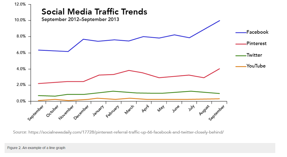
The line graph above illustrates social media traffic trends. Each social media organization is represented by a different colored line. The x-axis shows the passage of time, and the y-axis shows the percentage of media traffic each organization is capturing. The graph shows that Facebook traffic is trending up, while Pinterest has experienced some ups and downs. Third-place Twitter traffic is relatively flat.
Pie Charts
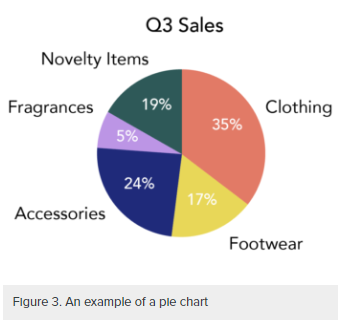
Pie charts show the composition of data, or the pieces of a whole. It can be as simple as “the team here is composed of 50 percent men and 50 percent women” or “Our sales are made up of 30 percent fiction books and 70 percent non-fiction.”
In Figure 3, the whole pie (the whole circle) represents the total products sold at a store; the pieces of that pie show you the percentage of sales each department made. A chart like this makes it very easy to see that the clothing and accessory departments make up the largest section of sales, and fragrances the smallest.
Some comparison charts aren’t shaped like a circle. Sometimes they’re donuts, and other times they’re shown in bars, as we’ll see next.
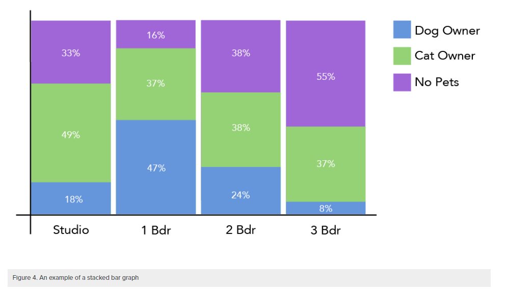
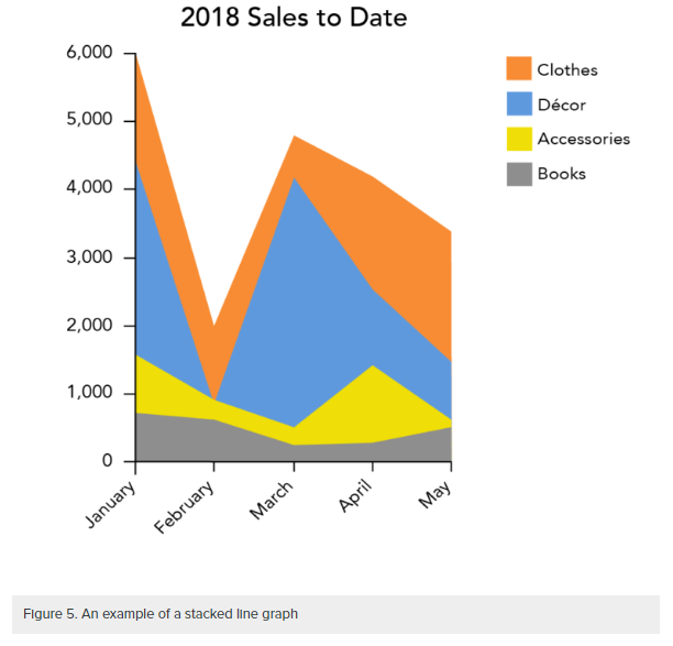
Stacked Comparison Charts
You can compare categories with a “pie chart” approach, incorporating the composition factor in a variety of ways. The categories in this chart are represented by bars, but the bars themselves are composition charts. Each bar is valued at 100%, and the colored blocks represent different levels of pet ownership within the population.
Similarly, the line graph below is “stacked” to show the level of sales based on product type. You’re seeing a trend as well as a portion of a whole – comparing and viewing composition.
Non-Numerical Data Charts
The charts above are very handy when your data is numeric. But there are charts for other types of data. Let’s talk about a few of the most common types of non-numerical charts.
- Venn diagrams
- Flow charts
- Gantt charts
- Organizational charts
- Pictographs
- Infographics
Venn Diagrams
A Venn diagram shows a comparison of two different categories and the items they have in common. The diagram in Figure 6 shows us the different types of image types that can be safely shared on the Internet.
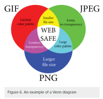
Wherever the circles overlap represents a shared characteristic. For example, JPG and PNG files both have a large color palette, so they overlap in that area. “Web safe” is a characteristic shared by all three, so it’s in the middle where all the circles overlap. Areas of each circle that do not overlap represent characteristics unique to each file type—something they don’t share with any other file type represented.
Flow Charts
Flow charts show a process. Flow charts document a sequence of events from start to finish so that the process can be documented, followed, and managed.
The flow chart in Figure 7 shows the process of how theories are created, spread, and accepted.
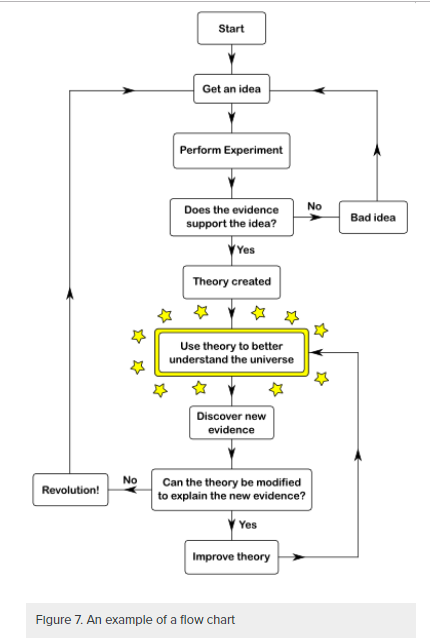
You can see at the top there is an idea that leads to an experiment, and then the results determine which path is taken. If the experiment is successful or unsuccessful, different paths will be chosen. Along the path of the flow chart, all alternatives are presented and choices are made between them. Your eye follows the path from start to finish for every part of the scenario.
Gantt Chart
A Gantt chart is a timeline. Multiple projects can be added to the timeline with start and finish dates, and milestones and deadlines are also reflected. This chart is used to determine how long a project will take, the resources needed, and the order in which tasks need to be completed.
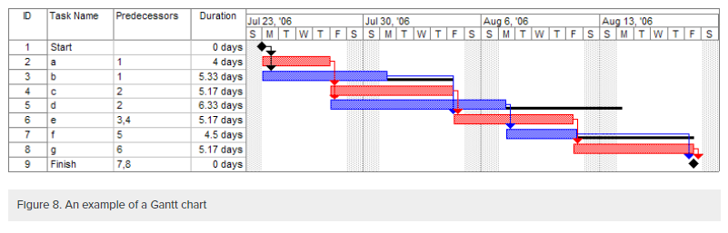
In Figure 8, you have two different teams running one project. The Market Team (red) completes the market research and defines specifications by the week of July 23rd (the date of the first milestone). Then, the Planning Team (blue) takes over with the overall architecture and project planning and is responsible for hitting that second milestone on August 6th. As you can see, the Market and Planning Teams have additional work to contribute even after their milestones are hit, and the project is not complete until the end of November.
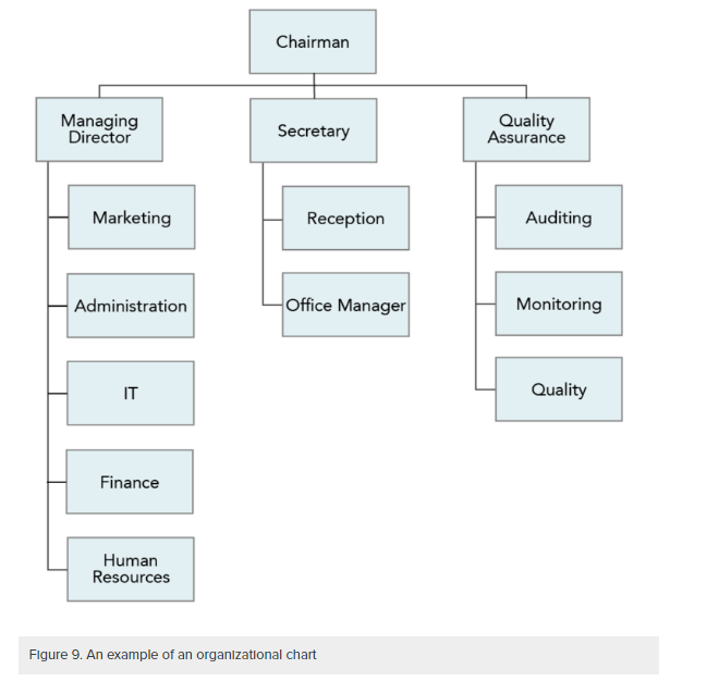
Organizational Charts
Organizational charts (sometimes call hierarchy charts) show the people in an organization and their reporting relationships. Usually, the organizational chart will have a chairman or CEO at the top, followed by a team of presidents and vice presidents, and then their direct reports, and so on. An organizational chart is usually created and maintained by human resource professionals who wants a visual view of their organization’s structure and reporting relationships so they can make better decisions about leveraging the company’s talent.
The organizational chart in Figure 8 shows a chairman at the top of the hierarchy and a managing director, quality assurance leader and a secretary reporting directly to the chairman. Each of those direct reports has direct reports of his or her own, and so on.
Pictographs
Pictographs use symbols and images to convey data, information, or ideas. The pictographs in Figure 9 are actually part of a resume and signal what kind of information can be found next to each pictograph (phone number, address, Twitter handle, and email respectively).

Figure 9. Four examples of pictographs
This makes it easier for a recruiter to view and pick out the necessary contact information. Other pictograms can convey processes (like the instructions to build IKEA furniture) or information (like when the weather app on your phone tells you it’s going to rain today by posting a picture of a rain cloud).
Infographics
Similarly, infographics use pictures, but they also incorporate data and words, all to explain a single point. Infographics can be used to make a complex subject a little simpler to understand, particularly when there are more than two or three factors to consider. They can also be used to compare two or more categories and make your data more interesting and eye catching.
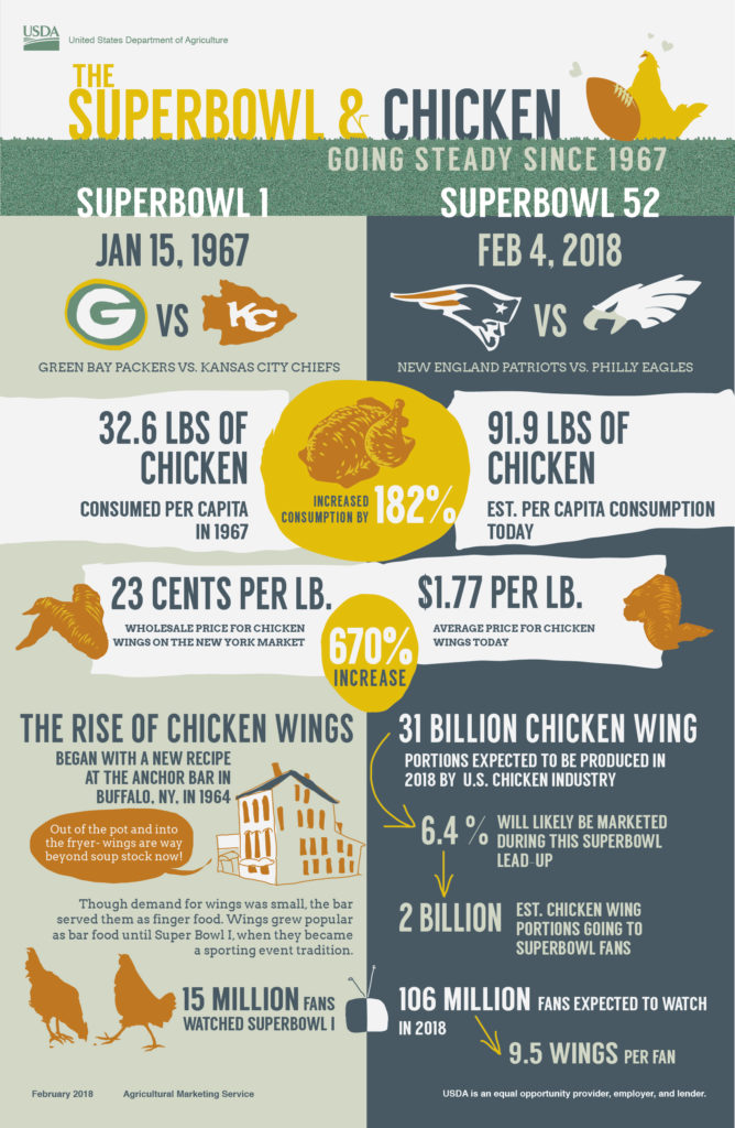
This infographic shows how chicken consumption relates to the Superbowl. You can see how consumption and the price per pound of chicken has increased over time. It also describes how chicken wings in particular have become more popular over time, all with a an eye-catching and entertaining quality that’s engaging and interesting to the audience.
EVEN MORE CHARTS AND GRAPHS
This is not an all-inclusive list of the kinds of charts and graphs available. If you work in the science arena, you may find yourself using scatter charts or heat maps. Statisticians might be reaching for a trellis chart or even a function graph. Learn what graphs your industry relies on most and take the time to familiarize yourself with them so you can use these important visual communication tools to your advantage.
MAKING CHARTS AND GRAPHS
As we mentioned earlier in this module, all graphs and charts that you see on the internet are someone else’s property, and using them in your work is stealing. But there’s little reason to use someone else’s chart—you’re creating your own chart to communicate your own data! Here are a few tools that can help you create something great:
- MS Excel. You’ve probably stumbled upon the charts and graph tools in your Microsoft program long ago, and if it’s simple graphs you want, that’s an easy tool to use to create them. Google Sheets and Apple’s Pages offer similar options. See Module 4: Research for more on making charts and graphs in Excel.
- Lucidchart. If it’s flowcharts you’re looking for, Lucidchart is the right place to start. This free, easy-to-use resource allows you to create flowcharts, organizational charts and diagrams that look smart.
- OnlineChartTool. If you’re looking for something different in terms of bar charts and graphs, and you’re tired of the graphics Microsoft Excel provides, take a look at OnlineChartTool. It might have what you’re looking for.
- Beam. This tool allows you to make engaging graphs and charts, even on your mobile phone.
- BeFunky, Visme, and Canva. Don’t let infographics intimidate you! Infographics are easily created with the BeFunky, Visme and Canva tools. These tools have free versions and include hundreds of images and templates to help you make a stunning visual.
Tables
A communicator can also use tables to display data. Tables can be formatted for words or for numerical data. They can be used for comparing data, or when one item has several data points associated with it.
Table 1 is a simple table of three people who are running races. George, Alana, and Sebastián each have four data points associated with them. By using a simple table, you can put all of this data in front of your audience. They can compare best times and review rankings of each runner
Table 1. Running a Race
| Participants | Races Run | Best Time | Average Time | Ranking |
| George | 2 | 3:23 | 3:47 | 3 |
| Alana | 3 | 2:56 | 3:12 | 1 |
| Sebastián | 2 | 2:54 | 3:36 | 2 |
Table 2 is a bit more complex, and because of that, the data is not quite as accessible to the reader. But the data is complex as well, and if it’s going to be displayed for ease of review, this seems like a decent choice. Table 2 shows the results of a survey where participants were asked to rank eight speakers (a male and a female of different English Language dialects) according to their professionalism, intelligence, education, friendliness, and sociability. The response rates are shown for male and female speakers, and then an average is calculated for each dialect.
Table 2. Average Perceptions of English Speakers*
| Standard American English: | |||||
| Gender | Professional | Intelligent | Educated | Friendly | Extroverted |
| Female Speaker | 5.83 | 5.83 | 5.75 | 5.42 | 4.92 |
| Male Speaker | 6.92 | 6.67 | 6.75 | 6.42 | 6.33 |
| Southern American English: | |||||
| Gender | Professional | Intelligent | Educated | Friendly | Extroverted |
| Female Speaker | 5.75 | 5.17 | 5.00 | 7.25 | 7.00 |
| Male Speaker | 4.33 | 4.17 | 3.75 | 5.92 | 6.42 |
| British English: | |||||
| Gender | Professional | Intelligent | Educated | Friendly | Extroverted |
| Female Speaker | 7.50 | 7.33 | 7.33 | 5.50 | 5.25 |
| Male Speaker | |||||
| Australian English: | |||||
| Gender | Professional | Intelligent | Educated | Friendly | Extroverted |
| Female Speaker | 7.00 | 6.92 | 7.08 | 6.25 | 6.42 |
| Male Speaker | 6.92 | 6.92 | 6.75 | 6.17 | .00 |
| *Participants in this survey were asked to rate speakers on a scale of 1–10. |
Tables help you manage more complex sets of data. A table can be used if you’re looking to display individual values, if values are being compared, or if data is going to be shown and then summarized. They won’t convey your story to the reader as quickly as a graph might, but you will still be conveying a large amount of information in an easy-to-understand way.
Matching Graphics and Objectives
It can be difficult to determine what graph or chart to use when. Some are for numbers, some are for words… So many charts, so little time!
The flow chart in Figure 1 can help you in choosing the right kind of chart or graph to support your message.
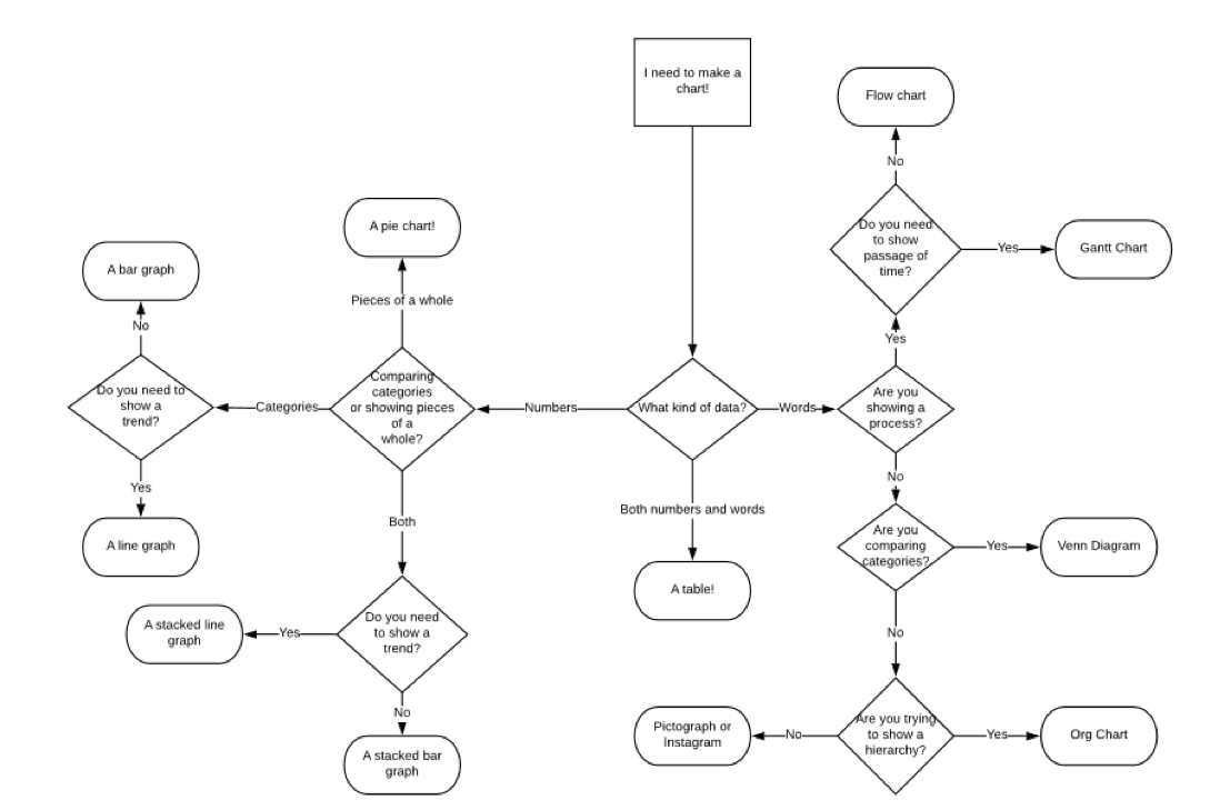
Figure 1. What type of visual aid should I use? Click on the image for a text-only version of this chart.
Now, was that easier than writing it all out?
Practice Question
If you have numerical data and you want to show a trend, the best graph to use is a
- Gantt chart
- Line graph
- Flow chart
- Answer
-
Line graph
Placement, Style, and Coloring
Once you’ve decided what graph or chart to use, we need to make sure it fits with our visual media usage standards. It needs to make your message more accessible by being:
- Clean and simple
- Uniform
- Persuasive
- On brand
Let’s build a pie chart and apply each of these standards to it as we go along.
Say you want to give a quarter bonus to the best member of each department, and you have settled on giving a $50 gift card for a movie theater. You have surveyed the company to determine which local cinemas are used by your employees to see movies. You have decided to make a pie chart from the results, because you’re looking to show the composition of your employees and their movie-going preferences.
At the moment, your pie chart looks like this:
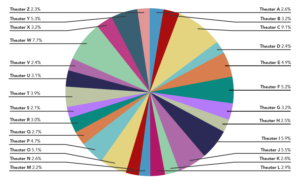
Figure 1. Which employees attend which theaters?
Figure 1 is definitely not clean and simple. There is so much to look at here that it’s hard to see anything. No one will find this useful. In fact, a rule of thumb for pie charts is that if you have more than ten categories, you should present the information differently. (There’s something called an exploding pie chart if you want to check that out.)
So how do we simplify the data? To begin with, we need to narrow down the categories. In this case, you could display theaters by company, rather than location, since all theaters of the same company will take the same gift card. Let’s take a look at how the revised chart would look in Figure 2:
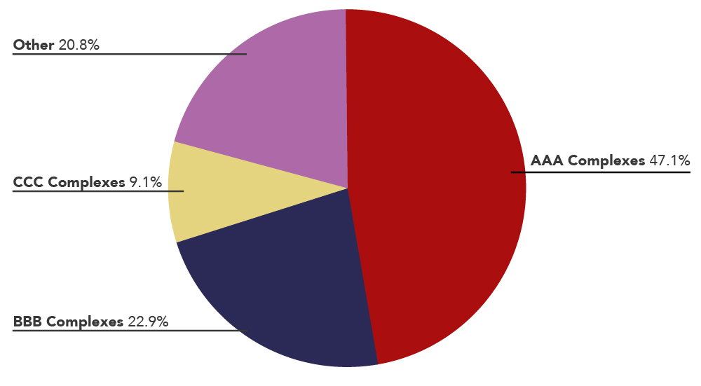
Figure 2. Which employees attend which theaters (by company)?
Now we’re getting somewhere! This is a much easier chart to read. We can see at a glance that nearly half of our employees go to a movie theater owned by AAA, and smaller portions see films at the BBB and CCC theaters. This information has become way more accessible for the reader.
We’ve also chosen some bold, pleasing colors here. We can clearly tell what part of the pie belongs to BBB and what part belongs to the others. This is clean and simple!
Once we’ve achieved that, we must make it uniform. Do the rest of your charts, tables and graphs use the same bold, pleasing colors we use here? Have we chosen the same font size for our chart key? If the answer is yes, we can move on. We know that we are sharing information without distracting the reader.
Now we ask ourselves, is this data persuasive? Well, that depends on the story you’re looking to tell. In this case, your best option is to purchase gift cards for AAA theaters because that is what your data is telling, since most of your employees enjoy seeing movies there. So let’s give this a title:
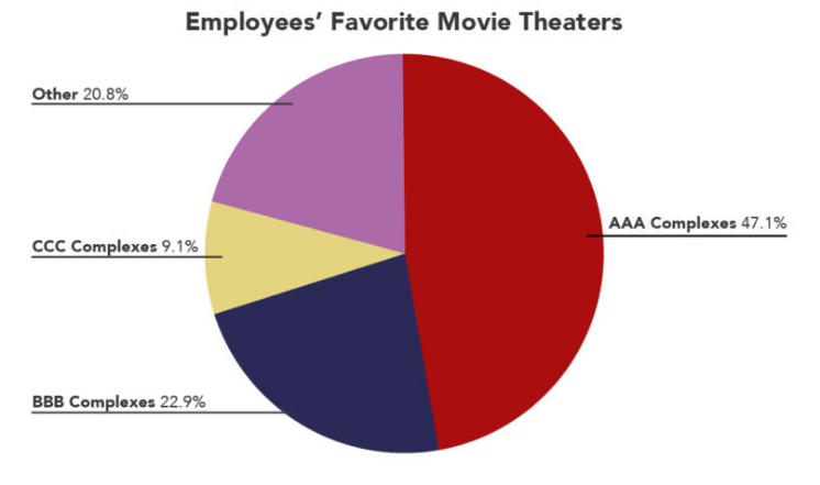
Figure 3: Your completed pie chart
Figure 3 a bit more persuasive. This immediately tells the reader “AAA Complexes are our employees’ favorite movie theater.”
Now, is your chart on brand? If your company’s palette of colors includes blue, red, yellow and green, then yes! We are on brand. If your company uses different colors, go ahead and change them. A lot of companies have very specific color requirements, even for internal projects, so be sure to look out for your company’s style requirements! For this project, it’s as easy as that.
You’ve made the point of this communication very easy and accessible by making these changes and following our standards of visual media communication!
Practice Question
How many categories is too many categories for a pie chart?
- Five
- Eleven
- Three
- Answer
-
Eleven
additional resources
- Misleading Graphs: Real Life Examples
- Good Data, Bad Graphs
Captions and Titles
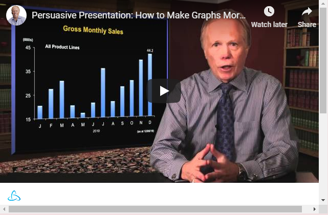
Most of the time, putting the data into graph form isn’t quite enough. In fact, it’s just the start. You created this graph to help you tell the story of your data, and to ensure your message gets across, you need to be clever about the captions and titles you include.
You’ll find most communicators title their graphs according to the content they display. It might say “Year-over-year performance” or “Weekly Average Ticket Sales.” But if your message is about how weekly average ticket sales are down 10 percent compared to last year, you might consider calling your graph “Average Ticket Sales are Decreasing.”
watch it
The video below is a demonstration about how to make a graph tell your story by making it easier to read and making the title active:
Captions usually indicate the source of information. If your sources and communications are not produced by people within your company, then this is an important step. Captioning the source gives your information credibility and strengthens your story.
Practice Question
When choosing a title for a graph, a great way to communicate your message to the audience is to
- Make the title active and point out your message
- Use an elegant font for the title
- Make the title as short as possible
- Answer
-
Make the title active and point out your message
You can also use captions to convey other pertinent information. You may want to include the sample size of a survey the graph is illustrating or additional background information about the data (as shown in Figure 1). Using captions in this manner helps the reader draw the right conclusion.
A caption on a graph can go badly when there is more information captioned than is of interest to your audience, or if information included in the caption would be better displayed elsewhere.
Let’s take a look at this line graph displaying the percent of world GDP (Figure 2):
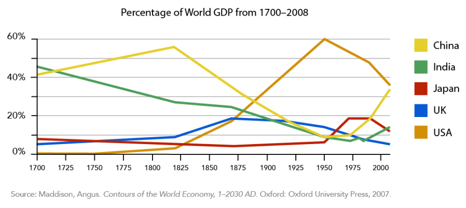
Figure 2: Percentage of World GPD from 1700–2008
Imagine if the graph above, which shows the percent of the world’s gross domestic product from 1700–2000, looked more like Figure 3:
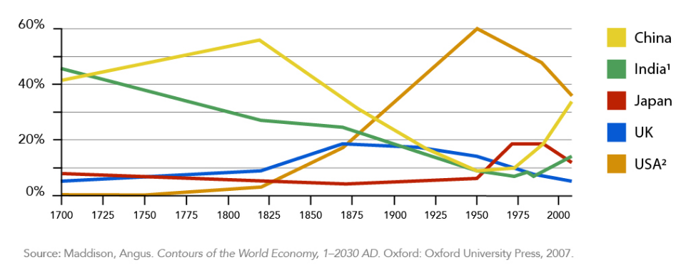
Figure 3: Percentage of World Gross Domestic Product by Country. You will note that (1) India was officially under British rule starting in 1858, when their entire GDP was transferred to the UK. India gained its Independence in 1947 after WWII. (2) The US was colonized by the British and was not its own country until 1776.
Now the title is included in the caption, as well as some information about British colonization. How could we make it a little easier for the audience to absorb that information?
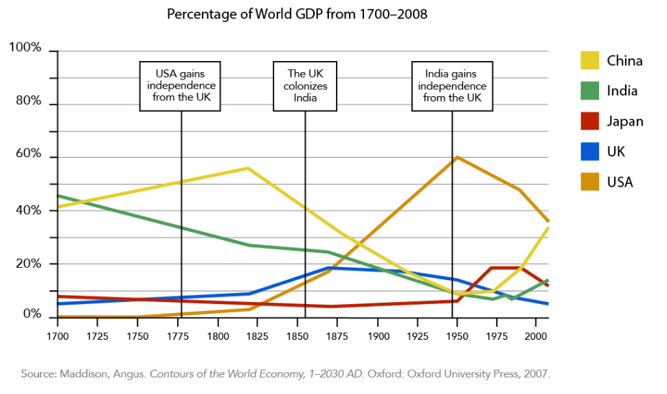
Figure 4: It should be noted that India’s GDP was actually considered in the UK’s totals from 1858 to 1947.
Figure 4 is even better. Now the graph is titled, and those instances of colonization are marked on the timeline. However, let’s imagine the author is focusing on India in their report or presentation. In that case, the note about the colonization of the United States isn’t quite relevant and should be trimmed out (Figure 5).
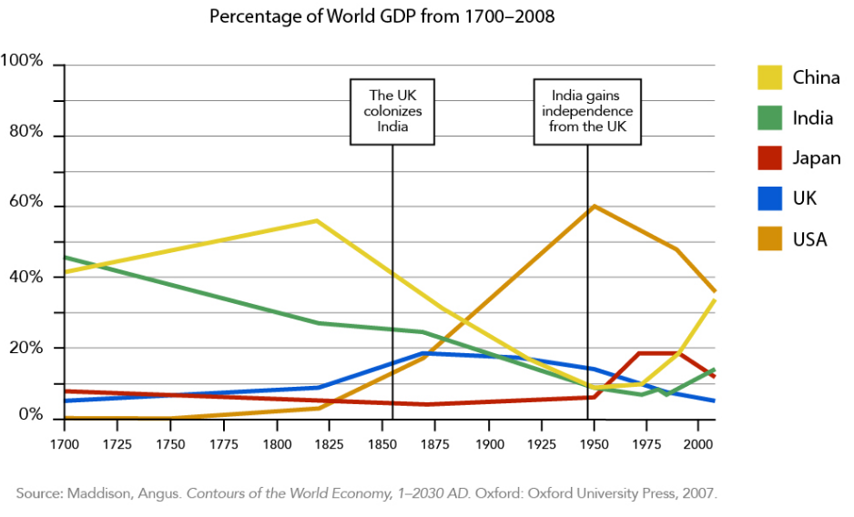
Figure 5: It should be noted that India’s GDP was actually considered in the UK’s totals from 1858 to 1947.
Much better! Now the graph shows only the information relevant to the point the creator is trying to make.
Visual media should always make a point clearer, so make sure your graph’s format, titles and captions are working for you rather than against you.