
8.5: Making a Presentation for a Meeting
- Page ID
- 4145
What you’ll learn to do: Create a presentation intended for a business meeting
Tools, no matter how sophisticated, are simply tools. Moving from the right tools to a good presentation involves perspective and planning. For perspective, we’ll approach the concept of a good presentation from two standpoints: identifying the key features of a good presentation and common mistakes that contribute to presentation failure. We’ll also discuss what’s involved in the planning process, including the three essential questions that need to be answered prior to developing content. Finally, we’ll explore the classic story structure and apply that structure to a business presentation scenario.

Learning Outcomess
- Identify key features of a good presentation
- Identify the purpose, audience, and message of your presentation
- Discuss common mistakes in presentations
- Create a presentation intended for a business meeting
Parts of a Good Presentation
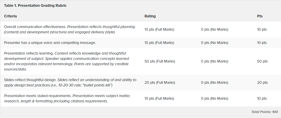
Like reverse engineering a product, we can distill the key features of a good presentation by looking at presentation evaluation scorecards. Refer to Table 1 for a sample class presentation grading rubric.
At the macro level, the key elements of a good presentation are content, organization, and delivery. There are both substance and style aspects of content. Substance elements include the originality and significance of your idea, the quality of your research and analysis, clarity and potential impact of your recommendations. Style aspects of content include confidence and credibility, both of which have a significant impact on how you—and your message—are received.
Good organization starts with a strong opening and continues in a logical and well-supported manner throughout the presentation, leading to a close that serves as a resolution of the problem or a summary of the situation you’ve presented. The audience experiences good organization as a sense of flow—an inevitable forward movement to a satisfying close. This forward momentum also requires audiences to have a certain level of technical and information-management competency. To the latter point, good presentation requires a presenter to put thought into information design, from the structure and content of slides to the transitions between individual points, slides and topics.
Delivery entails a range of factors from body language and word choice to vocal variety. In this category, your audience is responding to your personality and professionalism. For perspective, one of the three evaluation categories on the official Toastmasters speaker evaluation form is “As I Saw You;” in parentheses: “approach, position, personal appearance, facial expression, gestures and detracting mannerisms.” A good presenter has a passion for the subject and an ability to convey and perhaps elicit that emotion in the audience. Audience engagement—through eye contact, facial expression, perhaps the use of gestures or movement—also contributes to an effective presentation. However, to the point in the Toastmasters evaluation, gestures, movement other mannerisms can be distracting (see Module 7: Public Speaking for more on this). What works: natural (not staged) movement that reinforces communication of your idea.

Figure 1. The WIIFM Principle.
With those key features and presentation-evaluation criteria in mind, let’s add a disclaimer. The reality is that your features won’t matter if you don’t deliver one essential benefit: relevance.
Whether you think in Toastmasters terminology—”What’s in it for me? (WIIFM)” from the audience perspective—or put yourself in the audience’s position and ask “So what?,” it’s a question that you need to answer early. We’ll get into this more in the next section as we discuss presentation planning.
Practice Question
The key elements of a good presentation are:
- Strong opening and strong close
- Confidence and credibility
- Content, organization and delivery
- Answer
-
Content, organization and delivery
What’s My Presentation About?
It may be helpful to think of your presentation as having three key moving parts or interlocking gears: purpose, audience and message. Let’s walk through the presentation-development process at this planning level.
Purpose
Generally the first step in developing a presentation is identifying your purpose. Purpose is a multi-layered term, but in this context, it simply means objective or intended outcome. And why is this? To riff on the classic Yogi Berra quote, if you don’t know where you’re going, you might as well be somewhere else. That is, don’t waste your audience’s (or your own) time.
Your purpose will determine both your content and approach and suggest supplemental tools, audience materials and room layout. Perhaps your purpose is already defined for you: perhaps your manager has asked you to research three possible sites for a new store. In this case, it’s likely there’s an established evaluation criteria and format for presenting that information. Voila! your content and approach is defined. If you don’t have a defined purpose, consider whether your objective is to inform, to educate, or to inspire a course of action. State that objective in a general sense, including what action you want your audience to take based on your presentation. Once you have that sketched in, consider your audience.
Audience
The second step in the presentation development process is audience research. Who are the members of your audience? Why are they attending this conference, meeting, or presentation? This step is similar to the demographic and psychographic research marketers conduct prior to crafting a product or service pitch—and is just as critical. Key factors to consider include your audience’s age range, educational level, industry/role, subject matter knowledge, etc. These factors matter for two reasons: you need to know what they know and what they need to know.
Understanding your audience will allow you to articulate what may be the most critical aspect of your presentation: “WIIFM,” or what’s in it for them. Profiling your audience also allows you adapt your message so it’s effective for this particular audience. That is, to present your idea (proposal, subject matter, recommendations) at a depth and in a manner (language, terminology, tools) that’s appropriate. Don’t expect your audience to meet you where you are; meet them where they are and then take them where you want to go together.
Returning to the site analysis example mentioned earlier, knowing your audience also means getting clear on what management expects from you. Are you serving in an analyst role—conducting research and presenting “just the facts”—to support a management decision? Or are you expected to make a specific recommendation? Be careful of power dynamics and don’t overstep your role. Either way, be prepared to take a stand and defend your position. You never know when a routine stand-and-deliver could become a career-defining opportunity.
Message
The third step is honing your message. In “TED’s Secret to Great Public Speaking,” TED Conference curator Chris Anderson notes that there’s “no single formula” for a compelling talk, but there is one common denominator: great speakers build an idea inside the minds of their audience. Take, for instance, Chimamanda Adichie’s idea, which Anderson summarizes as “people are more than a single identity.”[1] As Adichie expresses it: “The problem with stereotypes [of a single story or identity] is not that they are untrue, but that they are incomplete.”[2] Or Sir Ken Robinson’s idea that creativity is a essential building block for learning. As he expresses the idea: “My contention is that creativity now is as important in education as literacy, and we should treat it with the same status.”[3] Ideas matter because they’re capable of changing our perceptions, our actions and our world. As Anderson puts it: “Ideas are the most powerful force shaping human culture.”[4]
So if ideas are that powerful, more is better, right? Perhaps a handful or a baker’s dozen? Wrong. As any seasoned sales person knows, you don’t walk into a meeting with a prospective client and launch into an overview of every item in your company’s product or service line. That’s what’s known as “throwing spaghetti on the wall to see what sticks.” And that’s an approach that will have you wearing your spaghetti—and perhaps the dust from one of your client’s shoes on your backside, as well. What audience members expect is that you’ve done your homework, that you know them and their pain, and that you have something to offer: a fresh perspective, an innovative approach or a key insight that will change things for the better. As Chris Anderson puts it: “pick one idea, and make it the through-line running through your entire talk.”[5] One message, brought vividly and relevantly to life.
So now that you have a macro view of the presentation development process, let’s review what can what can—and often does—go wrong so we can avoid the common mistakes.
Practice Question
The first step in developing a presentation is to identify:
- Your presentation subject and title
- The intended outcome of your presentation
- Who should be invited to the presentation
- Answer
-
The intended outcome of your presentation
Bad Presentations
For many, the prospect of developing and delivering a business presentation rates right up there with death and taxes. Interestingly, that same mixture of fear and loathing is often felt by audience members as well. But it doesn’t have to be that way. The ability to craft a compelling story is a skill as old as the human race, and the need to communicate is as primal and potentially powerful.

Figure 1. Akhenaten as a sphinx, and was originally found in the city of Amarna.
For millions of years before the invention of modern technology, humans used the tools available to perpetuate traditions and culture and to document—and often rewrite—history. Do a few internet searches and immerse yourself in the Egyptian tombs; the caves of Chauvet; or El Castillo, the Temple of Kukulcan. What you’re experiencing is a feat of both artistry and communication. Although we don’t know the full significance of these early carvings and structures, there’s no doubt that these early humans captured their world view in a way that is still deeply resonant. While the tools have changed, the communication challenges—and opportunity—remain the same: to communicate an engaging and inspiring point of view.
Regardless of whether you want to change the world, build your brand, or build a billion-dollar business, effective presentation skills are essential. To quote legendary investor, philanthropist and Berkshire Hathaway chairman and CEO Warren Buffet, “If you can’t communicate and talk to other people and get across your ideas, you’re giving up your potential.”[6] As would be expected of a numbers person, Buffet has quantified his point in talks on student campuses and professional organizations. Speaking at his alma mater in 2009, Warren Buffett told Columbia Business School students that he believed learning effective communication skills could translate into 50 percent higher lifetime earnings.
Given our vibrant storytelling tradition and with so much at stake, why are there still so many bad presentations? Wouldn’t you think that modern communication technology—considering the advances in graphics and communications software alone!—would lead to more compelling presentations? Interestingly, the problem is, to some extent, the technology. It’s estimated that 30 million PowerPoint presentations are created every day, with (seemingly) a majority of presenters opting for default layouts and templates. The problem is, we’re wired for story, not bullet points. A related failure is our use of available technology.
Seth Godin has a wonderful—and instructive—rant on these points: Really Bad PowerPoint (and how to avoid it), blaming Microsoft wizards, templates, built-in clip art and lazy presenters for ineffective presentations. In response to a question regarding “death by PowerPoint” on the TechTarget Network, Margaret Rouse provided this definition: “a phenomenon cause by the poor use of presentation software,” identifying the primary contributors of this condition as “confusing graphics, slides with too much text and presenters whose idea of a good presentation is to read 40 slides out loud.”[7]
So how do we avoid causing “death by PowerPoint”—or by whatever presentation software we use? The common denominator of presentation mistakes is that they represent a failure of communication. This failure can be attributed to two errors: too much or too little. The error of too much is generally the result of trying to use slides as a teleprompter or a substitute to a report, or, it would seem, to bludgeon the audience into submission. Of course, this tends to have an alternate effect, namely, prompting audience members to walk out or tune out, turning their attention instead to doodling or their device of choice.
What bad presentations have too little of is emotion. Presentation expert and author of the classic Presentation Zen (and 4 related books) Gar Reynolds captures the crux of the problem: “a good presentation is a mix of logic, data, emotion, and inspiration. We are usually OK with the logic and data part, but fail on the emotional and inspirational end.”[8] There’s also a hybrid too little-too much mistake, where too little substance and/or no design sensibility is — in the mind of the presenter — offset by transitions and special effects. Heed Seth Godin’s advice: “No dissolves, spins or other transitions. None.”[9]
The 10/20/30 rule, generally attributed to venture capitalist Guy Kawasaki, is a good guideline to help you achieve a “just right” balance in your presentations. Geared for entrepreneurs pitching their business, his advice is a discipline that would improve the quality—and, effectiveness—of most presentations. In brief, 10/20/30 translates to a maximum of 10 slides, a maximum of 20 minutes and a minimum of 30 point font.[10]
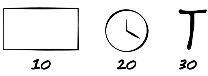
Figure 2. Your presentation should have no more than 10 slides, take no more than 20 minutes, and use type no smaller than 30 point font.
While this rule is a good starting point, it doesn’t overrule your audience analysis or understanding of your purpose. Sometimes, you may need more slides or have a more involved purpose—like training people in new software or presenting the results of a research study—that takes more than 30 minutes to address. In that case, go with what your audience needs and what will make your presentation most effective. The concept behind the 10/20/30 rule—to make new learning easy for your audience to take in, process and remember—should still be your guide even if you don’t follow the rule exactly.
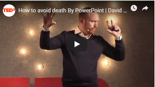
how to avoid death by powerpoint
For more on how to avoid causing death by PowerPoint, watch Swedish presentation expert and How to Avoid Death By PowerPoint author David Phillips TED Talk on the topic:
Practice Question
To balance readability and information processing, the 10/20/30 formatting rule recommends a:
- 10 point font size
- 20 point font size
- 30 point font size
- Answer
-
30 point font size
Making a Presentation for a Meeting
With perspective on the technical tools, communications planning and information design, let’s take this learning for a test drive.
What’s considered an effective (that is, persuasive) presentation structure hasn’t changed fundamentally over the centuries. In his analysis of dramatic structure in the Poetics, Aristotle identified a play as having three parts: a beginning, middle and end. The story begins with a “complication” (problem), ends with an “unraveling” (resolution), and follows a logical sequence of events from beginning to end. Hollywood screenwriters use the same structure and dynamics. Screenwriter, producer and author Syd Field, whom CNN called “the guru of all screen writers,” translated this simple three-step structure into numerous books and workbooks, including the bestsellers Screenplay: The Foundations of Screenwriting and The Screenwriter’s Workbook.
In a business context, a good presentation is an effective presentation. That is, a good presentation achieves its intended outcome. Clearly, in order to achieve a specific outcome or objective, you need to know what it is. So, prior to crafting the drama (in word or slide), you need to hone in on three things:
- The purpose of your presentation
- Your audience
- Your (one) message
For a review of these elements, refer to What’s my Presentation About.
Once you’re clear on those points, let’s proceed.
To build our presentation, we’ll use presentation expert Nancy Duarte’s interpretation of the classic 3-part story structure illustrated in Figure 1. For additional perspective on this structure, watch her TED Talk, “The Secret Structure of Great Talks,” or read her Harvard Business Review article, “Structure Your Presentation Like a Story.”
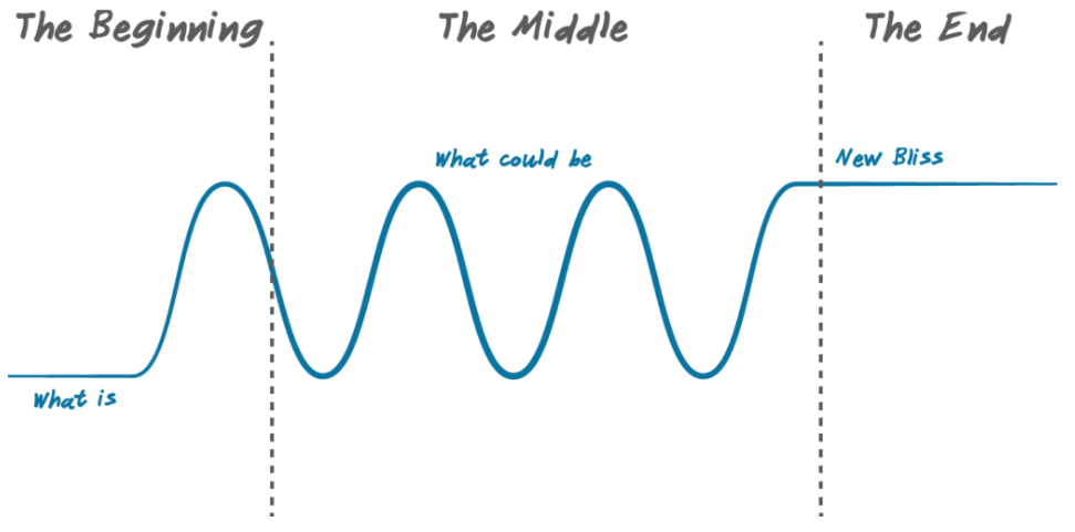
Figure 1. Persuasive story structure (Duarte, “Structure Your Presentation Like a Story,” 2012).
The Beginning
The story starts with “What is”—the current state. Describe this baseline state in a way that is recognizable to the audience. This allows you and the audience to get in sync. And with this base level of agreement, your audience will be more receptive to your proposed change.
The second step is to introduce “What could be.” The gap between what is and what could be adds tension and drama to your story and largely determines the significance of your presentation. If there’s no conflict, no proposed change, what’s the point of the presentation?
Let’s say you’re an analyst on the new product development team of a retailer known for exclusive, trend-forward “house” branded products. Your company’s reputation and revenue depends on consistent introduction of new consumer-product goods. Marketing and distribution are key strengths, but new-product performance is off, revenue is below expectations and the company’s stock price recently fell 30 percent. Within your company, R&D (research & development) is strictly an insider’s game; any ideas or innovations that weren’t developed in-house are blocked. The problem is, you can’t innovate fast enough—or with enough market demand accuracy—to meet financial and stock market expectations. You and the other analysts on your team have been tracking innovation trends and successes and you think the answer is opening the R&D works to outside ideas and innovations. Here’s how you might lay out your presentation:
- What Is: We missed our quarterly earnings numbers, largely due to a failure to meet our innovation success targets over the last six months.
- What Could Be: Initial data suggests we could get back on track by modifying our R&D model to incorporate external innovations.
The Middle
The bulk of your the presentation is developing the contrast between what is and what could be in order to set up your proposed resolution of the conflict or challenge. The objective is also to establish the validity of your arguments, so your proposed call to action is perceived as a logical, ideally inevitable, conclusion of the conflict.
- What Is: We currently bear the full cost and risk of developing new products and our innovation success rate—the percentage of new products that meet financial objectives—is running 25 percent below target.
- What Could Be: Sourcing promising innovations from outside the company could reduce R&D costs and risk while also increasing our innovation success rate.
- What Is: Our R&D process is taking so long that we’re missing trends and losing our market-leading brand reputation.
- What Could Be: We could license or buy promising innovations for a fraction of the cost it would take to develop them from scratch and leverage our marketing and distribution strengths to claim shelf and market share.
- What Is: Our below-plan performance and new product pipeline is costing us political capital with executive management, and we’re at risk of losing budget and/or layoffs.
- What Could Be: Adopting an open innovation culture would allow us to create partnerships that leverage our strengths and drive revenue, regaining a position of value within the company.
The End
To craft a powerful close, heed Duarte’s advice and avoid a list of bullet point to-dos. Your objective here is to achieve resolution of the conflict introduced at the beginning, to issue a call to action that inspires your audience to support your vision of what could be, a state Duarte refers to as the “new bliss.”
Call to Action
To recover our position of a source of revenue and brand value, we need to start working to build a culture and networks that support open innovation and accelerate the development of new products, regardless of the source of the idea.
New Bliss
Our ability to drive value secures our position and reputations in the company, and in the marketplace, and pays off in employee stock value and profit sharing.
The new bliss articulates the proposed—and a desired future state—incorporating the WIIFM, what’s in it for me, that motivates your audience to buy into and work to support the required change.
Practice Question
Which of the following is the best lead-in for your presentation?
- A bullet point list of action items.
- A chart illustrating the new product development performance relative to plan.
- An image illustrating open innovation.
- Answer
-
A chart illustrating the new product development performance relative to plan.
- Anderson, Chris. “TED’s Secret to Great Public Speaking.” TED, March 2016. ↵
- Adichie, Chimamanda Ngozi. “The danger of a single story.” TED, July 2009. ↵
- Robinson, Ken. “Do schools kill creativity?” TED, Feb 2006. ↵
- Anderson, TED ↵
- Anderson, TED ↵
- Gallo, Carmine. "How Warren Buffet and Joel Osteen Conquered Their Terrifying Fear of Public Speaking," Forbes. May 16, 2013. ↵
- Rouse, Margaret. "What is death by PowerPoint?" TechTarget Network. ↵
- Reynolds, Garr. “10 tips for Improving Your Presentations Today,” Presentation Zen. Nov 2014. ↵
- Godin, Seth. Fix Your Really Bad PowerPoint. Ebook, sethgodin.com, 2001. ↵
- Kawasaki, Guy. The 10/20/30 Rule of PowerPoint. December 2005. ↵